The Public Lab Blog
stories from the Public Lab community
About the blog | Research | Methods

Home-Made Disaster Kit: Plan Ahead With This Game!
Welcome to the Home-Made Disaster Kit. This kit is a card game designed to help people have conversations about their concerns, anticipated needs, and best use of available resources in planning for environmental disasters.
This game was presented by Emilio Vellis at the Texas Barnraising in the spring of 2019, and Public Lab collaborated with Emilio and members of Reaccion to produce this kit as a deck of cards that could be included in disaster kit and used as a tool to help communities strategize and prepare for their responses to environmental disasters.

This card game will be available for pre-order in the Public Lab store in December, and we anticipate further expansion kits that delve further into strategies for environmental sensing and monitoring.
This game is meant to work with communities at the beginning on the concept of using tools together to make a solution. Playing it takes about 10-15 minutes.
People are divided in groups of 10 max.
The game begins with describing a scenario (e.g. "You're working/sleeping at day/night at home and you hear a banging sound afar. You check the news/check outside and you hear that a gas explosion/earthquake/flooding is happening. Your family is at with you/away/nearby. You check with neighbors and see that someone is trapped/a home is on fire. What would you do?).
People should work together to choose from the tools to form their emergency kit out of household items. There is no limit to how many tools are used.
After working for five minutes, a person from each team explains what the tools will be used for.
After two or three scenarios, discussion is brought on how to use tools and the importance of creating an emergency kit.

Follow related tags:
barnraising blog disaster-response activity:disaster-response

Blurred Location and variable location privacy
With increased focus on location privacy in the wake of last year's New York Times report (Your Apps Know Where You Were Last Night, and They're Not Keeping It Secret, image above), we felt this was a good time to talk about some of the systems for storing locations, and some of the work Public Lab has been doing on what we're calling blurred location and a model for variable location privacy. We use both these terms to refer to systems that set out to share or store locations to different degrees of precision.
Clearly there are many reasons for the abuse or misuse of location data. Corporate and government data use must be constrained and responsible. But we are interested in exploring how location data, so useful in coordinating peer-based community strategies, may be used in systems that enable a structural approach to location privacy.

While there is existing work on different aspects of this problem, with the generous support of the Digital Impact Fund, we have set out to implement a prototype system that allows for some location sharing to enable community scientists to coordinate regionally, while not requiring them to share high precision location that might expose them to risk. The keys here are:
- the ability to share and integrate locations of varying precision using a prototype mapping library
- an accessible vocabulary to communicate precision
- a design vocabulary and set of UI/UX norms to respect individual decision-making in relation to location privacy
Together, we aim for these to articulate a model that is simple to use and understand, as well as universal enough---and powerful enough---to be implemented in real-world web applications.
Existing models
As adding location for both people and for research sites on the PublicLab.org website became increasingly important for Public Lab's mission, we began looking at how we could store location while offering a means for people to share low-precision (or obfuscated) location. We explored a number of existing options but all had drawbacks, from postal codes, to the "in this area" model used by AirBNB:

One of the biggest problems we saw in general was quick legibility---the ability to know how much precision has been scrubbed, for example, or the ability to perform the "blurring" mentally without an algorithm. Finally, we chose to go with truncation of longitude/latitude values, but to work on a coherent user interface and mental model to guide the translation from different precisions to a meaningful understanding of an "amount" of privacy.
A mental model of location privacy
What we sought was a simple mental model, and we based it around the latitude/longitude grid, known as a graticule in cartographic terms. By using a fixed grid, or a series of fixed grids at different decimal precisions, we avoided the need to insert random data, and we ensured the given truncated coordinates could be used to give a rough sense of the amount of precision offered. (Try it out here)

But most people can't quickly recall how big a coordinate grid square is, and so the interface for choosing one had to be intuitive and visual. We settled on a simple interactive web map using Leaflet, a very popular open source web mapping library. As you pan the map, you see the square overlapping the centerpoint of the map highlighted, indicating your current position at the center, and which grid square you "fall" in.
As you zoom the map in and out, you see the grid squares expanding, and if you zoom past a precision boundary, you'll see a sub-grid appear representing the 100 subdivisions of the larger grid square. Again, the smallest square overlapping the centerpoint is highlighted.
This provides an intuitive interactive means to visualize the region within which your location falls, and the maximum precision someone else will be able to determine your location to. By showing a map, we also remind people that spatial precision offers variable privacy -- in rural areas, a square mile may likely contain just a handful of people, rendering your position quite "findable," especially if it's your house. In urban areas, the same grid square might contain thousands of people.
Conveniently, as we are truncating, unchecking the "blurred location" checkbox simply shows a marker at the centerpoint of the map, and full precision is preserved, making the mixing of high and low precision data relatively simple.
Upcoming
This is only a brief overview of the Leaflet Blurred Location project, and we'll be posting some follow-up blog posts to dig deeper into different challenges and issues this new model and project has involved. And be sure to check out our proposal for a "blurred location" specification, here: https://github.com/publiclab/leaflet-blurred-location/issues/205
We're interested in tools that can offer people in online spaces the ability to organize, coordinate, and communicate in regional scopes, while placing the decision of how precisely to share location in the hands of those whose privacy is at stake. And we have worked hard to ensure that a clear mental model and user interface make it easy to quickly grasp what's being shared and how much it's being obscured.
Thanks for reading, and we'd love to hear your thoughts as this library continues to develop.
Resources
- https://github.com/publiclab/leaflet-blurred-location
- https://github.com/publiclab/leaflet-blurred-location-display
- https://github.com/publiclab/blurred-location
Follow related tags:
blog leaflet code privacy
Reporting frac sand mine violations in Wisconsin
Last month, I joined Public Lab’s Director of Community Development, Stevie Lewis (@stevie), for a pair of workshops in southeast Wisconsin for people impacted by the frac sand mining industry. Along with local environmental activists Pat Popple (@pat) and Sheila Danielson, we walked community members through the process of reporting violations by the frac sand industry. These materials are collected here for the public.
At the first meeting in Whitehall, we were joined by about 25 community members who shared their experiences as the frac sand mining industry has encroached on their towns. As mines and processing plants moved into the region, residents have been subjected to unbelievable torments: hauling trucks and train cars running all day and night, blasting happening just yards from their properties — cracking foundations and sheetrock, and damaging wells used for drinking water. One family had been without drinking water for over a year because of damage to their well. Another family had radon poisoning because of cracks in their home’s foundation.
 Community workshop in Whitehall
Led by Pat and Stevie, we walked through the types of permit violations that can be reported, the documentation that needs to be collected, and where to report to. Residents worked in groups on sample violations and the feedback was overwhelmingly positive; the reporting process was easier than most people assumed. Much of the information that was shared was compiled from the work done by Public Lab fellow Lemmy Kamau (@kamau19), who researched Wisconsin state policies related to frac sand mining so people can cite specific laws and codes that are violated.
After the event, I spoke with a woman named Diane who shared about the constant torment from a frac sand mine that is within yards of her property. The noise from the sand processing and trucks goes around the clock, less than 50 yards from her home. Stadium lights shine in her windows all night long. She said that the noise is so unbearable and there is so much particulate matter in the air that she doesn’t dare leave her windows open, and she has audiobooks and music playing constantly to help drown out the sound. She also spoke of the effects the industry has had on relationships in town. “People need to understand that if they hear of these things coming to their area, they need to take it seriously,” said Diane. “This has ripped our community apart.”
Later that week, we tagged along with Dr. Crispin Pierce (@crispinpierce) and students Connor Barnes (@Cbarnes9) and Aleah Gmeiner-Anderson (@Aleah) from the University of Wisconsin-Eau Claire as they installed Purple Air monitors at the homes of community members who live near frac sand mines. We watched as they set up these inexpensive sensors and showed residents how to track levels of particulate matter online. Some residents have begun tracking sand mines near them (blasting, transporting, etc.) and lodging them alongside changes in particulate matter captured and published by the Purple Air monitors. Not only is Purple Air data hosted online for residents and Dr. Pierce’s team to see, but the data streams were recently added to the Wisconsin Department of Natural Resources’ website that collects information on air monitoring.
 Installing Purple Air monitors in the field with (L-R) Aleah Gmeiner-Anderson, Connor Barnes, and Dr. Crispin Pierce (and a kitty named Sprinkles who came to help)
That evening, we met with about 45 community members in Black River Falls. The session kicked off with a presentation from Aleah and Connor about their ongoing work with air sensors and particulate matter. We again shared information on how to report violations in the frac sand industry and took questions about nuisance complaints.
 Community workshop in Black River Falls
At the meeting, I also spoke with Dwight Swenson (@dswenson), an agricultural educator at UW-River Falls in Plant and Earth Science. He and his wife have lived in their home in the town of Curran in Jackson County for about 25 years. It’s an idyllic, peaceful community tucked between rolling hills. “But when the sand mine came in five years ago, the peace was stolen from us,” he says. Mining operations have since decimated the hills outside their living room windows, lights from the plant shine all night long, and lines of trucks rumble past the property. The processing plant uses a million gallons of water per day, but little is known about the wastewater treatment and the effects on the local waterways and drinking water.
Of particular concern is the amount of silica dust in the air. Dwight and his wife, Ruth, have Purple Air monitors installed in their yard and Ruth takes meticulous notes on the readings and weather conditions each day. The data routinely show particulate levels that are well into the danger zone, but little has been done to hold the mining company accountable. “We're relying on local agencies to protect us and they've largely failed us so far,” says Dwight. Tipped off by a community member, he recently responded to a spill of viscous, mustard-colored liquid in a local river. He traced it up a stream that flows near his home, back to the mining site. Officials from the department of natural resources showed up to investigate, but not until days later. “This whole frac sand mining industry is so fraught with peril in terms of sustainability.” says Dwight. “It divides communities. And the economics just isn’t there. They’re not sustainable and they’re not financially viable.”
 Frac sand mine in Curran, WI
Follow related tags:
wisconsin air-quality blog fracking
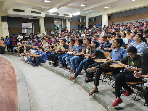
Congratulations to our 2019 Outreachy and Google Summer of Code team!
This week, we wrapped up our 2019 Outreachy and Google Summer of Code with the largest team of fellows ever -- 15, with two joining via Outreachy and 13 via GSoC. We also had our most successful summer ever, with a huge number of amazing projects and some incredible collaborations.
(above, a picture from an amazing event organized in Jaipur by @divyabaid16 about GSoC and Public Lab's first-timers-only work!)
This past Tuesday, we had an extra-long OpenHour (2-hours, actually) and folks got to give short presentations on their projects.You can watch them here on YouTube!
One thing I noted was that we had much more collaborative work this summer than in the past, with multiple 2-person teams working in close concert with each other, as well as a number of different bigger teams coordinating in parallel and across major integration projects -- MapKnitter being the biggest example of this!
I think this speaks to how we've grown as a community and developed strong cooperative practices! I also wanted to high-five everyone for opening MANY first-timers-only issues, and inviting many newcomers into their projects. It shows great leadership, and was crucial to the success of the summer's projects.
Overall, I was super impressed, and wanted to offer a big CONGRATULATIONS to everyone who participated: students/interns/fellows, mentors, and also all the newcomers who came and joined in on these projects.
Here are everyone's final reports. And again, GREAT WORK!!! 🎉 🎉 🎉 🎉
Follow related tags:
gsoc blog code wwg

Outreachy Final Blog : An awesome Journey
Here in this post I would be summing up my contribution for this summer. We do have this one single link to checkout the whole contribution in project -
https://github.com/publiclab/plots2/projects/10
What was the aim ?
My project was about revamping the design of various sections pages, sidebar etc. Me and gautamig did it together. We divided an issue of one section into small checklists and get ourselves assigned with those small parts and then starting working on it. We have covered Tags, People,Profile,Individual tags, Questions pages along with sidebar. Along with that, it included various bug-fixing.
What I did and What I learnt ?
The first section we covered in the summer of code was people's section as we had already begin working on the major parts. I started off with my parts which were addition of cards for the list of users which included info and other stuff. #5740. It was great experience with review process and working on responsiveness (@~_@~). After that I moved forward with small fixes of responsiveness. #5754.
Then till now, we had a card with details like user info but not tags the user is associated with. So I added in the most recent tags by user on its card #5765.


Gautami completed her portions and then we went to next section.
Yay !! Done with one section. (✖╭╮✖)
The next Section was Questions section , I created a new shadow page for questions page and added first section which included few info #5787. The idea of shadow thing still looks so COOL !!! (⊙⊙)(☉_☉)(⊙⊙)

After that I added featured Question part #5861 for which I took bit of time as it included changes in lots of cells (^_^;). I need to check the whole path of calling and adding a shadow function in back-end for popular questions only. We needed to show two features questions and this was third section for questions part.

Yay !! Done with with another one (✖╭╮✖)
Then we went to Individual Section page.
I started off with #5903 absolute fixing of wikis page if included for that tag in background and if not then add default grey with the addition of followers to that particular tag. I guess this PR of mine did create lots of bugs and broke many major things. (. _ . )( . _ .)(⌣̩̩́_⌣̩̩̀)

Then we went onto to next, I moved forward to as per new design draft changing navs, tabs to dropdowns and vice versa. One of that included distincting between notes questions [#5925]
(https://github.com/publiclab/plots2/pull/5925).
I wrote my very first extra-small screenshot test here after checking out the code written by jywarren. (✖╭╮✖) It was of getting redirected to tag page, clicking the button and getting a screenshot of dropdown.

This is another design change of side-vertical search results 5851

And then then then, I moved to next part which was actually something major #5948. Its not one or two anymore but changing the design of all the cards with all the info for that particular page. I did this kind of work into parts before. But here i went for all in one go. (︶︿︶) And it also included changing the UI test as per new design.

 Woah !! Done with another one (✖╭╮✖)
And Finally we came to profile section. I tried something completely new here. _へ__(‾◡◝ )> I tried building whole profile page in one single go #5990. (︶︿︶)
No taking small cases anymore. It was long review process with a lot of requested changes. As it was building up whole section in one PR , so lots of bugs and problems were there (~ _ ~;). And finally after 26 days, It was merged :'). Hurray !! ♪


(✖╭╮✖)
Me and Gautami tried to do various portions altogether. As the portions were dependent on each other and we had to wait for some parts. till that time, I went for sidebar. It was addition of toggle icons 😄 #6011, We can't leave our sidebar out when all his siblings sections are upgrading with new designs ¯(°_o)/¯

Ohk !! trying to build profile page in one go left some features (⌣̩̩́_⌣̩̩̀) and bugs. Then addition of some buttons and info required as per new design #6079. And after that addition of popular tags by that user to be shown on its profile section was added #6120.
I did few small bug-fixes of bootstrap upgrades : 5755,5756, #5767, 5772 (˘⌣˘ )
Also, few of the bug-fixing because of the new designs - 5766
And more than that, I somehow created lots of bugs ¯(° _ o)/¯, And thus created many first-timer and other bug issues for others to get them fixed. (҂⌣̀ _ ⌣́)
First-timers are: First-timer only issues link
Otherwise, we have lot more issues - Click to see issues
And some of the recent PRs which are still under revewing process (・_・;) - #6103 One of them is fixing the mismatch working of subscribe button as earlier we were subscribing to related tags but not that particular tags. And having dropdown for related tag. And if a user is subscribed, then we should have post option.

#6217 And another is addition of all the extra info of questions,notes,wiki to sidebar into ...


What is left
So Right now, we have one main section left which is Dashbaord. I'll keep on contributing. So My next target is dashboard now. (@~_@~).
I had an awesome collaboration with Gautami. Special shoutout to @warren for being such a patient mentor.(ø_ø) Thanks to mentors for solving and answering the silly questions I asked.
And Thanks to PublicLab for being such a wonderful community.
I guess I did miss various openhour calls sessions and was not much of active speaker if attended. (˘_˘٥)
I'll keep on contributing to PublicLab in future too. Thanks !!
Follow related tags:
design blog barnstar:basic blog-submission

Bringing Public Lab’s multispectral image processing to Leaflet maps
For a few years now, Public Lab's open hardware community has been developing not only DIY tools for taking multispectral photos, but also software tools to process and analyze these photos---the Infragram project, and more recently the Image Sequencer project. These have enabled many people to take multispectral (near infrared/visible) imagery and do NDVI plant health analysis at home, on a shoestring budget.
Above, converting a Canon A480 to take multispectral photos: https://publiclab.org/n/9985 (@chernabog)
Now we've released a standard Leaflet plugin, called Leaflet.Multispectral to make it possible to do image processing of multispectral imagery within a Leaflet map, in pure JavaScript:
(This library was made possible in part by NASA's AREN project)
We hope that this library makes it easier to get started for people looking to work with multispectral imagery, whether you're teaching it in a classroom, taking your own aerial multispectral imagery, or making use of NASA's amazing imagery resources.
The online demo demonstrates how you can use different colormaps, processing algorithms, and so forth, with your image overlay.
(Note I haven't aligned the above images at all, so they're just floating. Sorry!)
Learn about multi-band imagery and some of it's uses at this great blog post by Charlie Lloyd of Mapbox:
https://blog.mapbox.com/putting-landsat-8s-bands-to-work-631c4029e9d1
To get started, you can find some sources of multispectral Landsat 8 data here:
https://www.mapbox.com/bites/00145/https://aws.amazon.com/blogs/aws/start-using-landsat-on-aws/
While this library is intended for NRG or near infrared images used as overlays, we have more plans for this technique---coming soon... Leaflet.TileFilter -- a project to apply the same principles to full map tile layers!
Follow related tags:
ndvi multispectral nasa infragram