The Public Lab Blog
stories from the Public Lab community
About the blog | Research | Methods

Call for Summer of Code 2019 proposals!
Outreachy and GSoC
We're part of two different summer fellowship programs this year, Outreachy and Google Summer of Code (#GSoC) -- both recruit software contributors to work on open source projects. We may also join Rails Girls Summer of Code (#RGSoC) once it opens, but would need to be accepted first.
We've done GSoC for a few years now, and are really excited to be part of RGSoC for a third year and Outreachy for a second season. Outreachy writes:
We expressly invite women (both cis and trans), trans men, and genderqueer people to apply. We also expressly invite applications from residents and nationals of the United States of any gender who are Black/African American, Hispanic/Latin@, Native American/American Indian, Alaska Native, Native Hawaiian, or Pacific Islander. Anyone who faces under-representation, systemic bias, or discrimination in the technology industry of their country is invited to apply.
So, we're asking students from both programs to start posting their proposals for comment, here. Read on!
Deadlines
Outreachy's application deadline is the March 26, 2019 at 4pm UTC. GSoC applications will be open between March 25, 2019 - April 9, 2019.
Read proposal ideas
Once you've gotten a bit familiar with our project (see our welcome page here), the first step is to look over our ideas page, which you can find here. These were collected from the brainstorm we did earlier in the year.
For Outreachy, we will be posting a project idea soon on the Outreachy website.
Please feel free to ask questions in the comments below, or to join our chat channel at https://publiclab/chat
Our welcoming page will help you understand how we collaborate, and we'll be there to help you take your first step. And try tackling a first-timers-only issue, to get an idea of how to become a contributor!
Also, read this page carefully to understand our workflow and how we structure summer of code projects: https://publiclab.org/wiki/gsoc#How+we+work
Please ask questions! We're very friendly and we love welcoming new people into our community.
New this year
Once the term starts, we'll be asking all participants to review another person's work at least once time per week, and to either post a first-timers-only issue or help someone who's working on one once weekly. This will help us continue to support our growing community!
Post a proposal for comment
Once you've read through some of these ideas and become a bit more familiar with our projects, it's time to post a proposal of your own.
You don't need to have a complete or even concrete idea -- share your thoughts early and we'll help you refine your proposal, and help you choose something that's the right difficulty level as well as being something our project really needs.
We've created a template for you to post a proposal here. Click this button to begin:
Read other proposals
Before or after you post your own draft, read through others' listed below. Your best comments and input may come from other applicants!
Also see 2018's proposals here
Proposals
Questions
| Title | Author | Updated | Likes | Comments |
|---|---|---|---|---|
| Software project ideas for upcoming 2018 Summer of Code fellowships? | @warren | almost 7 years ago | 7 | 9 |
Follow related tags:
software gsoc blog code
Leaflet.DistortableImage full resolution download
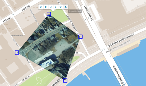
Across the Public Lab community, people are making their own maps using aerial photos (by balloon mapping, kite mapping, and the like) with the MapKnitter website - which helps people "stitch" or "knit" images into a combined map, using an existing satellite map base layer as a reference.
The core of MapKnitter's interface, the Leaflet.DistortableImage library, is seeing some new life as members of our coding community have started to dig in and make improvements! Its main goal of letting people distort aerial images to fit onto a map is being refined, debugged, and expanded. (This was made possible in part with support from NASA's AREN project)
Above, a new feature you can see in the menu is a full resolution download -- with no server-side processing at all. This was made possible through a lot of work by John905 and rexagod.
Try it out in the demo: https://publiclab.github.io/Leaflet.DistortableImage/examples/
This takes the original full resolution image and distorts it in your browser (you may need to allow popups), and then downloads.
For example, the lead image generated this full-res distorted image: full.png (2304x1536 pixels)
See the preview below.
This may mean that for some smaller MapKnitter maps, you won't need to run a full export, which can take a while. This code should publish on MapKnitter within the next few days. Down the road, we're looking at more ways to refine the export process to make it even easier to make your own maps using balloon, kite, pole, or drone mapping.

Follow related tags:
balloon-mapping kite-mapping mapknitter aerial-photography

RV SensorShip V
The original SensorShip had four environmental sensors and it was hard to cram all the wiring into the sailboat I printed for it. I was also concerned that a sailboat is not a ship. I also wanted a SensorShip with more sensors. So I searched Thingiverse for a more appropriate vessel.
Figure 1. An ESP8266 board and the bi- and trifurcating wiring harness for five I²C sensors (each sensor gets connected to the same four pins on the board). Plus three LEDs and a piezo buzzer. I’m going to need a bigger boat.
I quickly found Peter Sripol’s Utility Ship and the easier to print "make" of it by 08stanis. I immediately liked this ship because I had just reread Steinbeck’s The Log from the Sea of Cortez and the model reminded me of the Western Flyer.
Figure 2. The Western Flyer was built in 1937 and spent six weeks in 1940 in the Sea of Cortez with John Steinbeck and Ed Ricketts aboard. She had a long, hard life and was recently lifted off the harbor bottom and brought onto the hard.
Figure 3. The Western Flyer is being restored in Port Townsend, WA and will be used as a floating classroom and memorial to the poorly-formed ideas of Steinbeck and Ricketts about ecology and politics. Learn more here.
The new model is not really a ship, but it is a bigger boat and is designed to be easy to open to install stuff inside. It is intended for printing about two feet long, but it works well when printed 7.5 inches long.
Figure 4. The new RV SensorShip V is easy to print in 15 pieces and fun to glue together especially if assembling model boats is one of your favorite things to do. I used superglue.
Figure 5. The entire deck of RV SensorShip V can be used like a lid so it’s easy to install important stuff inside.
Figure 6. RV SensorShip V has five I²C sensors. Clockwise from upper left: BME280 (temperature, humidity, pressure), MLX90615 (thermal IR), VL53LOX (laser rangefinder), TSL2561 (light level), and MMA8451 (3 axis accelerometer). The paperclip on the left is for scale.
Figure 7. Two sensors are mounted on the stern deck of RV SensorShip V so they can be directed together at areas of interest. The laser rangefinder (right) and thermal IR (left) sensors are both directional.
Figure 8. Screen capture from the Blynk app of three hours of the data records from three of the five sensors on RV SensorShip V. The ship was next to my 3D printer when a 30-minute print was running. The laser rangefinder and thermal IR sensors were pointed toward the print head.
SensorShips incorporate ESP8266 microcontroller boards with integrated Wi-Fi. Data from the sensors are sent via Wi-Fi to the internet. This SensorShip sends its data to a Blynk server and the data can be viewed on a mobile device in real time.
A new feature of this SensorShip is the pair of directional sensors on the stern deck. I oriented the ship so these sensors were pointed near the print head while a short 3D print was made. Both of these sensors and also the accelerometer captured a clear record of when the 3D printer was operating (Figure 8).
This past weekend there were three days in a row with nighttime temperatures near 0°F. I have been heating my house with a woodstove this winter and was concerned that the cold snap might freeze pipes in the basement. I placed RV SensorShip V in the crawlspace where the most vulnerable pipes are. Fortunately we had some snow before the weekend, so I was able to bank the foundation with snow to provide some insulation.
Figure 9. I banked snow around the entire house before the cold weekend.
Figure 10. Temperature results from three different SensorShips for a week including a very cold weekend. RV SensorShip V (bottom) had its directional sensors pointed at the most vulnerable pipes in the crawlspace. The rangefinder was well positioned to detect raccoons. On Tuesday the 15th (dashed line) I surrendered and started using the oil furnace in addition to the woodstove. This figure is made from three screen captures from the Blynk app which were combined and annotated in Photoshop.
The basement low temperature dropped about one degree F for each of the cold nights finally dropping into the 30s F. I thought I had weathered the weather, but more cold nights were forecast, and in a few days the daytime high is forecast to be not much above 0°F. The woodstove would have a difficult time counteracting such temperatures, and provides almost no heat to the basement, so I ordered more heating oil for the furnace (which is in the basement).
I ran the furnace four times (Figure 10) in the first three days after the delivery (I had been out of oil since April). I learned that in order to raise the temperature on the first floor of the house into the 60s F, the temperature in the basement has to be warmed into the 50s F. That’s one reason I don’t like to use the furnace, but I think I will be very thankful for it over the next several days when the four-day average temperature will be very close to 0°F.
All three of the SensorShips use an ESP8266 board and connect to the internet via the integrated Wi-Fi. So SensorShips must remain in the range of my home Wi-Fi signal. I was pleased that RV SensorShip V had no problem connecting from the basement, even though the Wi-Fi router is on the second floor at the other end of the house.
All of the SensorShips are powered by 5V phone chargers plugged into the wall. They would last only a couple of days if powered by batteries because everything is powered continuously. I have not yet figured out how to sleep the ESP8266 boards or to use a low power external timer with them (my first attempt to use a timer failed). Let me know if you know a trick for using these boards with a TPL5110 timer.
Follow related tags:
arduino sensors blog wi-fi
Seeking GIS / Data folks: Help us create a nation Lead Exposure Risk map.
Background on lead at: publiclab.org/lead
Overview
Quite a bit of public data exists now that, if brought together, can paint the picture of lead exposure within neighborhoods across the country. This information is useful to a couple audiences: Concerned citizens can see what their risk is; this is general. More specifically and strategically: Community scientists and activists can prioritize where they work. And Public Health officials can prioritize where they work.
There are a few efforts out there, but much of it is local (particular to one city and/or state), or is incomplete or due for an upgrade. We’re seeking data scientists, epidemiologists, and GIS folks to build on these efforts.
The output is a simple map with lead risk scores presented by a geographical unit (census track, neighborhood, etc). The effort should be done in the open and documented (presumably on github, but maybe also here on publiclab.org).
If this is interesting to you, let us know and we can figure out how to work together.
The following are examples of work in this area. Each is useful and has strengths but (I think) insufficient.
Example 1: Washington State Department of Health

Source: https://fortress.wa.gov/doh/wtn/WTNPortal/#!q0=4718
Childhood Lead Risk Map For this measure we combined two variables: Percent people living below the 125% Federal Poverty Level (FPL) and Percent Housing built before 1980 (and weighted by era built).
Information About the Data In addition to the census of every U.S. household every 10 years, as required by the U.S. Constitution, the Census Bureau has a sub-sample, yearly survey called the American Community Survey (ACS). This representative sample-based survey gathers characteristics for a subset of the entire population of the U.S. each year.
You can find supporting documentation on code lists, subject definitions, data accuracy, and statistical testing on the ACS website, Data and Documentation section. You can find sample size and data quality measures (including coverage rates, allocation rates, and response rates) on the ACS website in the Methodology section.
Example 2: Vox (with Washington State Department of Health)

Source: https://www.vox.com/a/lead-exposure-risk-map Github: https://github.com/voxmedia/data-projects/tree/master/vox-lead-exposure-risk
From the article: “The trouble is that exposure risk is surprisingly difficult estimate, due to a variety of state-by-state differences in reporting standards. So we worked with epidemiologists in Washington state to estimate risk levels in every geographic area in America…
Our map uses a methodology that Washington State’s Department of Health pioneered earlier this year to estimate kids’ risk of lead exposure in different neighborhoods. Their mission was to determine how to focus scarce public health dollars on the kids most at risk of being poisoned by lead. We worked with one of the chief epidemiologists who created the map, Rad Cunningham, to replicate the state’s methodology nationally and apply it to all 72,241 census tracts in the United States.”
Example 3: Reuters

Source: https://www.reuters.com/investigates/special-report/usa-lead-testing/#article-off-the-charts
From the article: “Most U.S. states disclose data on the percentage of child blood tests that show elevated levels of lead. Yet this data, often for statewide or county-wide populations, is too broad to identify neighborhoods where children face the greatest risk.
Instead, Reuters sought testing data at the neighborhood level, in census tracts or zip code areas, submitting records requests to all 50 states.
U.S. census tracts are small county subdivisions that average about 4,000 residents apiece. Zip codes have average populations of 7,500. In each area, a relatively small number of children are screened for lead poisoning each year.
Reuters found 2,606 census tracts, and another 278 zip code areas, with a prevalence of lead poisoning at least twice Flint’s rate."
If you're a data guru, GIS epidemiologist, or just someone who wants to contribute to this effort, post a comment below or reach out to Read Holman at read@publiclab.org. Thanks!
Follow related tags:
mapping blog request lead

Experiment with polarizing filters to view crystalline dust
Over the years, a lot of people have been looking at crystalline particles under a microscope (like the DIY Community Microscope Kit), and the idea has come up a few times to try using polarizing filters -- for example to try to distinguish crystalline particles from other types of particles.
See #10493, #17785, and others under #polarized-light-microscopy:
| Title | Author | Updated | Likes | Comments |
|---|---|---|---|---|
| Experiment with polarizing filters to view crystalline dust | @warren | almost 6 years ago | 3 | 3 |
| Crystalline silica from tile grout at AS220 microscope workshop | @warren | almost 6 years ago | 3 | 10 |
| Automating Passive Particle Monitor Analysis | @mathew | over 8 years ago | 2 | 3 |
| Imagining & testing Polarized Light Microscopy for Silica dust speciation | @mathew | over 10 years ago | 5 | 20 |
| Viewing mica through a polarizer | @warren | over 10 years ago | 1 | 2 |
| Frac Sand mining- polar light microscopy? | @mathew | over 10 years ago | 1 | 5 |
How does it work?
The idea (I think) is that crystals "twist" the polarity of light, and so shining polarized light through them, and then re-filtering it with a second polarizer would... block or allow light differently through crystalline particles when compared to non-crystalline particles.
I'd love to hear more specifics from folks on what's happening here, but in any case the effect is that crystalline particles look really different, and change color pretty dramatically when the polarizers are rotated.
You can read a lot more on this, and see some early tests, here: #10493
Samples
Crystalline #silica is dangerous to breathe in; please be careful, and plain sand may be a safer thing to test this on unless you're specifically looking for crystalline silica. You can use a respirator as recommended on containers of grout, joint compound, cement or mortar.
What I did was to look at this while wet, so there's very little chance of it getting airborne. I got some from washing out some grout from a tile project, but you can collect dust samples too -- #dust-sampling.

Setup
I took these polarizers from a pair of 3d glasses from a movie theater (they appear kind of grey, not red and blue) - I think we used the left and right lenses. I believe in these the left and right are circularly polarized clockwise and counterclockwise, but I don't know exactly what that means; I also have some linear polarizing film but haven't tried it yet.
To get the filters out, I just broke the glasses and carefully pulled out the lenses, which are flexible film.
You can buy these as an add-on in the Public Lab store here: https://store.publiclab.org/products/microscope-addonns

I've drawn the polarizers at 90° angles, but we tried rotating them back and forth to see the color-changing effects pictured. Try different arrangements and report back what you see!
Examples
@peasepoint took some great ones at the last #community-microscope workshop at AS220 in Providence, shown below. Post your own in the comments!


Follow related tags:
as220 blog silica polarizer

Outreachy 2018 Week 2 and 3
Updates
The last two weeks have been quite good. I have made some progress.
I manged to refactor the statistics controller by using scopes in the user, node and revision models so that the queries are quite simple hence less code. e.g This was one instance variable on the statistics controller.
@weekly_notes = Node.select(%i(created type status))
      .where(type: 'note', status: 1, created: @time.to_i - 1.weeks.to_i..@time.to_i)
      .count(:all)
I made some scopes in the Nodes controller
 scope :status_one, -> { where(status: 1) }
 scope :weekly, -> { status_one.where("created > ?", (Time.now - 7.days).to_i) }
Which changed the method to
@weekly_notes = Node.weekly.select(:type).where(type: 'note').count(:all)
You can now select a range to view statistics on the /stats/range page. You can do it for past week, month, year or select from a calendar.

You can also see the statistics on the number of questions answered and asked within a certain period on /questions.

I am finishing up on moving statistics methods in the user model to a concern so that its not so long. I am almost done just fixing code climate issues on refactoring some code blocks.
Everybody Struggles
Last week Outreachy requested we share our struggles and the mentors to also share about their struggles. Thanks to the community for sharing your struggles and making me see that I am not alone. Here is a link to the week check-in where some of the contributors shared their struggles.
Here is some of my struggles.
I struggled with was date-picker positioning..sounds pretty simple but it was a pain to get it to appear where I wanted, asked for help from the community though the suggestions I got did not solve it I had to make some comprises.
Another major struggle was a brakeman issue User controlled method execution it looked critical to ignore. I tried to tweak it a couple of times and much much later solved it by making the method a private method.
Currently I am struggling on getting to refactor some two methods that gets code climate complaining. The methods look similar but have varying parts.
Next weeks plans:
Now that the statistics controller is looking a little cleaner, I will be implementing the new ui design for /stats page. I am currently working on a mockup and will attach it here for input when am done. Later on, after the new ui is up, I will implement downloads of stats as csv and json.
Follow related tags:
blog outreachy outreachy-2018