The Public Lab Blog
stories from the Public Lab community
About the blog | Research | Methods

Community Atlas: an "around the world collaboration" on MapKnitter
Over the past six months, we've overhauled almost every part of the MapKnitter website, and I wanted to share a bit about all the people who made this possible. Between our Google-funded MapKnitter code fellowships and our Google Summer of Code (#GSoC) fellows, we've had contributions from five continents and more than ten people, all coming together to build this complex system!
In March, we put out a call for Mapping Fellows to help lead mapping events in their communities and give feedback on their experiences using MapKnitter.org to stitch together their aerial images. We partnered with Mo, who worked with youth asylum seekers and refugees to do balloon mapping in their new home in Nottingham. We also partnered with Sairam, who worked with community members in Bangalore to map local waste sites and analyze optimum sites for installing solar panels. Mo and Sairam provided detailed user interface feedback on MapKnitter's design, from the overall workflow to specific organization and styling of buttons and tabs. See for example this annotated screenshot, which we are using to refine the UI:
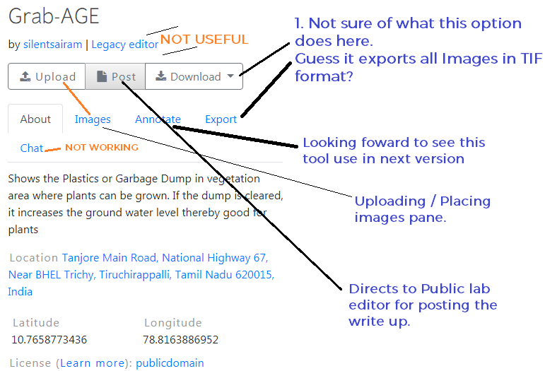
Meanwhile, Cess Wairimu in Nairobi and our GSoC fellows Alax Alves in Brasília and Kaustubh Nair in Bangalore were hard at work tearing out and rebuilding the Ruby on Rails foundation of the application, upgrading it and cleaning up old code. Much of the code hadn't been touched in years, and things really got refreshed, restructured, and brought up to date.
But the changes weren't only under the hood. Divya Baid of Jaipur was hard at work rebuilding image management, finding bugs and more, while our Providence-based coding fellow Rose Parker was going through, testing and resolving dependencies, one by one. GSoC alum and mentor Sidharth Bansal redesigned and launched a slick new login system that eliminated may unnecessary steps, while Sasha Boginsky of New York (also a mentor) took on dozens of bugs, UI issues, and new features in our map stitching JavaScript library, Leaflet.DistortableImage.
Meanwhile, Varun Gupta (a GSoC alum) in New Delhi and Sebastian Silva (our sysadmin) in Madre de Dios, Peru worked hard on a cloud-based exporting system to offload heavy image-processing jobs to a cluster in Google Cloud, implementing both Node.js and Ruby workflows, and linking MapKnitter to our new image-processing library, Image Sequencer.
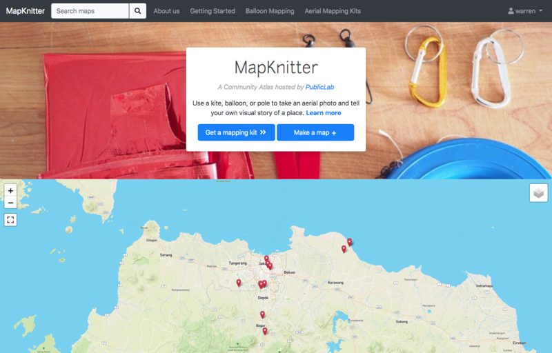
Stéfanni Brasil (a former Rails Girls Summer of Code fellow) joined in from Vancouver and brought our UI up to Bootstrap version 4, while Cess stepped in again to build on Stefanni's work in launching a new front page design that highlights mappers' work from around the world.
Finally, hard work by Ananya Arun in Hyderabad and Sagarpreet Chadha in New Delhi has made the new "tour" feature possible, highlighting MapKnitter maps around the world.

It's been an amazing journey, and there's still a lot left to do through the end of the summer. But the launch this week of MapKnitter 3.0 (bigger announcement coming soon!) proved how input from so many folks can make for a really fantastic and cohesive project! It also shows the geographic breadth of the Google Summer of Code, Outreachy, and Public Lab communities!
Thanks to everyone who's helped make this possible, from fellows to students to mentors, as well as the Outreachy program and the Google Open Source office. We're looking forward to a new wave of mapmakers on this fabulous rebooted project, and the many Community Atlases they'll go on to create!
Follow related tags:
balloon-mapping mapknitter collaboration software

Gulf Coast Educator's Workshop Summer 2019
The Project
Public Lab is excited to announce that with support from the National Academies of Sciences, Engineering, and Medicine’s Gulf Research program we will be working on building the scientific capacity of the next generation. To this end, Public Lab is partnering with educators along the Gulf Coast to pilot a curriculum designed to support students as they use community science methodologies to explore environmental challenges facing their community. This project centers students as knowledge producers, rather than knowledge consumers, on a path toward becoming scientifically literate citizens. As a team, students undertake problem identification, study design, data collection and analysis, and sharing results back to their community. Throughout the project, students will utilize Public Lab to connect to a larger network of community scientists, experts, and locals working in their field.
The Curriculum
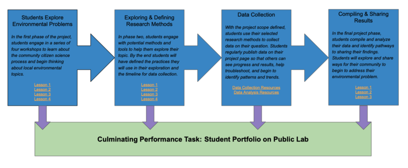 This project utilizes four phases and a problem-based learning approach to allow students to progress from problem identification to sharing their story with the community. You can learn more about the project or check out lesson plans at the Student-Led Community Science Wiki or see an overview above.

The Team
In the first year of this program, educators @amallozzi, @jeanell873, and @fwagner will be working to adapt and refine the program for their classrooms. You can follow along on the projects progress by subscribing to the tag #student-community-science.

The Workshop
Over the course of three days in New Orleans, LA our team gathered to workshop lesson plans, discuss connecting classrooms to the larger communities, and share our experiences with student-led inquiry. We worked together to set goals for this year of our project. You can take a look at our goal setting in this document. These goals include:
- Work in a Climate Context
- Advance Student Inquiry
- Aim for Accessibility
- Experiment in Engagement
- Refine Our Program
- Unblock Youth Drive
- Test Technology
- Work Openly
- Build Networks
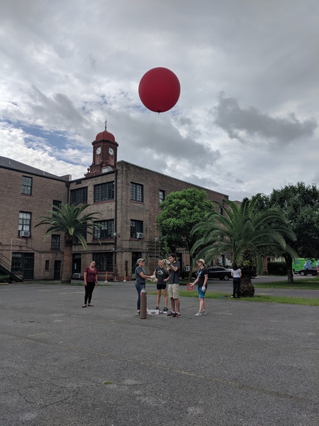
Workshop Takeaways
Throughout the workshop, we began a list of things to share with educators who are facilitating student led inquiry for the first time. Here are some of our key takeaways:
- Student-led inquiry is incredibly messy but extremely worth it. I feel this type of learning allows my students to think and solve problems in a way that they don't get the chance to in a traditional classroom.
- Starting student-led projects involves a leap of faith. You've got to trust in the process but also listen to your judgement as you go.
- The process is the process. There's going to be moments of failure in there, and that's part of the learning process. Stick with it.
Get Involved
Support Student Work
Our students will be asking questions, sharing their work, and looking for feedback throughout their projects. If you'd like to follow their work, provide help, or cheer them on, subscribe the tag #working-together. If there are specific topics where you feel you'd be most helpful, let us know in the comments and be sure to subscribe to tags.
Help us Refine the Curriculum
We're working to share our lessons as frequently and openly as possible. Share helpful feedback on lesson plans, or try them out and let us know how it goes. You can see the full lesson plans here.
Join our Second Gulf Coast Cohort
In the 2020-2021 school year we'll continue to refine this curriculum. If you're an educator in the gulf coast, let is know that you're interested by completing the form below.
Follow related tags:
education workshop blog with:stevie

MapKnitter UI evaluation 2: Mapping Nottingham's Urban Greening
https://publiclab.org/notes/molangmuir10/05-13-2019/mapping-nottingham-s-urban-greening-growing-spaces
https://mapknitter.org/embed/mapping-nottingham-s-urban-greening--3
Since my first evaluation post (https://publiclab.org/notes/molangmuir10/06-10-2019/mapknitter-ui-evaluation) I have encountered some different additional user interface experiences...
As with anything, mapknitter gets quicker and easier the more you use it!
I have made a screen recording video to highlight some of my key experiences and issues when using Mapknitter...
Summary of key issues from the video...
- Not being able to reduce the size of the image beyond a certain point is frustrating and means I have to re-upload the image.
- It would be more efficient if you could re-place a previously uploaded image.
- Occasionally, a white blank space appears at the bottom of the screen (I could be doing something without realising?) This reduces the view area so can be annoying. It also means the zoom too for the map disappears.
- Using the rotate tool can cause the image to skew slightly
- When zooming out and then in on skew mode the line jogs. It seems like it is moving, although it doesn't actually move the border. This could be misleading/confusing.
- The blue square came off one corner so it was uncalibrated. This happened a few times.
- Red outline would appear at random - sometimes when transparency toggled and sometimes not
- Download and help links did not work -- how can I download my map?
As well as the screen recording here are some general points from using mapknitter...
Sometimes it is hard to move the photo to the EXACT point on which you want it. If you could click the photo and use arrow keys to move the selected photo this could help with the accuracy. At the moment pressing the arrow keys moves the whole map. This is also a good feature. Keep this but add a way of clicking on the photo which selects it so you can then use arrow keys to move accurately.
It would be good to have a photo cropper -- some of my images had one bit that was off/blurred but the rest of the image useable. I know this can be done by cropping the original file and reuploading, but it would be much quicker if you could do this in situ.
It would be nice to have a save button. Feels scary closing the window without knowing what's happened!
I also was thinking if it were possible to make an off-line extension? Particularly for remote research areas or 'on-the-go'.
Uploading map through to Publiclab's page was straightforward
Follow related tags:
balloon-mapping mapknitter community mapping

Second Blog: My work for outreachy
Last month, I started my Outreachy journey with publiclab. It's been a great learning experience so far. Today, I'll be telling more about what tasks did I accomplish in the complete month.
So once again who am I ? Hey everyone, This is Lekhika Dugtal. An undergrad student at IIITA and currently an outreachy intern at Publiclab.
I'll be explaining What and How I worked for my project under Outreachy.
What's my Outreachy Project ? My main focus for Outreachy intern project is based on UI Redesign of plots2, which is public lab's main knowledge exchange platform based on ruby on rails. All the work is done collaboratively by me and other contributors of the project.
We have divided the project of outreachy into various parts on the basis of sections. As the project is knowledge exchange platform, So the various sections include ---
1. Dashboard section
2. Profile section
3. Tags section
4. Individual tags section
5. Question section
6. People section
7. Search Section etc.
In the last one month of outreachy, we have finished the following sections --- People, Question, Tags sections and the work on other sections is going on.
People Section ( Completed)

Older UI

New UI
The people section is list of all people registered in the platform. It gives a brief detail of when has person recently contributed in platform. And how much time ago, that person has joined the platform. Earlier the UI was a a simple table and list of people being shown in the form of rows. As per the style guide, the new design was card design. Cards are a convenient means of displaying content composed of different types of objects. And considering we have to show various similar objects whose size or supported actions can vary considerably, like profile photos or information of user. It was a good design and method.
Tag Section ( Completed)

Older UI

New UI
The New Tag section was a card based design. We followed Bootstrap4for it. The cards need to show all the recent Notes based on that tag along with author. It showed that how many people are discussing over that tag and much more information. There was a small section featuring popular tags. A second column of the page showed a stats graph showing the link that how often some tags are used with each other.
Questions Section ( Ongoing)

Current UI

New UI on shadow interface
For this section, we tried something new called testing on shadow page before pushing the code over actual production code. The New design was page on shadow interface with different route and was implemented side by side instead of directly replacing the older code. Later we can try out testing with users regarding the new designs. There can be self-tests or other stuff facilitated in real-time by a designer. New design which has been implemented right now in shadow interface
Individual Tags section (Ongoing)
Current UI

New UI which is being worked on
The Individual section had many bugs and breaks due to recent bootstrap4 upgrade for whole platform. Thus we decided to directly implement the New design over older one rather than testing it before on shadow interface.
Searchbar and Search Results Section (Ongoing)

Current UI

New UI which is being worked on
This part could be considered as huge section consisting of various new features. Feature like Google Custom Search is supposed to be added beside the already existing intra-search queries for enhancements and betterment of search results. The features results for search terms and related tags in the top of the search results will be implemented. This New Design is a step towards better display of search results.
The sections left are Dashboard and Profile Section. Both the section consist of huge information and massive change in Design. Thus they were left for later part of timeline of intern.
This work has been done under an awesome collaboration. All the section were divided further into smaller parts and those parts were resolved in form of Patches or Pull Requests.
I did came across problems and breaks. But there always been mentors and other participants forward for help in resolving it.
The team is amazing and support from mentors and reviewing team is immense. It's great to be a part of such amazing team.
Thanks for giving it a read ❤.
Follow related tags:
design blog soc ui
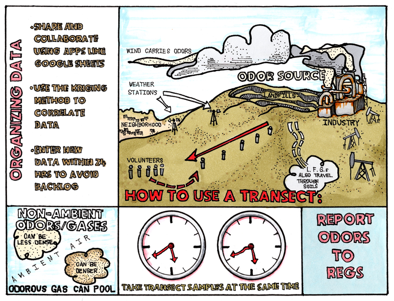
How to Use a Transect, illustrated by Sara Sage
This illustration by Sara Sage was featured in the centerfold in Public Lab's Community Science Forum, Issue 16.
Follow related tags:
blog transect graphic odor

Launching a Newcomers Welcome Call!
Over the past couple years Public Lab has hosted a weekly Open Call every Tuesday. We started this call with the intent to share an open line for anyone who wanted to physically talk with people at Public Lab (by phoning in or connecting through video conference).
Open Call has served as a place for people seeking to do many things from get acquainted with Public Lab, and exploring how to get started, to hosting those who are workshopping new ideas, launching new projects, and exploring partnership opportunities. It has served as a spot for people to talk about everything from nuanced local environmental issues to big scale changes across geopolitical landscapes. It has even been a meeting grounds for people who ideating on ways the Public Lab website itself could be improved. This one Tuesday call slot has done a lot!
All this being said, we're adding something new! Starting next week, Public Lab is launching a Newcomers Welcome Call. This call will be hosted every Tuesday in the 15 minutes leading up to Open Call, on the same call in line.
We aim for this call to be a space for anyone who is new to Public Lab to get acquainted, and explore pathways for getting started with the Public Lab community. While we will still hold broader topic conversations on the Open Call time, the Newcomers Welcome Call will serve as a launch spot for anyone looking to get their proverbial boots wet with Public Lab!
Follow related tags:
organizing blog getting-started organizer