About me
I am Sara, a second year Computer Science student. I got to know about open source this year and this is my first time contributing.
Affiliation: Ghulam Ishaq Khan institute of Engineering Sciences and Technology
Location: Pakistan
**contact : **+92 3339806096
**email: **sararasool2002@gmail.com
Project description
The Infragram project brings together a range of different efforts to make Do-It-Yourself plant health comparisons possible with infrared photography. Basically, users upload the image and can also use infragram webcam, infragram uses different techniques to help people analyze the image. The infragram UI design needs some improvements to make it more user friendly. Furthermore, it also lacks some features that can make the site look more organized.
Abstract/summary (<20 words):
Enhancing the UI design of Infragram, while keeping users good experience and needs in mind.
Problem
Front Page:
 **
**
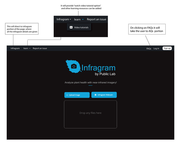
* I changed the color combination, in terms of focusing on visitors attention.
* I think logo text needs some adjustments so I rearranged texts to give it a better look.
* I think picture upload page should be separate from the editing page so I come up with this design. User can upload and drop file or use infragram web camera.
* On dropping and uploading picture, the new window will open.
* It will have a login and sign up option on the home page.
* On the Nav bar there are three options.
1. Learn
Its execution is explained in the picture above.
2. Report an issue
It will take the user to Infrgram github repository
3. Infragram
**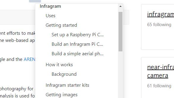
Infragram will have all these options so user can directly learn infragram from this page, so there will be no need to got to public lab page first
I designed this page as it will contain all the information about how to use infragram and about filters and math expression etc. On clicking the options it will display all the relevant details about that topic.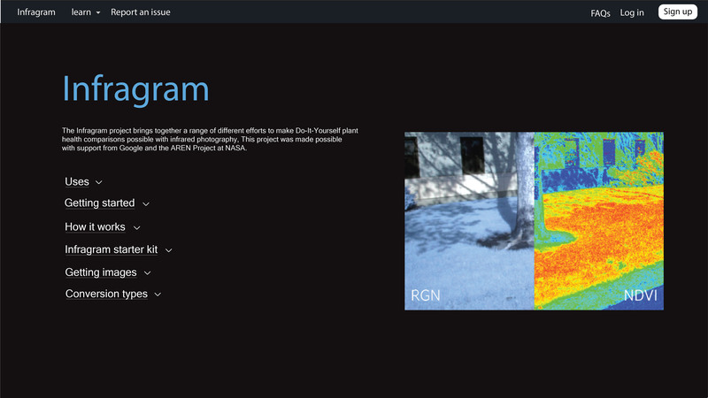
**4. **FAQs
**** I think Q& A section is very wide that it is difficult to scroll through the website as Q&A section comes in between. The FAQs in the Nav bar can directly take the user to this section. I think there should be a search option as it will be a lot easier for the user to filter through questions. I would also like to add the filter between "answered and answered" question but I haven't add it in the design. There is an expand option on the right side of question, it will show the answer and the likes and replies will be written under the answer .
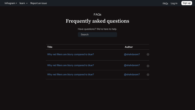
Ask question section will right below the Q/A section
Editing window:
This window will open once user upload an image or open webcam.
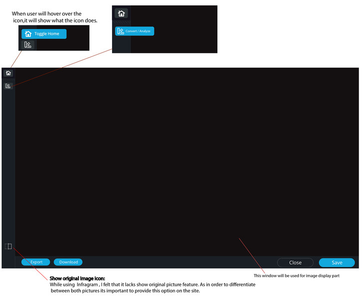
On clicking convert icon:
A small side window will expand and it will show functionalities the icon provide
1) Convert/ Analyze
I think the convert tool should be more specific on what the user should enter as input as it is a little confusing. While using infragram I was inputting digits in the start so I think users can also make the same mistake. For that I designed it this way, where user can get a menu of expression to choose expression and can also write their own expressions. Furthermore, we can add details of expressions little description but since I m not an expert in this so I left that portion empty. The image is attached below. The preset option will also be in the convert menu as it is also the part of conversion, but there will be no write your own expression option in it.
2) Colorize
I find colorize option a little intimidating as well, so I changed its style a little to make it more simple and easy to user.
3) Overlay
The current overlay tool is not well organized as the slide bar is very far so its confusing wether the slide bar is associated with overlay or not. I tried to give it a little simple yet understandable look.

Timeline/ milestones
| Week Task |
|---|
week 1 May 30 - June 5
|
| week 2 June 6 - June 12 note: I will not be able to work more in this week as I will have my exams in this week ( june 6 to june 12) other then that I am fully available and free through out the period. |
| week 3 June 13 - June 19 |
| week 4 June 20 - June 26 |
| week 5 June 27- July 3 |
| week 6 July 3- July 10 |
| week 7 July 3- July 10 |
| week 8 July 11- July 18 |
| week 9 July 19- July 26 |
| week 10 July 27- July August 4 |
| week 11 August 4- August 11 |
| week 12 August 11- August 17 week 13 August 17- August 25 |
Needs
I will need help from mentors where I get stuck. Especially while understanding the current codebase I might face challenges as its written by someone else.
First-time contribution
My first contribution: https://github.com/publiclab/plots2/pull/10843#issue-1181954050
You can use links like these to show recent activity:
- Open issues:
- https://github.com/publiclab/infragram/issues/385
- https://github.com/publiclab/infragram/issues/333#issue-1195623000
- https://github.com/publiclab/infragram/issues/299#issue-1188493130
Experience
I started my computer science journey 2 years ago; I learnt C++ during my first year in university and made several projects in C++. During my second year and I learnt HTML, CSS, Javascript and reactJS. I took software development course this semester in my university and I will be done with this course by May 30.
Teamwork
I have worked in team several times throughout my 2 years in university. Mostly my projects are group based, which includes both CS and non CS bases projects. I am a part of Microsoft Student Club; moreover, I was a part of ICPC management team and arranged codding competition in my university.
Passion
Firstly, I really appreciate the Public Lab mentors, the way they supported us through out was really welcoming. I also want to be a part of such organization so that I can welcome the new developers the same way. Also I see this opportunity as my way forward to opensource. I personally think though this opportunity I can learn a lot especially under constant guidance. I worked hard drafting my proposal and understanding Infragram; I want to gain experience by working with community.
Audience
I am from a village background and I have interacted so much with farmers and I know how much they get worried about their crops health etc. I didnt know that there is a software exists that can do this task. I would like to introduce more people to infragram so that they dont have to pay for this.
Commitment
I understand that this is a full-Time commitment. I have a semester break from 12 June to 1st October. I am fully available throughout the internship period.
2 Comments
Hi @sara_rx, thank you for your proposal! I really like the dark background choice -- it makes sense since we're working with light, right? :-)
The full-width fixed navbar and sidebar work really well, very minimal footprint and efficient use of space. Would the logo and all disappear once you drop an image in? Maybe it'll be helpful to make a mockup which includes the uploaded image, so we can see how it'd look. I wonder if the first step should be open already. Many of the tools could create a pop-up modal window too which could include more explanation and such, so I like how compact they are to start, but how flexible they could be once activated.
Have you looked through the Bootstrap library a bit? Do you think it'll take a lot of customization or that it could be themed to achieve the dark look you're going for?
Overall I appreciate the proposal, thank you very much!
Is this a question? Click here to post it to the Questions page.
hello! thank you so much for your feedback. Yes, I looked into Bootstrap library and this theme will require customization but we can achieve it using SASS to create utility API, then using SASS compiler extension we can compile sass file into CSS.
The "upload image and webcam section" will be a fixed landing page (home page). No logo and all will not disappear, I will add a sub page (nested sub page) for editor. I hope it makes sense, I'll edit my proposal for better understanding
Reply to this comment...
Log in to comment
Login to comment.