About me
I am Asma Butt, a Computer Science Student pursuing my bachelors degree from University of Engineering and Technology.I am a junior Mern Stack Developer have good knowledge of different technologies (Html,Css, Bootstrap,Reactjs,Nodejs,Expessjs and MongoDb).Im also interested in Ui/Ux ad graphic design work.I Love to explore new technologies and learning by implementation.In my free Time I love to do sketching and calligraphy.
GitHub: https://github.com/AsmaIbrahimButt
LinkedIn: https://www.linkedin.com/in/asma-butt-4063a31a6/
Location: Lahore, Pakistan
Time zone: UTC+05:00
Project Description:
The Infragram project brings together a range of different efforts to make Do-It-Yourself plant health comparisons possible with infrared photography. Infragram.org enables people with Infragram-modified cameras to upload photos for analysis and conversion using techniques like NDVI (used in satellite imaging analysis). It also allows for live streaming from a modified webcam. This project will overhaul the UI of Infragram to be full-screen and create space for new features like multiple resolutions of video, dragging in a recorded video instead of a still image for conversion, and pop up panels with Q&A, tips, tutorials, and more, so that they can feature more helpful guidance text.
Abstract/summary (<20 words):
Redesign the user interface of infragram to be full-screen and create a space for few new features like multiple resolutions of video, pop up panels with Q&A etc.
Problem
1.Header of the infragram is not disguisable from the toolbar and Alignment should be balanced.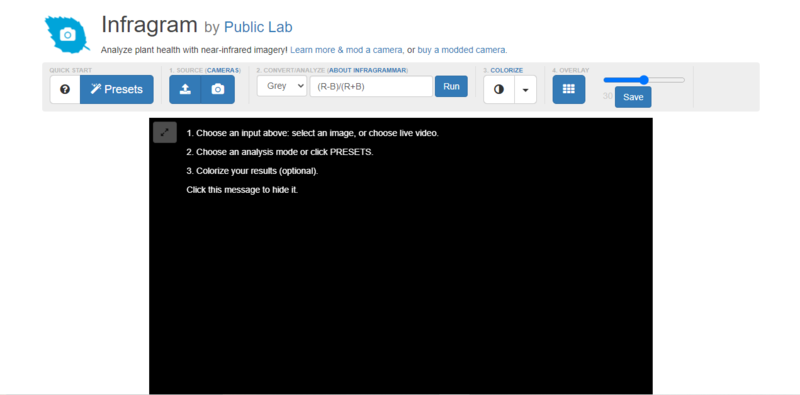
The user interface of the header section is difficult to distinguish from toolbar. In addition of these the alignment in the toolbar section is not equally balanced from left and right side that probably annoying for a user to proceed further. The spacing between each components is not equally divided. There is lack of color theme consistency .
Suggested Solution:
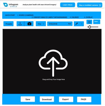
By improving the alignment among each components helps the user to easily proceed further. Make enough space between header and toolbar ,therefore, user can easily distinguishable it.
2. Cross Browser drag and drop functionality:
I will implement the cross browser drag and drop implementation using Javascript and jquery.
I will used the HTML first which consists of two HTML DIV controls "Source" and "Destination". To the Source DIV I have added some images which eventually will be dragged and dropped to the Destination DIV.
Code Snippet:
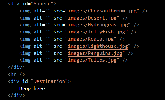
Drag and drop implementation using JavaScript &jQuery
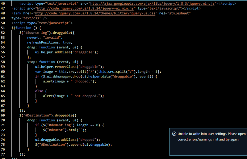
The very first thing I have done is inheritance of the jQuery and the jQuery UI CSS and JS files.Inside the jQuery document ready event handler, I have applied the Draggable plugin to all the images inside the Source DIV so they can be dragged and dropped.To the Destination DIV I have applied the Droppable plugin so that it can accept the dropped images. As soon as the images are dropped they are appended to the DIV.I have added JavaScript alert boxes to notify users when the images are dropped successfully and when it is not successful if the images are dropped outside the Destination DIV.
Code snippet:
3. Rebuild the question answer section that can work as help menu.
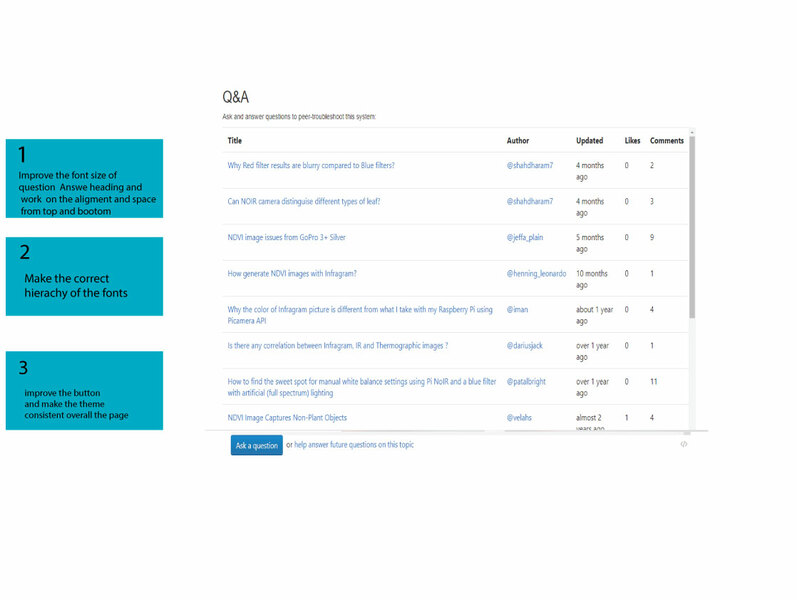
4. To make responsive each section responsive I will used the bootstrap grid system therefore, It will responsive for each devices.
Timeline/milestone
Week 1( May 30- Jun 4)
- Learn about the existing user interface of infragram properly
- Communicate with the mentors
- Make sure to understand the complete workflow of interface
- Understand the end goals
- Identify and clarify the all requirements using the methodology of various use cases
Week 2 (Jun 5- Jun 11)
Make low fidelity wireframes of infrgram
* Getting solicit feedback from the community
* Note down the pain points after getting feedback from the user
* Ideate the solutions for the problems that user face
Week 3 (July 12- Jun18)
* Consider the feedback of the users or the community and make the wireframe improve
* Add a cross browser drag-and-drop on the entire page instead of just selecting an image
* Improve the useability
Week 4 (Jun 19- Jun 25)
* Move Q&A feature into a Help menu
* Make the help system design consistent so that user can easily identify between help and simple flow of website.
* Design a complete help system on the other page so that user cannot distract.
Week 5 (Jun 26- Jul 2)
* Add a popup "Welcome" modal box which guides your first few steps based on tutorial at https://publiclab.org/n/15075 and more at https://publiclab.org/infragram#Activities
* Make effective popup so that user can proceed further easily
* Add Content in the popup relevant to the user intensions
* Make the mockups using icons,colors,fonts,and text
* Prototype the high fidelity wireframes
Week 6 (Jul 3-Jul 9)
* Try creating a working "mockup" interface with Bootstrap elements (that is not hooked up to JS yet)
* Make the responsive for all devices
* Negotiating with community and the mentors
Week 7 (Jul 10-Jul 16)
* Iterate the mockups
* Getting user feedback and again iterate the design
* Consider the user reviews and try to implement those features in the user interface using bootstrap4
Week 8 (Jul 17- Jul 23)
* Enhance the useability by designing the features that leads to the user to its end goal easily
* Communicate with the mentors for guidance
* Make sure the user interface of the infragram display perfectly for all devices
Week 9 (Jul 24- Jul 30)
* Communicate with the Google summer of Code Intern
* Implement the new interface in HTML/JS( cooperation with possible Google Summer of Code intern on corresponding project)
* Begin with an "index2.html" next to the original index.html
Week 10 (Jul 31- Aug 6)
* Discussing the issues with the Google summer of Code intern and with the mentors
* Resolve the issues while implementing the new interface in Html/css
Week 11 (Aug 7- Aug 13)
* Integrate the all features functionality
* Ensure each feature/function still works
* Resolving the errors or issue with the help of mentors
Week 12 (Aug 14- Aug 23)
* Make sure the structure of the files and folder be understandable
* Checking the all files indentation
* Make sure the code should be clean
Week 13 (Aug 24- Aug 30)
* Stretch goal: design a new colorize popup modal window to describe each colormap and offer thumbnails (could use https://sequencer.publiclab.org to achieve this)
****Need:
Guidance from mentors and communication with the community members related to the project issues.
First-time contribution
- Open issues: https://github.com/publiclab/plots2/issues/10985
- Closed PRs: https://github.com/publiclab/plots2/pull/10992#pullrequestreview-937312355
- https://github.com/publiclab/plots2/issues/11025
Experience
I have working knowledge of all major programming languages including HTML, CSS, Bootstrap, JavaScript, Json, jQuery, AJAX, React, and Nodejs on MongoDb. Recently, I did my internship on reactjs at LGM. I am a creative and enthusiastic developer who is always eager to learn something new related to technology. I focus on the implementation of a variety of software solutions in addition to developing, modifying, and maintaining existing software.
I have developed the To Do app using reactjs
https://github.com/AsmaIbrahimButt/Task1-LGMVIP-WEB-.git
I have also design a grocery shop static template using Html,Css and bootstrap.
Teamwork
Im used to do Pair programming during my four years at university, I worked on semester term projects with allocated groups. We worked on a School Management Website, and I was in charge of designing the front-end and implementing using Html and bootstrap. Consistent communication between my teammates and me was critical to the project's success.
Passion
Public Lab is a community where one can learn how to investigate environmental concerns using DIY techniques amongst other effective solutions, for me its a great opportunity to pursue my passion of designing by redesigning the user interface of infragram.
Audience
This work is for the Public Lab open network made up of community organizers, educators, technologists, researchers working to create spam management issue to make sure that details are actually true and confirmed, and open source contributors like myself trying to make the world a better place in our own way one code at a time
Commitment
Do you understand this is a serious commitment, equivalent to a full-time summer job? Tell us how you'll structure your schedule from day to day!
Yes, I understand. I will commit my full time in this project and can spend at least 40 hours per week. I have great passion in coding and designing. I am willing to pay my efforts in making the user interface more easy to useable for the users.

6 Comments
Hi @asmaibrahim657, I really love the amount of research you've done. I have a question about the Q&A section. I love your redesign of that section but do you think it distracts the user away from Infragram's functionality? Do you think it'd be better if we converted that section to a help menu?
Also, it's better to break each week's task into smaller pieces so that it's more manageable. Thanks!!
Is this a question? Click here to post it to the Questions page.
Thanks @mathildaudufo for review. Yeah ,I understand and updated proposal .
Reply to this comment...
Log in to comment
@asmaibrahim657 Can you also discuss how you plan to implement the cross-browser drag and drop functionality? The library you plan to use or code snippets would also be helpful. Thanks!
Is this a question? Click here to post it to the Questions page.
Reply to this comment...
Log in to comment
@mathildaudufo @warren @cess I have made a draft of my proposal and would appreciate your reviews of it. I look forward to your review. Thank you.
Reply to this comment...
Log in to comment
Hello @asmaibrahim657, thank you for your proposal! I'll leave a few comments and points of feedback here!
I like the thought you're putting into the Q&A section but wanted to warn you that the Q&A is produced using an iFrame containing this URL: https://publiclab.org/embed/grid/question:infragram
and so therefore our ability to change the design or layout of that page is quite limited. The page is generated in this repository: https://github.com/publiclab/plots2/ and while we could initiate a change over there, the Q&A feature is also used in other places, like here: https://jywarren.github.io/fisheyegl/example/ and so any changes we propose will have to work on other sites as well. That's OK - we can still, for example, put the iFrame in a popup modal window, or a sidebar, or other options, but it is not completely customizable.
As to your mockup, i really like some of the ideas you're showing, like putting the Q&A at bottom, like having a drag and drop symbol in the middle. Have you thought about which Bootstrap elements you'l be using for each section, and how they'll adapt to different screen sizes? https://getbootstrap.com/docs/4.6/
Thank you!
Is this a question? Click here to post it to the Questions page.
Thanku @warren for your feedback .I will update my proposal.
Reply to this comment...
Log in to comment
Login to comment.