Lead image courtesy of Nathan Woodrow CC BY 2.0
Do you have data you want to display on a map? Is this data associated with a location (for example, organized by county, city, or country) but you don’t have exact coordinates? Check out the activity below to easily get your data on the map!
Purpose
This activity introduces some basic functionality of the open-source GIS software QGIS. If you’re new to GIS, check out this QGIS Introduction document from Duke University’s library for more info and common procedures in GIS software.
This activity shares step-by-step instructions to visualize your location-based data using a process called a “table join”. This process adds your own data to an existing GIS file that has coordinates and visualizes it all on a map. This activity will bring your data to life and illustrate spatial trends that may go unseen in a spreadsheet.
Materials Needed
This activity uses the open-source GIS software QGIS which can be downloaded for free here by Windows, Mac, Linux, BSD, & Android users.
Can this activity work for my data?
The steps below work for the following situation:
- Your data is in a spreadsheet format (.csv, comma separated values)
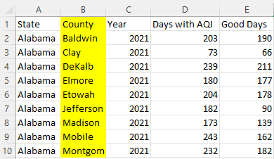
- Each data point has a unique location that is recorded in its own column within the spreadsheet (see highlighted portion of spreadsheet below)
- For example, this activity uses air quality data for the United States organized by county. Although data was originally recorded at monitor sites, these point-based measurements have been generalized to give an idea of the air quality for the entire county each monitor is in. This dataset from the EPA is called “Annual AQI By County 2021” and can be found under “Annual Summary Data” here.

- Each data point’s location corresponds to a well-known “geographical entity”, such as census blocks, cities, counties, countries, etc.
- Note: If your data doesn’t align perfectly with an established geographical entity, consider generalizing your data to such an entity. For example, if you have soil contamination data from houses across your city, you can generalize each point to its city block.
Step 1: Open & explore QGIS
1. Top menu bar: lots of useful buttons that can be learned as needed
- Some immediately useful buttons are: Save
 , zoom in & out
  , and New Project
2. Left: catalog
- Browser--- local computer files
- Layers--- data layers actually on your map; rearrange what layer is on top/bottom by dragging up or down
3. Bottom: coordinates of your cursor, scale, projection 
- When you first open QGIS, the coordinates and scale will be blank since there is no basemap.
- To see these features work, add the OpenStreetMaps layer that comes with QGIS.
- In the catalog, find the OpenStreetMaps layer and double click to add it to your map

- Now, move your cursor across the map and zoom in and out to see the coordinates and scale change

- In the catalog, find the OpenStreetMaps layer and double click to add it to your map
4. Right: Layer Styling
- This tab will become very useful once you have data layers on your map.
- You can change what data your map displays, how the data is visualized, and tinker with countless styling options
Step 2: Add your data
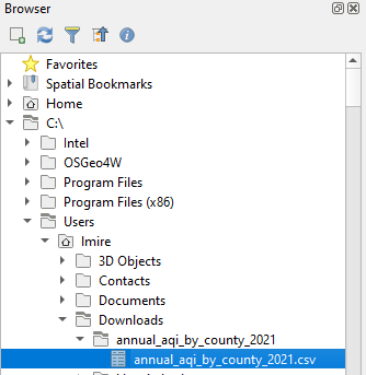
1. Browser > C:/> find your file
- My file is named “annual_aqi_by_county_2021.csv” and has the following file path

2. Double click your file to add it to your map
- Your dataset should appear in the Layers tab and look something like this

Because your data is just a .csv file, nothing new will appear on the map. The  icon indicates this is just a table, NOT a true “layer” as it has no spatial component to tie it to the map
3. Examine your data file in QGIS
- Right click file in Layers > Open Attribute Table
- In GIS, columns in an attribute table are called “fields” and rows hold “features”, each an individual spatial entity (such as a point, line, or polygon).
- Find a field (or column) that holds a unique geographical location for each feature.
- My data is organized by county, so the “County” field holds the name of the county within the US within which the data point was collected.
- Note: It is important that this field is unique for each feature. In other words, there is only one entry for each county.
Step 3: Find a GIS file of the same geographical entity as your data
1. Shapefiles (.shp) are a very common vector spatial data format. A shapefile is actually a cluster of files, so don’t forget to “unzip” your shapefile after downloading.
- Note: When searching for GIS data, it’s a great rule of thumb to add “shapefile” to the end of your search and look for the file type .shp
2. For the US, the Census Bureau has a set of GIS data called “TIGER/Line Shapefiles” with lots of different options
- Here are a few shapefiles from the TIGER/Line set that may be useful: US Counties, Census Tracts by State, US ZIP Codes, US States and Equivalencies
Step 4: Add your new shapefile to your map
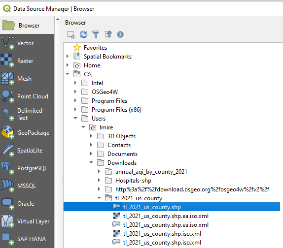
1. Go to Layer (top menu bar) > Add Layer > Add Vector Layer > Browser

Find your shapefile (.shp) and double click ->
 <-
<-If your new shapefile isn’t showing up, hit the refresh button

2. Examine the shapefile
- You should now have a new layer visible on the map. Mine looks like this
->
 <-
<-
Note: Now that we have something on the map, you can remove the OpenStreetMaps layer by right clicking on it in the Layers tab and clicking “Remove Layer…” and OK
- In the Layers tab on the left, right click your file > Open Attribute Table
- Examine your shapefile and find the field (or column) that holds the same geographic entities as your original dataset
- Note: This field does not have to have the same name in both Attribute Tables. For example, in the US Counties shapefile, the field “NAME” holds the name of each county. This field matches the “County” field from my original dataset
->
 <-
<-
- Note: This field does not have to have the same name in both Attribute Tables. For example, in the US Counties shapefile, the field “NAME” holds the name of each county. This field matches the “County” field from my original dataset
->
Step 5: Join your dataset to a shapefile by a matching unique identifier in a "table join"
1. In GIS software, a “table join” is the process of appending the fields of one table to those of another through an attribute or field common to both tables”
2. Right click on your shapefile in the Layers tab > Properties > Joins > Add new join 
3. Choose your dataset from the dropdown menu as the “Join layer”
4. Select your matching fields. The “Join field” will be from your dataset and the “Target field” will be from the shapefile.

5. Click OK > Apply > OK and then you can close out of the Layers Properties window
Step 6: Verify your table join worked
1. Open your shapefile attribute table. You should now have all the fields from your original dataset attribute table present in your shapefile (they will all have the name of your dataset table preceding the original field name).

Step 7: Display your data on the map
1. Now that your data is joined to a shapefile, it can appear on the map!
2. You can display your data in the Layer Styling tab on the right.
- Change “Single Symbol” to “Categorized”
- From the “Value” dropdown menu, choose what data (or what field) you want to visualize on the map
- Select your color ramp & click “Classify” at the bottom of the tab
->
Tinker around with the styling options to get an idea of all the different ways to display your data! Different styling options can help highlight different pieces of your data and show trends you haven’t seen before.<-
3. You should now see your data on the map! Mine looks like this

Optional: Make a layout
1. If or when you decide you want to share or save your mapped data, you can create a Layout and save it as an image file. This is like taking a screenshot of your map and fixing it up so that others can see.
- Find more info on map layouts here
2. On the top menu bar, go to Project > New Print Layout > Name your layout
3. Add Item>Add map 
- Click your cursor on the corner of the layout and drag diagonally down until your map is your desired size.
4. There are a few things every map should have:
- Add a Legend

- Add a Scale Bar

- Add North Arrow

- Add a Title

5. When you’re happy with your map, export it as an image file
- In the top menu bar of the Layout window, find Layout > Export As Image
Wrap Up
Congratulations! You’ve now put your data on the map and successfully navigated GIS software! There are countless ways to visualize your data and display it on a map layout---check out the resources below to keep tinkering and keep learning. Have other GIS and QGIS tutorials, tips, or questions? Join the conversation by commenting below :)
Resources
Where to get data:
General GIS & QGIS resources:
- The Open Source Geospatial Foundation: https://www.osgeo.org/resources/
- EPA’s EJScreen tool: https://ejscreen.epa.gov/mapper/
- QGIS 3 for Absolute Beginners

1 Comments
@bhamster awards a barnstar to laurel_mire for their awesome contribution!
Reply to this comment...
Log in to comment
Login to comment.