About me
Name: Tilda Udufo
Github: https://github.com/TildaDares
Email: mathildaudufo@gmail.com
Timezone: GMT + 1
Location: Nigeria
Project description
Due to the growing community of educators using PublicLab.org content management system, the project aims to tackle a collection of systems, features, and fixes focused on educational users, and incorporating feedback from a community of educators. This project will include changes and fixes to the draft saving system, co-authorship model, and changes to username autocompletion scripts, all culminating in a smoother and more coherent system for educators across the US gulf coast who are working with students on environmental justice topics.
Abstract/summary (<20 words):
Improvement of educational-related usability with functionalities that make it easy for educators to share knowledge to their students and pursue environmental justice.
Problem
- Separate author names with commas instead of 'with'. Replacing 'with' with a comma in
show.html.erb will solve this. This could be a FTO issue for first-time contributors to work on.

 2. Add listing of draft posts to user profile pages. The fix would be to create a method in tag.rb that runs a where query on the Node table to select only nodes with a type of 'note' and a status of 3. I'll write a unit test to check if
 Tag.find_drafts returns all of the profile_user's drafts.


The link to the drafts page would be displayed among the user's activity ( research notes, wiki edits e.t.c). This location is perfect because it is easy to keep track of the number of drafts, it is easily accessible to the profile_user and it conforms with the style guide. The drafts would only be displayed if the current_user is the profile_user.
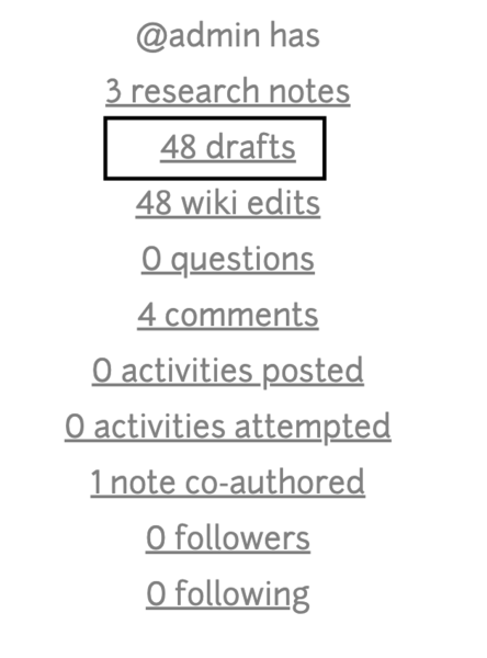
I'll be using the font-awesome edit icon for the drafts page because it visually explains that this post is editable. The ellipsis menu will have a publish button so that users can publish their posts from the drafts page.

The present draft-post page looks like this:
 I do not think a draft post should have a comment section. Users should not be able to post comments until the draft has been published. Another issue is that if the warning alert message is cancelled/closed, users can no longer publish their drafts because that is the only place the
 publish button can be found.
Implementing all these changes would result in this:

This way users will always be able to publish their notes even when the alert is closed and placing the publish button in the same location as the title of the post makes it easy for users to find.
3. Add Bootstrap tooltips explaining latitude/longitude tags. The fix would be to add a method in tag.rb that checks if a tag is a location tag. I also added a delay of 500ms to give users enough time to click the location privacy link. I'll write a unit test for the is_a_location_tag? method.


4. Refine the display of co-authored posts on profile pages. To be honest I was a little undecided on what approach to take for this project task. Changing the co-authorship model would involve lots of changes since research notes, questions and wikis all have the co-authorship functionality. But I finally came up with a solution that would not involve too many changes:
```
coauthored_tag = "with:" + name.downcase
Node.where('node.uid = ? OR term_data.name = ? OR term_data.parent = ?', uid, coauthored_tag.to_s, coauthored_tag.to_s).order('created DESC')
```
This would allow co-authored posts to be displayed and counted as regular posts on a co-author's profile page.
5. Include high-relevance usernames in autocompletion results while typing into comment boxes. I'll be using https://guides.rubyonrails.org/caching_with_rails.html and https://github.com/ichord/At.js/wiki as documentation.

6. Refine design and details of newly relaunched dashboard with community input. The newly relaunched dashboard is amazing but there are a couple of improvements I think should be made if the community agrees.
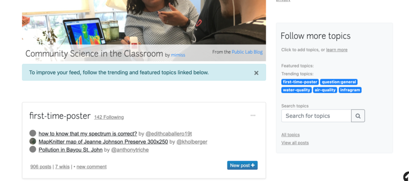
a) Follow more Topics card:

There's too much space between the card-header and the card-body. I think the
paddingon the card-body can be reduced so that it looks compact.I think using a different background colour for this card makes the site look more narrative. Users are able to differentiate between the main content and an aside. A different but non-distracting colour can be used for this.
The card-header and card-body are not aligned. Removing padding from the card-body would fix this.
The
Follow more Topicscard should also be made non-collapsible on desktop screens. The whole point of the collapsible card was to make it mobile responsive so since desktop screens have a larger width and more space the collapsible button is no longer serving it's purpose.Click to add topics, or learn morelink: When a user looks at the first text in the card-body 'Click to add topics, or learn more', they might be a little confused. What are they supposed to click on? What if they are using a mobile phone and they cannot click? Where does the learn more link lead to? Using a more descriptive link will provide users with the proper context of where clicking the link will take them. The learn more link also leads nowhere. I'd suggest a fix but I have no idea what that line is supposed to do or mean so I'll just leave that for now and discuss that later with the community.
This is what the Follow more topics card would look like with all of these changes applied (except for the last point).
b) Add your location button:

The Add your Location button looks out of place because it is not aligned with the featured blog post on the dashboard. This can be fixed by adding a margin-top to the button. So it looks like this:

c) Click to start following link:

The text is very small. Users will find it hard to see this at the bottom of the page.
Screen readers announce only the text within the hyperlink, so using vague or non-descriptive links like ‘following’ creates a barrier that does not allow visually impaired users to use the site. Web Accessiblity in Mind (WebAIM) has written guidelines on hyperlink text. Furthermore, a lot of users make use of their mobile phones to access the web so using 'click' makes the user focus on their mouse instead of the interface and implies that other modes of website navigation are not supported. I think using 'Follow more topics that interest you' is more action-oriented and provides information when read out of context. Also, I think the underscores before and after the text were meant to be horizontal lines with the text in the middle.
d) Topic Cards:

- Hovering on the
New postbutton changes the text colour to a dark colour making it hard for the text to be seen.

The solution would be to change the background colour instead of the text colour on hover.
- There's a lot of space between each topic card
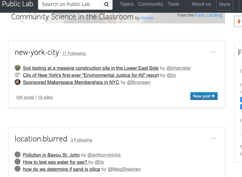
Reducing the padding-top for each topic card will fix this.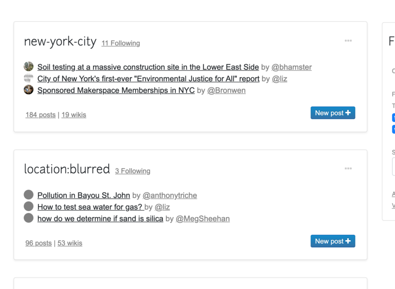
- Number of topic followings: Each topic card displays the number of users/people following that topic as a link. This link is misleading because a user will probably tap/click on that link with the aim of viewing the users following that topic when in fact the link leads to the url of the topic. This can be fixed by changing the url to https://publiclab.org/contributors/tagname so that when users tap/click on the number of followings it shows them the people following the topic.

e) Share your work button: I do not know why this button was removed but I think it should be brought back. On the new dashboard, the only way a user can create a post is when they click on the new post button on the topic cards. But what if the user is not following any topic, how do they create a new post? This is the reason why I think the Share your work button should be in the new dashboard. This way users can create a new post right from their dashboard without stressing themselves looking for that button. The Share your work button would be added under the Follow more Topics card. This way the button does not disrupt the flow of the page.

Another thing I'd like the community to consider is placing the share your work button in the profile picture's dropdown menu. Placing this button there ensures that the user can create a post from any page on the website. This will improve the UX of PublicLab.org.

f) The featured Public Lab blog post has an alignment issue. Adding a margin-top to the 'From Public Lab blog' will fix this.

7. Moving the new v2 Dashboard redesign to be the default Dashboard, and moving the legacy dashboard to /v2/dashboard. This task is divided into four:
- Renaming all routes from v2/dashboard to dashboard
- Rename the folder views/dashboard_v2 to dashboard
- Rename the dashboard_v2 action in the home_controller to dashboard
- Rename all references to dashboard_v2 or v2/dashboard in the tests folder files to dashboard and dashboard
Each one of these tasks would make good FTOs
8. Continued CSS/style refinements to the new beta print templates. There are a few minor issues I think need to be fixed.
- Headings and paragraphs should be aligned
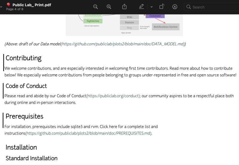
- Color of links needs to be more pronounced so that users/readers are able to tell the difference between an ordinary text and a link. A deeper shade of blue will work.

- It would also look nice if the
🎈 Public Lab: Printat the top of the page was centred.

9. Add table of contents under an icon for wiki/markdown pages. I'll be using tocbot library for this task. The library requires each heading to have an id. So I followed @warren suggestion and used a css selector to fetch all the headings and add unique ids before running the table of contents code. The documentation is very easy to understand and the usage is even easier. The only thing I had to do was run yarn add tocbot and then add this line import * as tocbot from 'tocbot' to application.js

The menu will include headings and subheadings. This is not the final look of the menu, a few stylings can still be added. I think a fixed menu should also be considered so that the user does not have to scroll all the way up to access the menu.

10. Accessibility: Making all of these features/fixes accessible for everyone is a very important part of this project.
Timeline/milestones

Needs
Availability of mentors to give feedback on PRs, answer questions and clear confusions.
First-time contribution
First Time Contribution: https://github.com/publiclab/plots2/pull/9387
FTOs I opened: https://github.com/publiclab/plots2/issues?q=is%3Aissue+author%3ATildaDares+label%3Afirst-timers-only
PRs: https://github.com/publiclab/plots2/pulls?q=is%3Apr+author%3ATildaDares
https://github.com/publiclab/PublicLab.Editor/pull/710
Recent Activity: https://github.com/search?p=2&q=commenter%3ATildaDares+org%3Apubliclab&type=Issues
Experience
I started learning Ruby on Rails last year during the pandemic. During this time I gave all my attention and time to sharpening my web development skills and since then I have developed a number of projects with HTML, CSS, Javascript, React, Bootstrap, Ruby and Ruby on Rails.
One of the projects I worked on is a Facebook clone. I learnt a lot from this project but most importantly I learnt how to write better code. The project was larger than most of my other projects, so clean code was essential.
Github Repo: https://github.com/TildaDares/odin-facebook
Live: https://sheltered-lowlands-27506.herokuapp.com/
I also made a flight booker app where users can search and book flights (not real flights). I learnt how to dynamically generate dropdown lists and how to seed databases. I used HTML, CSS, Bootstrap and Ruby on Rails to develop this app.
Github repo: https://github.com/TildaDares/odin-flight-booker
Live: https://evening-ravine-67117.herokuapp.com
Teamwork
During my two years in school studying for an Advanced Diploma in Software Engineering I worked with assigned groups on school projects. We worked on a Furniture Website where I was tasked with developing the front-end of the site. Consistent communication between my team mates and I was an essential part of the success of the project.
We also had to work on a Baby Store android app in which I prepared the documentation of the project.
Passion
Ever since I can remember I've been surrounded by trees and animals (poultry). Most times when I'm returning from school, there would always be someone seated under the shade of our tree at the entrance of the house. Everyone was always drawn to our compound because of the trees, it gave them some kind of comfort, peace and protection. The birds we reared in a free range system, showed me the importance of having a clean environment as easy access to clean water and provision of healthy food at specific times of the day ensured the survival of the birds, especially the chicks. They also add beauty and watching them go about their daily activities is intriguing. I am very passionate about my environment and helping to save it is more than just an internship, it's purpose.
My development in coding grew because I had free access to classes, videos and the likes on the internet. If these were limited to only a specific class of people, then my software development would have been stunted and I believe this experience applies to other people also. So, open science or environmental justice? I am passionate about both.
Audience
I live in Lagos which is one of the most polluted cities in Africa, I also hail from Delta state where oil spillage has greatly limited farming and fishing activities of the residents, so I know how important education about the environment is. Public Lab is a community filled with people who genuinely care about their environment and are making significant contributions to help the environment. I love Lagos and empathise with Deltans and the fact that I'm working on a project that makes it easier for students and researchers in Nigeria and all over the world have access to information about their environment and techniques and technologies to make it better makes the future seem brighter. So this project is for everyone who is trying to save their environment by sharing their knowledge.
Commitment
My schedule is completely free so I'll always be available. I'll be working for 40 – 45 hours from Mon-Fri.

9 Comments
@warren @ruthnwaiganjo @cess Your reviews will be highly appreciated
Reply to this comment...
Log in to comment
Hello @mathildaudufo and thank you so much for your proposal! I'm excited to go through it tomorrow morning and offer some feedback. Thanks!
Reply to this comment...
Log in to comment
Hi! Love this proposal and I appreciate how you've thought through different solutions.
The drafts tab is super interesting. I guess it would show drafts only for that topic area (i.e. tag)? That is, do i understand right that only drafts for
water-qualitywould appear on https://publiclab.org/tag/water-quality?I wonder if that might make it hard to find drafts if a) they don't have tags yet, or b) you may have drafts in different topics, and need to hunt around to find them? What if, alternatively, we made a drafts nav item on https://publiclab.org/notes -
But if you imagined the tab on another page, like the page listing a person's notes, like https://publiclab.org/notes/author/cess/ (note this currently has the wrong template), maybe it could work. I do think we need a button leading to drafts from the dashboard though! How might that look?
Actually i think we can leave it the same as it is, as one purpose for comments in drafts if if you share the "secret" draft link with someone for feedback, they can leave comments on drafts to help the author out. Good to bear in mind!
Is this a question? Click here to post it to the Questions page.
@warren Yes the author page https://publiclab.org/notes/author/cess/https://publiclab.org/notes/author/cess/ was where I imagined the drafts tab. And if a drafts button is to be placed on the dashboard I think it would be best to place it in the dropdown menu for the profile picture. Placing the drafts button on the dashboard page itself would look out of place because a button leading to the drafts should be found where you can find a user's notes. That way everything has its own place.
You are totally right about the comments section.
Reply to this comment...
Log in to comment
I love the careful design tweaks and refinements you're proposing for the dashboard! I do think we should get input or approval for some of them, but overall your work on this looks excellent. Alignment, text size, padding, all that looks great and we should definitely do it.
In this part your code looks super. Great work!
Reply to this comment...
Log in to comment
Here, i like the idea. I worry that the topic title itself doesn't look clickable and we do want MOST traffic going to the lead tag/topic page of /tag/TAGNAME, so i'm interested to hear ideas on how to ensure that is the primary destination from this whole card. Does an underline on the title look bad? Another idea? Thanks!
Here, i hear you -- and appreciate the thoughts. The big advantage to pushing people to post /into/ a topic is that you can skip explaining what tags are. The "Share your work" button is just posting without a topic, so it's something we may want to try to think of another way around.
We already try to recognize when there aren't many topics being followed and encourage people to follow more. Is there some way we can either show people that you have to follow more to take part in discussions (including posting) or to... offer a chance to post but ask them to find a topic to post into? I'm not sure. But that was the reasoning behind moving all posting into specific topics rather than providing a high-visibility button that posts into no topic. We really want people to be thinking in terms of topic groups!
Thanks for all your thought on this!!!
Is this a question? Click here to post it to the Questions page.
Presently the topic/tag blends with the rest of the body and the only thing that makes it stand out is the font size. Using an underline on the topic would make the line usage excessive. I think using Junction Bold for the topic will immediately call the attention of the user as soon as they see the page.
You are right about making people think in terms of topic groups but I think the help text at the bottom of the input field for tags already explains to the user why they need to add topics. Also if the Share your work is to be removed I think adding a link to https://publiclab.org/tags on the dashboard will give users more options as to which tag/topic they would like to make a new post with so that they are not limited to only the topics they follow.
Reply to this comment...
Log in to comment
Hi @mathildaudufo, thanks for posting your proposal. I love the detailed research that you have done. I hope you plan on submitting this on the Outreachy Website for your final proposal on Monday before 4 pm UTC.
Other things you could think about is other kinds of tests you could write. I have seen you mention unit tests, you could also mention if you will write system or feature tests. Also, you could think about how your work affects accessibility.
All the best and thank you!
Thank you @ruthnwaiganjo for your feedback. I'll make the necessary adjustments
Reply to this comment...
Log in to comment
Login to comment.