Homepage and logging in:
- I love being able to see everyone else’s projects listed below
- This is a minor issue but when I originally tried to log on, I used my publiclab username ‘molangmuir10’ – because it says ‘username’. This didn’t work and I had to type in my email to login. Could change the ‘username’ to ‘email’ or ‘account email’ or ‘public lab email’
- Jeff’s tutorial video on the homepage is great. Really helpful to visualise exactly what you’ll be doing
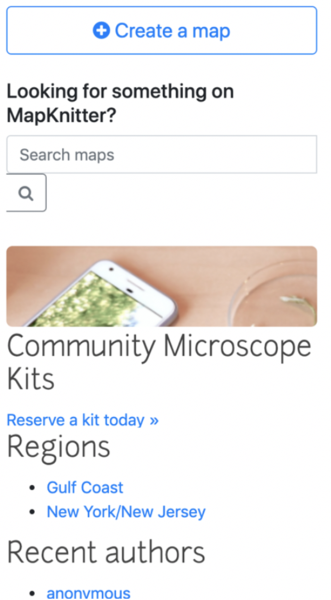
- More space between the ‘Community Microscope Kits Reserve a kit today’ and ‘Regions’
- Why is Community Microscope kits listed here?
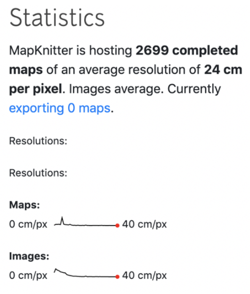
- I like that you can see the number of maps! Especially if this changes in real time.
- Why is ‘resolutions’ listed twice?
Creating a map:
- I found the initial stages very simple; entering the project name, entering the location and long and lat coming up.
- I like how the map zooms to your location as you enter the text. Straightforward, simple and clear.
Uploading images:
Straightforward
You should be able to delete an image and re-‘place’ the same image without having to re-upload it. There is only an option to download rather than ‘place’ them.

- Also it would be great to be able to clear these images once you’ve used them as it can get quite crowded when you’ve uploaded a few.
Placing images to the map:
- Adjusting photo size: You should definitely be able to change the size of the image after the first placing/tool toggling – I couldn’t work out how to do this. It’s very frustrating if you have got the image size slightly off in the first place.
Toolbar: - There should be an undo tool button! - It would be great to get the transparency tool to work on a range – going from opaque to increasingly more transparent
Keymappings:
- The keymappings window is quite obstructive and I couldn’t work out how to get rid of it
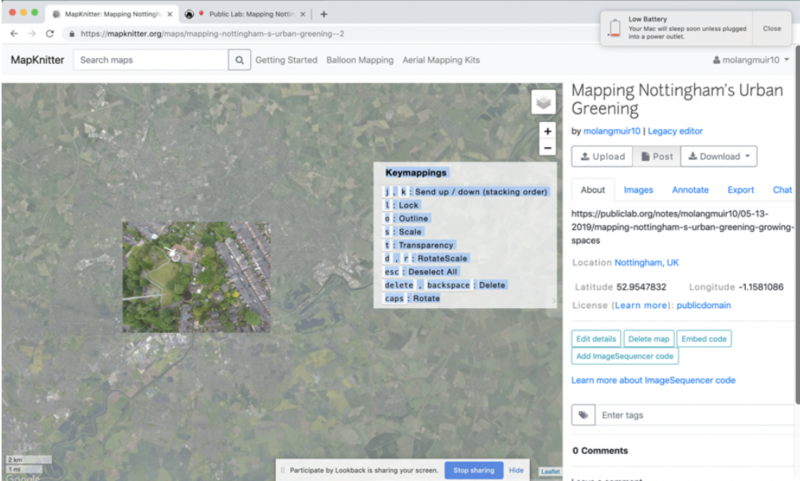 - Pressing the letters on the keymappings toolbar (jk/o/s/t/dr) did nothing – (I have a macbook). But pressing the other commands on the toolbar (esc/delete/backspace/caps) did work.
- ‘delete, backspace’: could it say “delete photo/image” just to clarify it’s not the map you’re deleting
2nd image upload:
‘Keymappings’:
2nd time I logged in to use mapknitter, the ‘keymappings’ didn’t come up initially.
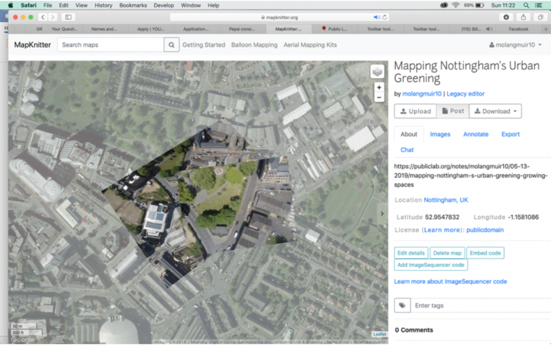 And then it came up twice
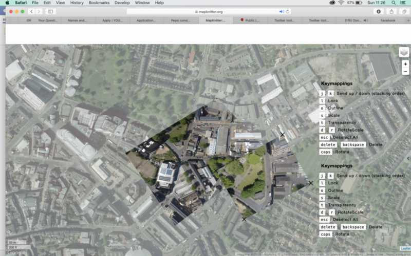
- It would be good if there was a button for ‘keymappings’ – you click and it brings up the window. Then you can close again when its obstructing the map view.
Altering the image size and scale:
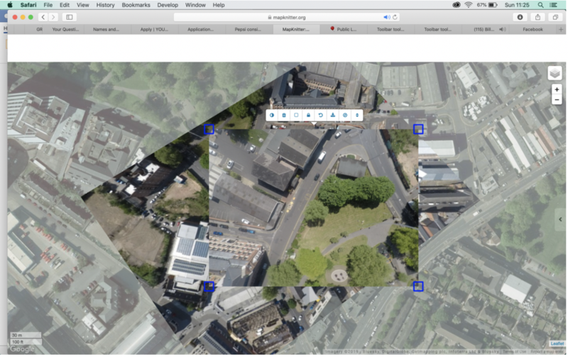
The second image I uploaded I couldn’t change the size of the image at all – it came up with the blue squares in the corner rather than the black ‘x’s. Then I couldn’t find a way to change the size. I closed the app and reopened. I re-uploaded the image and the same thing happened – I can’t figure out how to alter the size!
Initially it was black ‘x’s and I dragged them bigger or smaller after first placing the image. How do I get back to that?
General comments:
I really like being able to switch to the street map view!
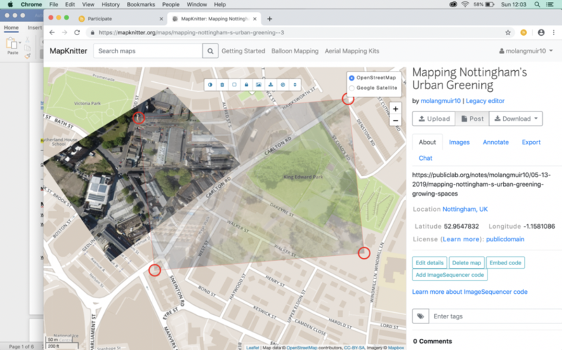
Just a small thing though – ‘OpenStreetMap’ has no spacing and ‘Google Satellite’ does – would be nice if they both had the same spacing.
Once you have made a map it would be great for it to have a link directly from your profile homepage. e.g. After logging in to mapknitter, a ‘My maps’ button links you to the maps you’ve made.
Recent toolbar tool updates by @sashadev-sky:
https://github.com/publiclab/Leaflet.DistortableImage/pull/255#issuecomment-498781215
• GREAT that the keymappings order has been re-arranged to match toolbar order
• ‘toggle image transparency’ and ‘toggle image outline’ – makes sense to have these tools next to eachother
• Delete on the end in red is much better – makes more sense to have delete on the end
• “Fixed _toggleOutline method: fixed bug where we were also toggling image opacity here not just the outline opacity” I was going to comment on this bug in my evaluation above – great that it’s already been done!
Overall the toolbar changes are much improved! - I did think it would be useful to have an undo button on this toolbar
The things I’ve suggested may already exist – but if they do then they aren’t obvious/simple for a new mapknitter user like me!
Have you tried using mapknitter? I’d love to know your experiences in the comments below!

5 Comments
@stevie awards a barnstar to molangmuir10 for their awesome contribution!
Reply to this comment...
Log in to comment
Thank you so much for this, @molangmuir10! This level of detail is SUPER helpful. @stefannibrasil @kaustubh_nair @alaxallves @cess @rexagod @sashadev-sky
Reply to this comment...
Log in to comment
@silentsairam awards a barnstar to molangmuir10 for their awesome contribution!
Reply to this comment...
Log in to comment
@molangmuir10 this is great thank you! I will make sure to try get all of this addressed. I have already started with a PR for this point :)
1) More space between the ‘Community Microscope Kits Reserve a kit today’ and ‘Regions’ https://github.com/publiclab/mapknitter/pull/686
Great minds, eh! Thankyou :)
Reply to this comment...
Log in to comment
Login to comment.