Hello! :)
I've started thinking about better ways of organizing the /people page.
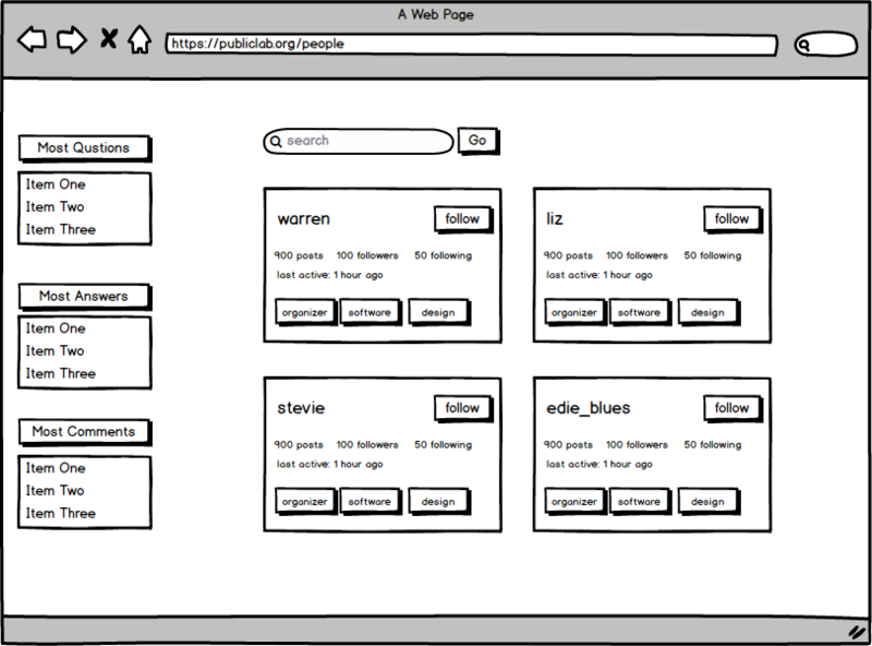
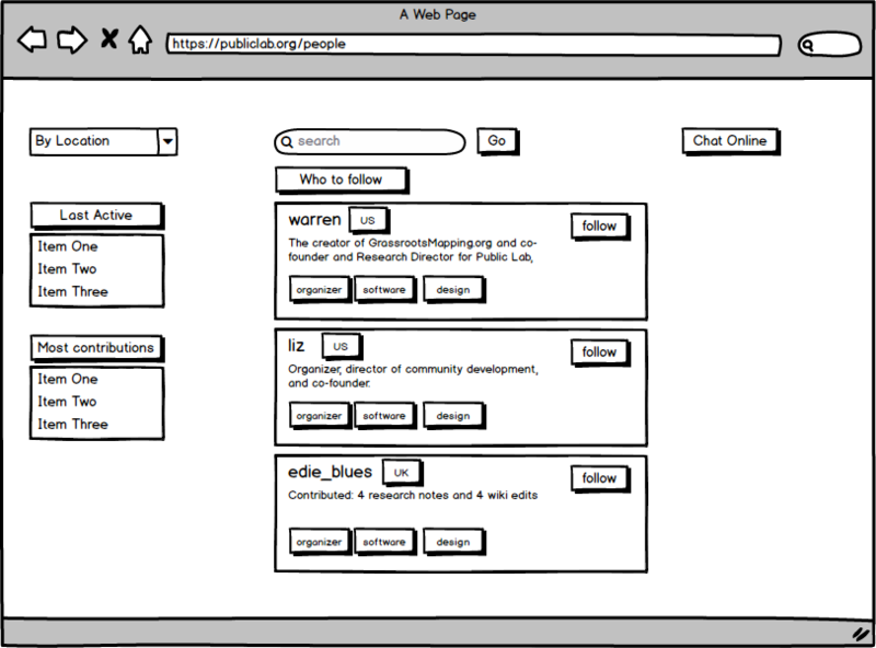
I've come up with two designs. Both of them feature "people to follow" (instead of just listing a massive table of all the users of Public Lab).
There is just too much content out there and I think we should focus on getting the right information to the user.
The main goal of the /people page, I believe, is to encourage people to follow user's that would be of interest to them and to interact with them.
The easiest way of recommending users would be by the tags that I'm currently following (we could also feature some users - the leadership team and the most active contributors perhaps).
The first design gives out more user information at a glance: the number of contributions, the number of followers, as well as the tags followed. This gives a really quick snapshot of the user's activity (making it easy to decide whether I want to follow them or not).

The second design is slightly more focused on the user's location. You can lookup users by location (dropdown menu with the list of "active" countries). Of course, there's also the option to search all users. You can join a chat and talk to the people that are currently online.
Instead of contributor stats, we could share a one-sentence bio and the current location (maybe even add a nice flag icon next to the name) - again, encouraging users to connect by location and also encouraging everyone to fill out their profiles.

Which design do you prefer? Why? Is there anything you would like me to add?
Let me know :)
Eva
**

8 Comments
This looks awesome, @edie_blues. I prefer the first version. I think that I would only use the location info if I were looking for people working on similar topics near my city—so the country info wouldn't be important to me. Would the map function on the current page remain as-is?
Is this a question? Click here to post it to the Questions page.
Reply to this comment...
Log in to comment
@joyofsoy thank you for your feedback!
Would it be useful to recommend you "users to follow" based on your tag preference first?
For example, let's say I follow air-quality
Should this page then start with: "other users that follow air-quality:"?
I'm still thinking about how best to display the map, and especially, how to link it with projects. What do you think of the current map on the /people page?
Thanks! Eva
Is this a question? Click here to post it to the Questions page.
Reply to this comment...
Log in to comment
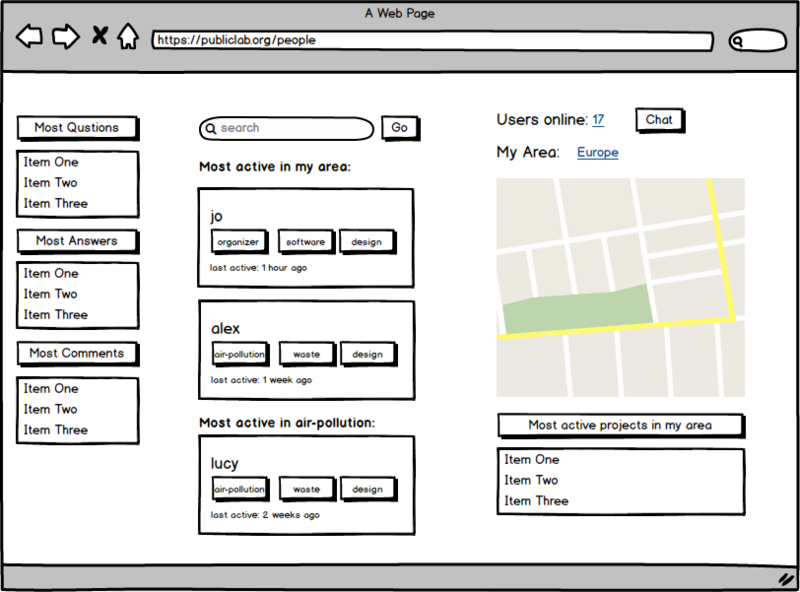
Hello all, Following a discussion I had with @liz, I'm adding a new design for the /people page (let me know what you think @warren et al! )
A brief explanation :) It's a three column page featuring: 1. on the left is a leader board to give you a quick impression of who's most active (and what the benchline is) 2. in the middle is the "recommendation engine" with people suggested to you by most active, either by area or people following the same category. I removed the "follow" component (and number of followers), after discussing this with Liz. 3. on the right is a number of users cufrently onilne (and a prompt to join the chat), followed by a map that displays recently active people in my area. Lastly, a list of most active projects (in my area).
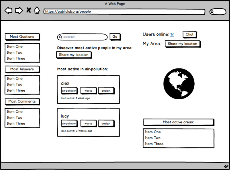
If the user has not shared the location yet, they would be prompted to do so, by clicking "Share my location" - see the design below.
As always, the main goal is to connect users with other active members in their community (either by location or topic of interest).
When a user has shared their location and follows at least one topic/tag:
When a user hasn't followed a topic/tag yet:
When a user hasn't shared their location yet:
Let me know what you think :)
Eva
Reply to this comment...
Log in to comment
That's a great solution @edie_blues! I think that could solve all of the needs.
Just to match with other text on the page, maybe "Discover most active people in my area" could be "Most active users near me." I know you're still at the concept stage right now, though ;)
Reply to this comment...
Log in to comment
Yes this is looking great! Thank you for listening and thinking so profoundly about these factors!
Reply to this comment...
Log in to comment
I want to highlight three big takeaways from this layout that stand out to me:
I'm interested in approaching this in parts 1-3, and each would need a bit more design iteration.
For the card layouts, (noting this prior reference to card layout), let's look at the many many types of card layouts in Bootstrap:
https://getbootstrap.com/docs/4.3/components/card/
And some ideas from Froala:
https://www.froala.com/design-blocks
I'm interested in what is the most relevant and critical information to include in the people card design. What if it looked a bit like this?
Is there more we could include in there?
Maybe instead of crowding it, we could have a
...menu to offer more:(working on this all in this mockups doc)
Is this a question? Click here to post it to the Questions page.
Reply to this comment...
Log in to comment
Or for something more compact...
Is this a question? Click here to post it to the Questions page.
Reply to this comment...
Log in to comment
Refined this a bit with the new map design:
Reply to this comment...
Log in to comment
Login to comment.