Hello! I posted a couple of weeks ago about the Low Cost Air Quality Sensor Calibration project that I am working on this summer with Public Lab.
As a brief summary of the project, I aim to:
- Collocate three Dustduino sensors with a Federal Reference monitor in Providence Rhode Island.
- Develop calibration equations for the three sensors/implement methods to increase robustness of data
- I then want to use the calibrated sensors to monitor the air quality in the area of Lower South Providence.
- My main deliverable will be a detailed step by step for conducting and evaluating this type of work.
Why?
Reason 1: There are a lot of published articles on calibration methods for this class of low cost sensors. However, they are often chalked up with technical jargon. I don't think that what I am doing is brand new but I just want to walk through the process myself so I can write about it in a hopefully more approachable way for community scientists.
Reason 2: The Lower South Providence area neighbor three of the largest industrial sites in Providence. This area also, coincidentally (or not so coincidentally) has the largest percentage of Hispanic and Black people in all of Providence. For reference, Lower South Providence is only 5% white. Providence, as a city, is 37% (source).
How far have I gotten?
I've built 3 Dustduino sensors and am 3D printing plastic enclosures for each of them. Photos to come later
I've met with the RI Department of Environmental Management to discuss their monitoring practices, collocation, and learn how to access air quality data from anywhere (in the EPA's monitoring network) United States
and, (the reason for this post)
- I've become acquainted with a programming-free tool for data visualization, Tableau, that I am a huge fan of now! I've seen other people in the Public Lab Community use Tableau but i wanted to make this post as a special shoutout to Tableau Public (the free version) and show y'all what I've used it for thus far.
Using the air quality data that i downloaded from the EPA website, I was able to generate some cool visuals of the Providence-Warwick Monitoring Network for 2018. I am not trying to show any particularly interesting trend here. Just trying out Tableau's visualization power!
The fully interactive visuals* can be found here ****but I've included some screenshots below! Check it out!
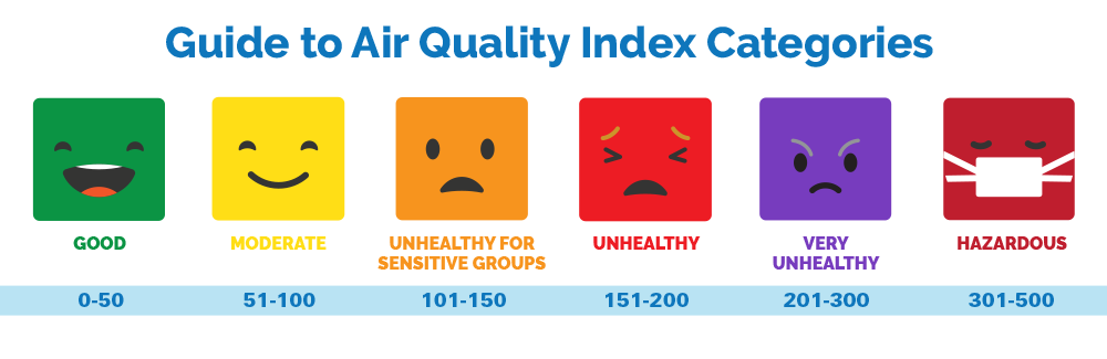
*Note: For the AQI scale, I have only included 0-90 which corresponds to "Good" to "Moderately polluted" on the Air Quality Index scale. I've done this just to more clearly show the respective air quality for different monitoring sites but in general, Providence has good air quality.
**The EPA has a lag of several months before data is publicly available which explains why some months are missing for certain sites, and why it only goes up to May

You can also hover over the dots to get specific data values.

What's next? Collocation with the Dustduino sensors!
3 Comments
Ooh, awesome - @sagarpreet check out https://www.epa.gov/outdoor-air-quality-data/interactive-map-air-quality-monitors
Reply to this comment...
Log in to comment
HI, Thanks for the update. I have a few questions though. You are apparently enthralled by the EPA Air Quality Index. Why?? My understanding, at least for particulate matter PM2.5, it is based on 24 hour averages. In fact, the EPA regulations require 24 hour monitoring averages be from midnight to midnight and for public health concerns they modified the procedure to a moving 24 hour average. But it is still a 24 hour average. Perhaps you should consult some people in public health and/or epidemiology to see what they think of 24 hour averages? and what time interval they would consider appropriate. Then decide what time interval is appropriate for your calibration procedures. Some examples where time intervals may be important: sand mines or other industrial operations that do NOT operate 24 hours a day. Operating time is then averaged with non operating time. Similarly for air quality near heavily travelled roadways where the heaviest travel only occurs at certain times of the day and a 24 hour average would include heavy and non heavy travel. Perhaps I am jumping the gun and you were using AQI just because you wanted to explore the visualization tool? I would want the shortest time interval I could get and do the averaging on my own as I would find appropriate.
Is this a question? Click here to post it to the Questions page.
Reply to this comment...
Log in to comment
@jeffalk I wouldn't say that I am particularly enthralled by 24 hour averages. The publicly accessible data that i've been able to find are daily averages and this was just a test-run with the tool using random data. They have "raw" data that is supposed to be available with some extra steps but I've had issues accessing that thus far and am working with the DEM to figure that out. I'm not sure how "raw" this data will be i.e. whether or not they will have hourly recordings or not. Stay tuned.
I agree with you completely. I am more interested in the shorter time intervals, particularly the day time when people would be active and outside.
Reply to this comment...
Log in to comment
Login to comment.