We're in the midst of a broader design overhaul for this very website -- PublicLab.org (read more at #ui) -- but we're also looking to get more people subscribing to follow topics (tags) on the site.
As we're moving tags to the upper right, in this issue, we'll have a chance to redesign what happens at the end of a post (see this example post). Right now it's a little busy, but once tags are gone, maybe we could consolidate the social media stuff (which is looking a bit dated) and a line prompting people to `Subscribe` to stay up to date? Then go right into comments.
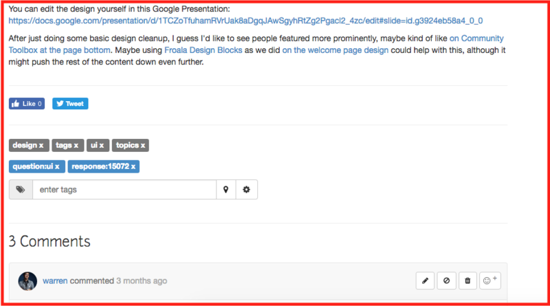
Currently it looks like:

But what about something like this?

My design sketches are here: https://docs.google.com/presentation/d/1TCZoTfuhamRVrUak8aDgqJAwSgyhRtZg2Pgacl2_4zc/edit#slide=id.g3cde15ba60_0_0
Reply to this comment...
Log in to comment
Reporting in input from @liz -- When subscribing, people may often want to get only one email per day or per week, rather than the "firehose" of everything as it comes. So let's come up with a way to easily switch digests on at the moment of subscribing. Two ideas:
you'll get approximately X emails per week. Click here to get only one per day, per week, or per month.Subscribe [ ]so people can say "weekly digest" (or some other period -- see screenshot below)Other ideas welcome!
Reply to this comment...
Log in to comment
A little ugly, but just trying this out!
Also tracking this over here: https://github.com/publiclab/plots2/issues/3219
Reply to this comment...
Log in to comment
This is a great idea to catch people at the bottom of a post they appreciated. I anticipate that this is a great pathway for the Blog, for instance. Subscribing to the Public Lab blog is a nice "slower lane" of involvement.
For other types of content i am less excited to see subscription separated from the tagging area. I will mull on ideas to address this!
Reply to this comment...
Log in to comment
Just to your last comment, this is in addition to, not instead of, the
Followthat's assoc. with tagging!Reply to this comment...
Log in to comment
@bansal_sidharth2996 this old post might be useful for the subscriptions project?
Is this a question? Click here to post it to the Questions page.
Reply to this comment...
Log in to comment
Thanks a lot. I will read up and start brainstorming now. :-) Just fixing my ubuntu. No write access from a day. I don't know how it happened. Will be pushing code through cloud9 if the problem persists longer. :-)
Reply to this comment...
Log in to comment
Awesome and good luck with your computer!
I had also thought we could incorporate the checkboxes for each popular tag into this popup as well, if we could make it look simple. Don't want to overcomplicate! Maybe
Subscribe to this post's topics | Select topics +so they're hidden and all checked by default, but if you expand, you can uncheck some? I'm not sure.Is this a question? Click here to post it to the Questions page.
Reply to this comment...
Log in to comment
I really liked the designs.
I want to implement this,
Subscribe to this post's topics | Select topics + so they're hidden and all checked by default, but if you expand, you can uncheck some. I am working on similar stuff, #4283. Let's finish the backend first this week. Then let's change the checkboxes into better UI.Reply to this comment...
Log in to comment