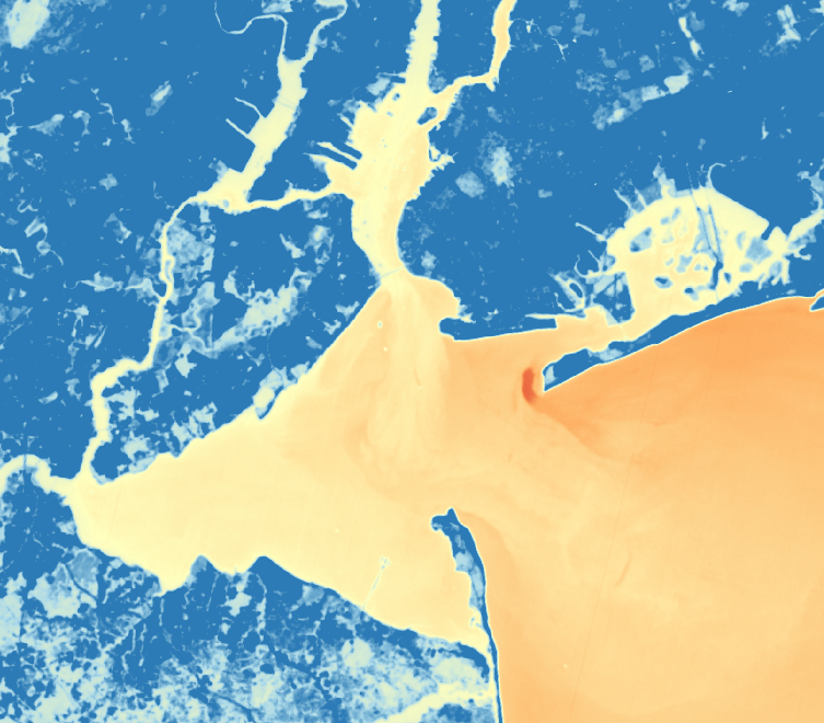
Following this amazing tutorial, I dove in and started looking at satellite imagery over New York City. Using the techniques discussed in the tutorial, I began processing the image with QGIS and created the above image. The image provides a very interesting view of the New York bay and one can visually see color differences in the water(which I'm assuming are temperature differences - I really have very little understanding of satellite imagery processing!).
What is most interesting in this image is the large red spot located just off Breezy Point. Can anyone help me to understand what would cause the differences in temperature there?
Thanks so much for the tutorial and I would love to keep learning more about this technology and the various ways to use it.
5 Comments
@nedhorning , @donblair did you see this?
Is this a question? Click here to post it to the Questions page.
Reply to this comment...
Log in to comment
I'm not sure what would cause that red spot. There isn't a legend or an image date so I'm assuming that the red spot is cooler than the surrounding water. It's possible that there is an underwater spring but that's just a guess. It looks like an island which make runoff and a drain pipe cause less likely.
Reply to this comment...
Log in to comment
Yes I should have documented my work a bit better. I basically followed the tutorial and then kept moving the zoom around and playing with the settings. The image was the latest from the Landsat set. Here's my hypothesis...the water is much shallower in that area, yet still submerge and there is a channel that has been created in the soft sand. Water passing through that channel then cools (or heats up...not sure which) faster than the surrounding water? I'm not sure at all but it was a very curious finding given the drastic difference in color from everything else in the image!
Is this a question? Click here to post it to the Questions page.
Reply to this comment...
Log in to comment
It seems like the red is cooler, since the beaches and shallow water of Jamaica Bay are that lighter yellow color, and they should be warm spots.
That means that the red spot is a cool spot. It is a channel there by the jetty, so it is a little trough of deeper water. The tide seems to be running out by the plume reaching out into the Atlantic. Perhaps that trough contains some cooler water that is being stirred up by the outgoing tide?
Jay
Is this a question? Click here to post it to the Questions page.
Reply to this comment...
Log in to comment
It would be nice to have a scale. At the Open Hours last week they did say it was hard to get absolute temperatures without some sort of calibration, but the colors should represent relative temperature differences. I wonder what that relative temperature difference is here?
Jay
Is this a question? Click here to post it to the Questions page.
Reply to this comment...
Log in to comment
Login to comment.