Jeff asked me to share this as a reference for thermal pollution mapping. It's an animation I made several years ago of thermal pollution from Oyster Creek Nuclear Plant in New Jersey. I went through a similar discovery process as Don -- and actually did the calculation where I was able to measure temperature by pixel -- but for the purpose of the clarity I chose to simplify the visualization to above ambient water temperature. Enjoy!
A Year of Thermal Pollution from Zenon Tech-Czarny on Vimeo.
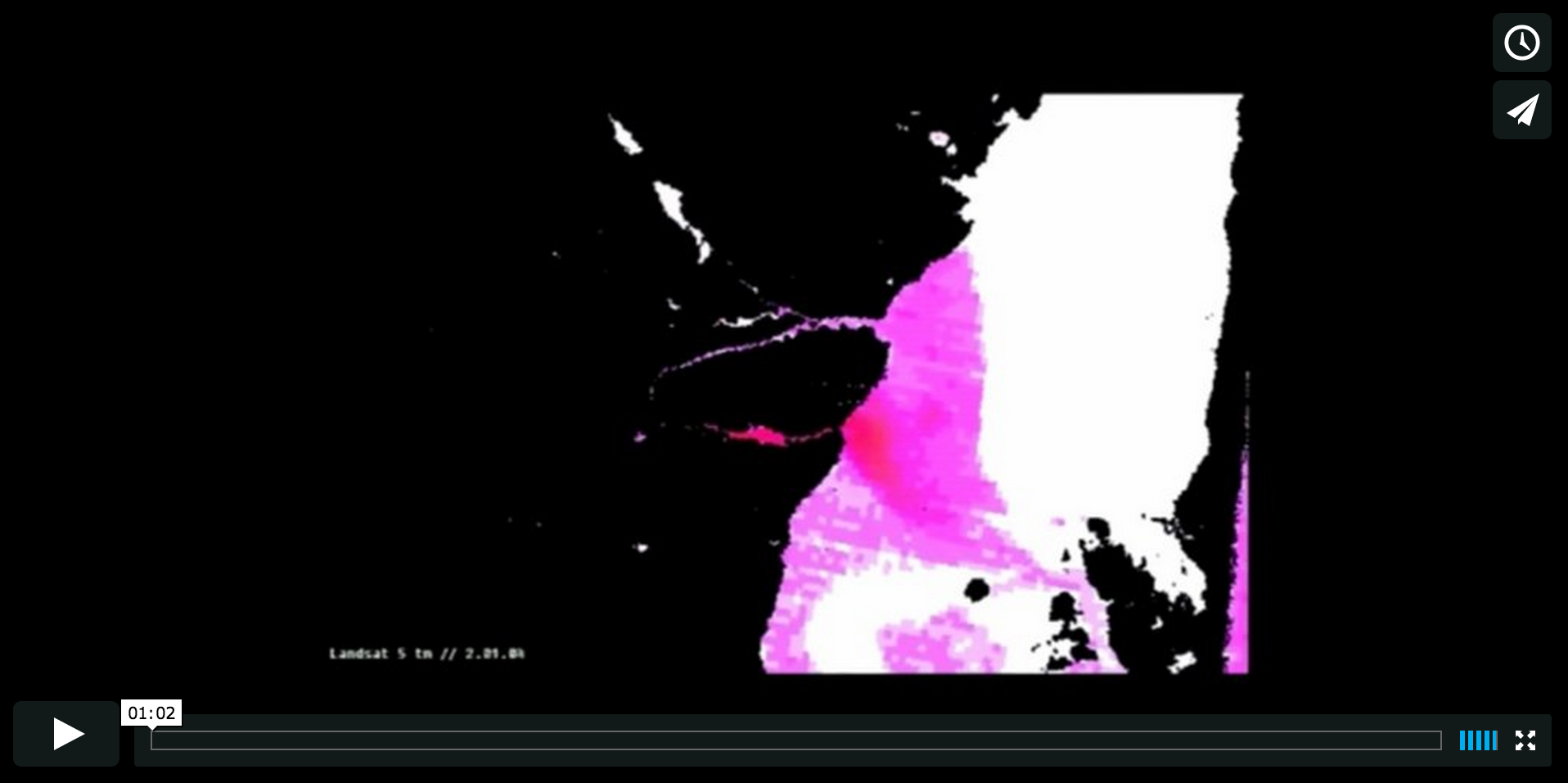
The following animation presents a series of thermal infrared LANDSAT images that visualize what a year of thermal pollution from Oyster Creek Nuclear Generating Station looks like. The pink represents temperatures above ambient levels. The imagery was provided by the Center for Remote Sensing and Spatial Analysis at Rutgers University, and was produced by the Environmental Health Clinic.
4 Comments
Great stuff! We would love to see this for our local applications. Some things that would make it even more useful: 1) a scale so we can see the physical size of the area. 2) a definition of "above ambient" 3) a comparison to the predicted or reported thermal plumes that the plant is permitted for. (i.e. is this plume bigger or smaller than the plant already reports?)
Is this a question? Click here to post it to the Questions page.
Reply to this comment...
Log in to comment
This is fantastic! Would LOVE to do this for our work on a local power plant. Super interesting to see the plume move and change shape so much. Agree with the comments above - how big did the plume look compared to what is reported by the plant? How big of a plume is it? Thanks for sharing this!
Is this a question? Click here to post it to the Questions page.
Reply to this comment...
Log in to comment
I agree that this is great Zenon and we are looking to do something similar with another project. Who was your audience for this video? For our context, I'm thinking some explanation of thermal pollution might also be helpful - like what does higher temp water mean for the ecosystem in these environments and is there a way we can show that.
Also, how did you get the calculation where you translated temp to pixel? We are trying to figure out ways to do that as well.
Is this a question? Click here to post it to the Questions page.
Reply to this comment...
Log in to comment
Wow this is great! Nice to hear from you Zenon. Would you consider sending out to your neighbors on plots-nyc@googlegroups.com? :)
Is this a question? Click here to post it to the Questions page.
Reply to this comment...
Log in to comment
Login to comment.