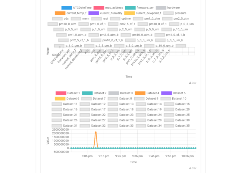
In follow-up to the question @stevie posted about cleaning datasets, I had a related one -- when I tried to post a CSV file (essentially a spreadsheet), I found it had too many columns to be very readable. When it graphed, there was just too much information.
I tried deleting a few columns but it wasn't ideal... What are common ways to deal with this?

Hi @stevie, @Aleah, @Cbarnes9, and @crispinpierce, I posted this in follow up after the purple air datalogs ended up so dense and tough to read! Thanks!
Reply to this comment...
Log in to comment
This is very much dataset, project and software dependent.
Sometimes I remove columns, other times I combine them (averaging, adding, etc), other times I split the dataset into "themes" like "all PM data" or "all flow data" or "all temperature data".
Sometimes I use a spreadsheet tool (LibreOffice) but most times I work with a scripting language (R, Python, Octave) where I can easily select which parts of the dataset I want to look at.
What's "universal" is that you need to know (and understand) what each column means and have access to any metadata available so that you can judge which columns are relevant to your question and what might explain certain weirdness in the data.
From the looks of those plots there seems to be several columns that have the same value for most of the dataset (firmware version, macaddress, hardware) while others seem to be "time axes" like "UTCDateTime", "uptime". My recommendation would be to first write down a few very specific questions you want to answer (what's the average PM10 concentration?; what's the range of temperature observed? ... etc) and only look at the parts of the data that help you answer them. I've always found that when I start with a specific question, the data often lead me into the next (more complex) question and I get more proficient in dealing with that particular dataset.
Good luck!
Is this a question? Click here to post it to the Questions page.
Thanks! Yes, i started by removing things like firmware #, for sure. It's interesting to see how some values track each other roughly, while others don't. But I agree it makes sense to start with a question! Thanks @guolivar!
I also noticed that some very high values make others basically unreadable. So having 2 y-axis scales can sometimes help, i guess, although that's not so simple with some graphing software (like google spreadsheets).
Normalising is your friend when you have things with very different ranges. Depending on what you're looking for you can divide each column by its maximum or the mean, or substract the mean from the values, or "properly" normalising making the mean 0 and the standard deviation 1 ... here is a short(ish) page about normalising with Python but the formulas used are also available in all spreadsheet tools. https://machinelearningmastery.com/normalize-standardize-time-series-data-python/
Reply to this comment...
Log in to comment
Pivot tables? Lookup or index command? Conditional formatting? all of these things can help. i had to have 10 years and 14 plant plot growth sites of data, where each record was one of 10,000 plants, all in one csv. i colored a lot of columns
Is this a question? Click here to post it to the Questions page.
Reply to this comment...
Log in to comment
Whenever we have such large numbers of columns then we first perform correlation analysis before plotting the graphs. In correlation analysis, we compute the correlation coefficient of each column with the other column. I performed a correlation analysis on the above dataset https://docs.google.com/spreadsheets/d/1Ie5Jzyd8CIT8ZBFQU2I67Ph1eklJcoZ2x-laeGT3qyw/edit?usp=sharing you can see that out of 32 main attributes 24 attributes are highly correlated(as the correlation coefficient is greater than 0.99.And it very very high) .So instead of keeping all the 24 attributes we only keep 1 attribute as the other 23 attributes won't give us any information about the data. By this way, we can have also reduced the size of the dataset by 75%(from 32 attributes to 9 attributes).And as you mentioned above the problem of high values, To deal with this before plotting the graphs we replace the outliers by the mean of that column. We generally classify an outlier as a data point which lies outside the range (mean+-1.5*IQR). After replacing then we should plot the graph
Is this a question? Click here to post it to the Questions page.
Reply to this comment...
Log in to comment