We're working a bit on redesigns of some of our main pages. I want to collect some ideas and pool our thoughts on goals for one page, the Tag Page -- which is here:
https://publiclab.org/tag/particle-imaging
We've had some discussion on tag pages, in this question -- and it was a great one -- but it went in a lot of different directions outside of the narrower question of the design of the tag page (into tag visualizations, nomenclature, other good stuff) but I worked a bit on the visual layout and information organization on the tag page itself, and have a rough sketch that I'd like to use as a starting point to refine the page design -- addressing other discussion topics in parallel.
Goals
- less busy/overwhelming - cleaner, easier to follow information design
- quick at-a-glance view of the community engaged on this topic
- prominent ask a question prompt
- less confusion about Subscribe/Follow/Answer questions
Inspirations
- GitHub Pulse: https://github.com/publiclab/plots2/pulse/weekly
- I also wanted to point out @julvie's heuristic review, posted in this comment: https://publiclab.org/questions/tommystyles/10-20-2017/need-your-feedback-on-tag-pages#a725
Note that the code for the tag page can be found here:
https://github.com/publiclab/plots2/blob/master/app/views/tag/show.html.erb
You can read it in full here: https://docs.google.com/document/d/1796lMEwSjUawamKIYebbsSikFBBboVK5lZ6jZFKJLXI/edit
We'll be going through this and @cfastie's great comments and input in this process, though we may go pretty slow and incrementally. Thanks, all!

You can edit the design yourself in this Google Presentation: https://docs.google.com/presentation/d/1TCZoTfuhamRVrUak8aDgqJAwSgyhRtZg2Pgacl2_4zc/edit#slide=id.g3924eb58a4_0_0
After just doing some basic design cleanup, I guess I'd like to see people featured more prominently, maybe kind of like on Community Toolbox at the page bottom. Maybe using Froala Design Blocks as we did on the welcome page design could help with this, although it might push the rest of the content down even further.
On people being featured more prominently, thinking of something like this:
Reply to this comment...
Log in to comment
@xose - thought you might be interested in this sub-idea - a little embeddable badge that links to various collaborative features, for extending PL.org's knowledge sharing platform onto any website --
Inspired by these kinds of badges from GitHub:
Reply to this comment...
Log in to comment
Excited about this! I really like these ideas, especially featuring people more prominently. One of my favorite things on the whole site that perhaps i'd like to consider keeping as-is is the lead image and text from the wiki that loads side-by-side at the top of tag pages. The sketch shows an expansion of that header information that takes up more "real estate" that i feel is unnecessary. It would be great for a designer to think carefully about how we suggest that people follow tags that they are interested in -- a critical step! Tags are very important for how Public Lab community organizes knowledge, but i feel their functions may not be widely understood.
Reply to this comment...
Log in to comment
Hi, all - just noting that a few new things have happened on this page since this sketch was posted:
Related tagsdisplay on the tag page, shown belowI hope this doesn't complicate things unduly - the related tags is the only one that ought to be more prominent; the others could be less visible to newcomers.
Is this a question? Click here to post it to the Questions page.
Reply to this comment...
Log in to comment
Hi, all - getting back into this real quick -- if folks have input, it's really useful to think about offering feedback under three headings:
This helps us separate out what your "pain points" are from specific design proposals to consider. Thanks!
Reply to this comment...
Log in to comment
Hello here... I am Kelvin Mutiso but just call me Kelv.... I am the one to implement the design views on the tag page.
Reply to this comment...
Log in to comment
@warren How many platforms should we collaborate if we are to add on the collaborate feature?
Is this a question? Click here to post it to the Questions page.
Reply to this comment...
Log in to comment
Hi, do you mean how many collaborators? Sorry, can you clarify a bit? Thanks!
Is this a question? Click here to post it to the Questions page.
Reply to this comment...
Log in to comment
Yes... like the functionalities for the collaborate button
Reply to this comment...
Log in to comment
I think that's for other sites, and that we won't have it on our tag pages. Thank you @kelv!
Reply to this comment...
Log in to comment
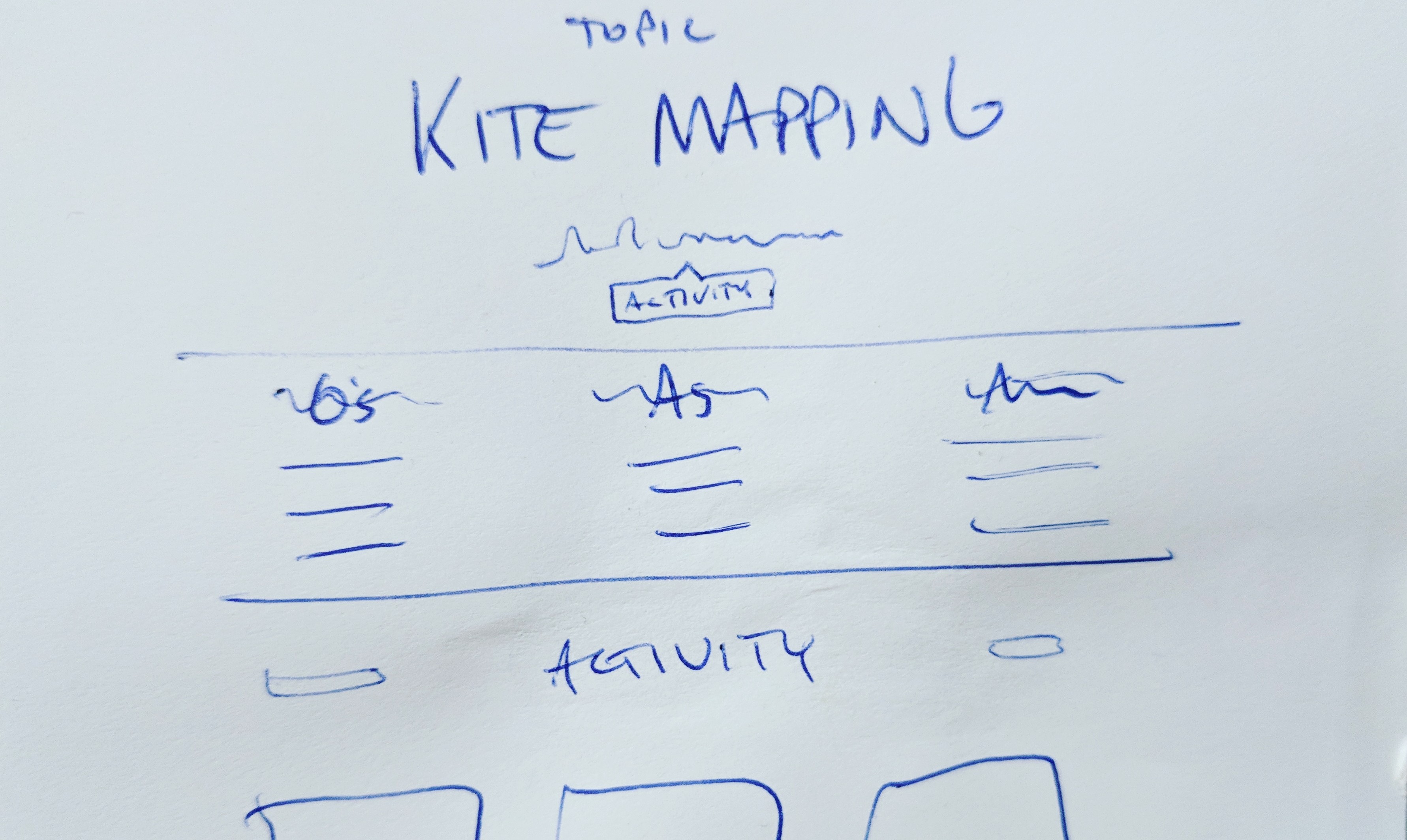
Hi, @kelv - ok i get what you're saying -- this interface --
So in this mockup, the ? is supposed to represent the number of questions, the wrench is the number of activities, and the person is the number of collaborators, kind of as it's listed at https://publiclab.org/methods. Having these listed on the page is important, but they don't have to be displayed in this way. You could come up with another design if you like.
I'd love to see a sketch for the top of this page -- do you have anything you can share?
Is this a question? Click here to post it to the Questions page.
Reply to this comment...
Log in to comment
Hello team, I have sketched some design here... kindly look at it then get me a feedback please. regards... I hope it is visible. regards;
Reply to this comment...
Log in to comment
@liz and @warren ... I need your feedback please.
Reply to this comment...
Log in to comment
Hi Kelvin!!! Apologies again for the slow reply. I'm just catching up now.
This looks like a good basic layout and I like how you've created a really clean three column main content area. I think I'd have to see a more detailed sketch (maybe a digital mockup) to know if the sidebar works, though. I could imagine it getting a little crowded.
Could we move the Contributors section up, do you think?
How would you organize the content in the middle area? Kind of as it is now, or as a list?
Finally, we often have a short paragraph of text summary/introduction at the top of tag pages. Could we see what it looks like with that added in somewhere?
Thanks!
Is this a question? Click here to post it to the Questions page.
Reply to this comment...
Log in to comment
noted Warren. I will get you that asap.
Reply to this comment...
Log in to comment
@warren .. How is this landing page? I decided to remove the ask question and follow buttons... and place them somewhere else.. actually on a left sidebar that would scroll with its content... Hows that?
Is this a question? Click here to post it to the Questions page.
Reply to this comment...
Log in to comment
Oh, this is cool! I like the idea of the sidebar. Can you upload some more images of lower down on this page? And what will the grid of content and the tabs look like in this new design? Thanks Kelvin!
Is this a question? Click here to post it to the Questions page.
Reply to this comment...
Log in to comment
The lower part is yet.. working on contributors and some other stuff, when done will upload more...
Reply to this comment...
Log in to comment
great, looking forward to it!
On Mon, Oct 22, 2018 at 1:51 PM \<notifications@publiclab.org> wrote:
Is this a question? Click here to post it to the Questions page.
Reply to this comment...
Log in to comment
Hi, just checking if you had a new iteration of this to share? Thank you!
Is this a question? Click here to post it to the Questions page.
Reply to this comment...
Log in to comment
Hi @kelv!
I'm working on the other design project (the welcome page). I use github pages to share my design demos - I think @warren and the rest of the team appreciate it as they can scroll up and down the page and get the feel of how the entire page looks like.
Reply to this comment...
Log in to comment
@edie_blues hadn't thought of that, lemme work on it. Thank you!
Reply to this comment...
Log in to comment
hello here, as @edie_blues suggested, I did host my work on github pages herePublic Lab Tag page #ThanksEdie
To the team now, I have changed quite some stuff around: 1. Changed the landing design 2. altered the side bar 3. added some research notes and paged them
the next version should contain: 1. more research notes modified and reorganized 2. questions 3. wiki pages 4. any updates and feedback I'll have got from you
@warren @liz @edie_blues i will need your feedback on the design so far, what you think needs to be changed or retained. Thank you!
Reply to this comment...
Log in to comment
For the tag page, should I create like a template for all tags or create inserting content for all tags? regards
Is this a question? Click here to post it to the Questions page.
Reply to this comment...
Log in to comment
Ok, adding some comments but first a quick sketch:
Reply to this comment...
Log in to comment
This is starting to come together, thanks!
I do want to suggest we use a Bootstrap UI style, like potentially vertically stacked pills, here: https://getbootstrap.com/docs/3.3/components/#nav-pills, for the sidebar.
Just a small detail but it'd be great to see the # of contributors listed, for a sense of "how big the community around this topic is".
I also feel like the questions could be more highlighted -- what about, like in the sketch i just posted, a horizontal band of a few recent questions, and a prompt to post your own questions, above the rest of the work below? I just feel like people may miss the questions section in the menu bar but maybe you have another creative solution.
I'd also like to start distinguishing between "content that's most important/interesting" versus "what's most recent" -- perhaps the main view would be of the top overall, but there'd be an easy way to toggle to content that's "new this week" or just "recent updates". What do you and @edie-blues think about this distinction? Maybe @joyofsoy and @stevie have some input on this particular balance of "new" versus "important"?
Is this a question? Click here to post it to the Questions page.
Reply to this comment...
Log in to comment
Also just want to say that I think the "card" design here is pretty good, great work!
Reply to this comment...
Log in to comment
Just checked it out. Looks great! Is there any way we could put the "follow topic" as a button larger on the top left hand corner? to me, getting followers on topics, is a major goal of the tag pages.
Thanks! -Stevie
Is this a question? Click here to post it to the Questions page.
Noted! It will be up in the next version.
Hi, Kelvin - how are things progressing? Thanks!
Is this a question? Click here to post it to the Questions page.
Hey Warren, been working on some stuff for fetching data from your database and placing it on the cards so that we can now sort or rather filter... with the view I had on the cards.. it would have worked, but then when we need to filter, it becomes hard... So I had to rewrite the code again... but it will be up soon... sorry for the delays... thanks!
Hi, Kelvin - no worries - actually you don't need to be doing any database work yet; we will be integrating your code, or pieces of it, into this page:
https://github.com/publiclab/plots2/blob/master/app/views/tag/show.html.erb
Each spot that says "render partial" is broken into a sub-template in this folder: https://github.com/publiclab/plots2/blob/master/app/views/tag/
But you don't have to worry about that just yet, we really would like to see some more detailed design work on the issues we've discussed above. Can you post your latest static HTML mockup? Thank you!
Is this a question? Click here to post it to the Questions page.
Hello Warren, I needed this so that I know how to implement the cards.. but its ok.. I'll just have it static.. for now... For the latest HTML mockup, I will upload it by Friday, Please do check on Friday. Thank you.
@warren the latest static HTML is up and running. Kindly have a look. Thanks!
@Warrenmcdonalid, What do you mean by this?
Is this a question? Click here to post it to the Questions page.
Reply to this comment...
Log in to comment
@warren , in distinguishing between content thats most important vs. whats most recent means we filter as follows: top overall, most recent, new this week and recent updates?
I dont like glyphicons, so I'll probably use Font awesome I mean, for the nav-pills.
Do you like the header section?
I'll work on the feedback in the next update.
Is this a question? Click here to post it to the Questions page.
Reply to this comment...
Log in to comment
@kelv looking good!
The cards look really nice and nice colours on the sidebar.
For the header section, I think the text in black is quite hard to read on such a dark background. I would suggest changing the opacity of the background so that it stands out more.
For the filters, I quite like how Reddit does it, they use Hot, New and Best (also Top, Controversial and Rising - but I don't think those are needed here, although you could change Best to Top).
Reply to this comment...
Log in to comment
@warren, which databases do you use? I need to know so that I can generate an algorithm for it. Thanks
Is this a question? Click here to post it to the Questions page.
Reply to this comment...
Log in to comment
OK, sounds good. Thank you!
On Wed, Nov 14, 2018 at 9:06 AM \<notifications@publiclab.org> wrote:
Is this a question? Click here to post it to the Questions page.
Reply to this comment...
Log in to comment
Hello, sorry for the delay.. so here is the final project view have a look at it and let me know the feedback
Link to the final design
Most Regards.
Reply to this comment...
Log in to comment