You can also access this as a Google Doc here. Print or create a copy to follow along and record your observations.
Outliers
Sometimes a dataset can contain extreme values that are outside the range of what is expected and unlike the other data. Outliers can have different causes, such as:
- Measurement or input error
- Data corruption
- True outlier observation
No precise way to define or identify outliers exists in general because of the specifics of each dataset. Instead, you have to interpret the raw data and determine whether or not a data point is an outlier. There are statistical models that we can use to identify these unlikely data-points as outliers.
Note: Just because a model suggests that a value is an outlier doesn't mean it should be immediately thrown out. A good strategy to consider is plotting the set of outliers on their own to see if there is a systematic relationship or a pattern to the outliers. If you can identify a pattern, then perhaps these values are not true outliers and can be explained.
Box Plots (Box-and-Whisker Plots)
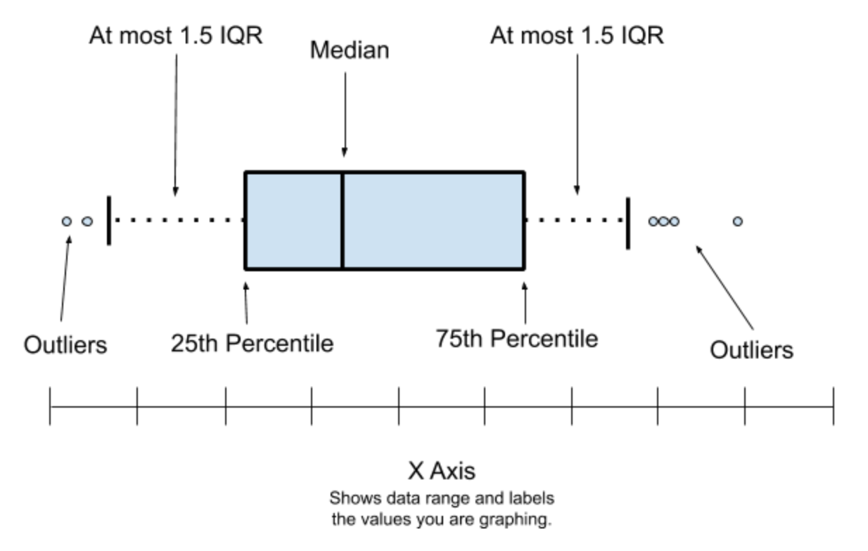
Box Plots provide a way to visualize the distribution of a dataset. It uses 5 numbers to summarize "most" of a distribution, and then plots any outliers that it does not cover. Those five numbers are
- The median, showing the value of a typical observation, represented as a line in the interior of the box.
- The 25th and 75th percentiles, represented as the lower and upper endpoints of the box. The 25th percentile is a number such that 25% of the data is less than that number. Likewise, 75% of the data are less than the 75th percentile (so 25% are above it).
- These two numbers are chosen so the box represents the spread in the "middle half" of the data.
- The distance from the 25th to the 75th percentiles is known as the "interquartile range" and abbreviated as IQR.
- The Box Plot extends outside of the box showing the variability outside the upper and lower quartiles. An arm extends out of each side of the box.
- Each arm extends no more than 1.5 times the IQR and ends at an observed value.
Here is an example of a Box Plot:

Creating a BoxPlot with CODAP
While you can calculate the numbers by hand, creating this graph with the help of software (such as Google Sheets, Microsoft Excel, or on a graphing calculator) can save time and increase accuracy. Today, we'll create our BoxPlot in an online software called "Common Online Data Analysis Platform", or CODAP. If you'd like to use another software or create your BoxPlot by hand, checkout the resources below.
- Creating a Box and Whisker Plot By Hand from Purple Math
- Creating a Box and Whisker Plot in Microsoft Excel from Microsoft Support
- Using GoogleSheet's Candlestick Plot from Google Support
- Making a BoxPlot on a TI-84 Calculator from CPM Student Tutorials
Getting started with CODAP is simple. From the homepage, https://codap.concord.org, click "Try CODAP" to open a new document. You can easily import data from a GoogleSheet or upload a document. To learn more about CODAP and its features, check out the CODAP Startup Guide.

Once you've imported your data, create a graph by pressing the Graph Button.

To add data to your graph, drop a "Numeric Attribute", or chart label, like "Water_Temperature" onto the X-Axis of your Graph. To create the Box Plot, click the ruler and select "Box Plot". This will create an overlay of a Box Plot like the one below.

To remove the data points and view only the Box Plot, Click the paintbrush on the graph menu and change the color of the Data Points to white. Hovering over a piece of the boxplot, like the 75th Percentile above, will display the numeric value. You can select all of the datapoints in a section of the BoxPlot by clicking that section of the BoxPlot.
Outliers are displayed as a cross on the graph. In the example above, you can see a single outlier on the right side of the graph. Clicking on the cross on the graph highlights the datapoint in the chart for further analysis.
Record Your Observations
Create a chart like the one below for each variable of interest to record your observations.

5 Comments
The common test for outliers in industry is the t-test. Is that the test codap is using?
Is this a question? Click here to post it to the Questions page.
Hello, thanks for that question! I think I should make some edits above to be more clear that box plots help us to identify potential outliers that would then need more rigorous testing before being thrown out.
This method does not use a t-test. What we're doing here is checking for a normal distribution pattern, and identifying values that are outside of that normal range, which we can classify as potential outliers.
At this point in our analysis, we wouldn't want to use a t-test because it's answers a different question than the one we are asking. A t-test checks to see if two numbers (typically two averages) are different, so it's useful in a case like "is the test score higher after training in a manner that is statistically significant". Here, the question we would want to answer is "could this be an outlier". An outlier isn't necessarily something that is different, which a t-test would tell us, but something that is outside of the "population" that you want to study.
You could easily have a bimodal distribution in your population. But, if you gather more data, who knows? It may turn out to be normal.
Ok, how far are you going to go and what tests do you plan to include?
Is this a question? Click here to post it to the Questions page.
That's a great question, especially since there are many examples of things in nature that would have a bimodal distribution.
A full rundown of statistical methods probably isn't best done in the comments, but I definitely encourage you to write and share posts or even a collection of resources about it. We're currently building up resources for student-led environmental monitoring studies, which this is included in.
@Ag8n would you be interested in mentoring students when they get to the data analysis portion of their projects? I'm hoping to gather a group of contributors to ping in and you seem interested in talking about it!
Is this a question? Click here to post it to the Questions page.
What we were taught in industrial statistic s is that often times bimodal curves work themselves out into normal curves. How? Well, even if you have a bimodal distribution, by the time you get QA sampling done, and the averaging on this, it will often look like a normal distributio n.
As for montoring, I'm sorry but no. I'm already working on a turbidity project that is going slower than I would like. Mostly because of work going on around the house. Maybe I'm the future...
Is this a question? Click here to post it to the Questions page.
Reply to this comment...
Log in to comment
Login to comment.