 **
**
red** reps a static side nav which I thought it wise for a tag page so that users don't have to scroll up again to get to new content and also included nav pills that display content only when clicked then hide other content.
Green reps the home banner: here I needed something unique and that which would attract users with lead image and text. It also has a FOLLOW TOPIC button for easy navigation to the topic.
Purple reps quick access to asking and answering questions.

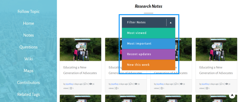
above is notes sections
I decided to use cards to display information so that it would be appealing to the user and also descent arrangement.
Then there is the **
FILTER NOTES toggler - **Which I made it toggle-able and made it different from the other filters and it has different colors to remove user boredom.

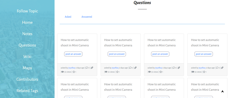
Above is questions division - still used cards and the user can toggle either between asked questions and answered questions. Though I borrowed alot from the existing page.

Lastly on the main design, is the contributors'page
I used gallery cards with photos so that it won't be tedious scrolling 500+ normal text names, at least to increase interactivity.
Below is the link to an online version of the design.ONLINE DESIGN

0 Comments
Login to comment.