(This template is for students applying to summer code programs with Public Lab. Use this link to start writing a post: https://publiclab.org/post?n=899&tags=soc,soc-2019,soc-2019-proposals You can delete this line once you've started filling it out.)
About Me
Name : Ankit Kumar
Timezone : Asia/Kolkata (UTC+5:30)
Email : ankitkumar3624@gmail.com
Course : Bachelor of Technology - Civil Engineering
University : National Institute of Technology, Jamshedpur
Country : India
Obligations : None
Links : LinkedIn GitHub CodeChef
I am in the second year of my Bachelor of Technology - Civil Engineering course. But despite having Civil Engineering as my course, computers have always interested me. I am a coding enthusiast and an avid full stack developer. I have always loved working on algorithms and their visualizations emphasizing on writing readable code. It has been 2 years since I started programming. I am very comfortable with HTML, CSS, Javascript, React.js and have experience in C++ as well. My major interest is in web development. I can write clean and efficient codes. I am looking forward to the challenges awaiting me. In my opinion, the main objective of Outreachy is to learn and gain experience and I hope to accomplish that.
Project Description
The project to Design a new full-screen UI for Infragram.org intrigues me, here's an idea on how to go about this project :
Synopsis
The major goal of the project is to improve the User Interface of Infragram.org along with the implementation of various features. My goal with this project is to design a better layout and UI for Infragram.org. This will allow the UI of Infragram to be full-screen, accept multiple resolutions of video, output multiple resolutions, and will allow dragging in a recorded video instead of a still image for conversion.
What it means to accomplish
- A better layout and UI for Infragram.org
- Allow dragging in a recorded video instead of a still image for conversion.
- Accept multiple resolutions of video.
- Output multiple resolutions.
- Higher code quality and consistency.
Abstract/summary (<20 words):
To create and implement a new and improved full-screen UI for Infragram.
Problem
I have gone through the current UI of Infragram web page, and found the following issues with it :
- When the first time someone will visit this page, they will get confused about where to start as elements are not placed in a good way and there is no navbar for the page.
- There are so much of uneven white spaces and elements placed too close that are making the page look so messy and confusing the user.
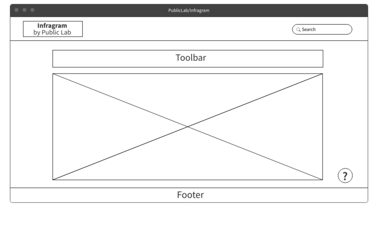
- There should be a floating icon at the right bottom corner of the page for the Ask a Question and Help Button so that users can easily navigate through it when needed help.
- Footer section just contains two lines and a link within it. It can be modified.
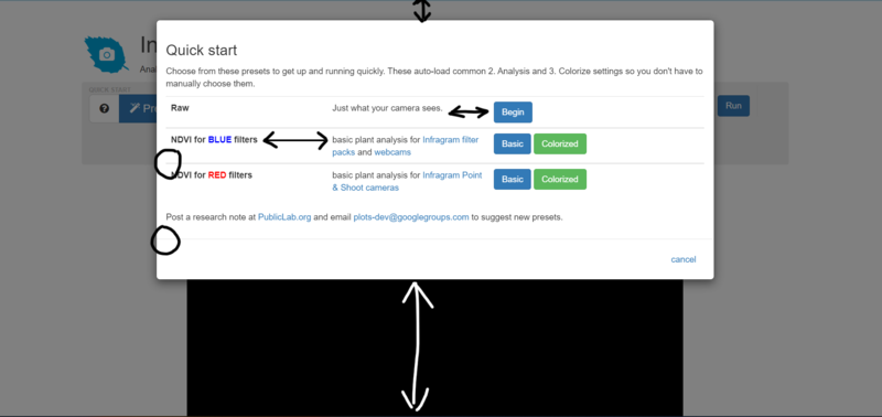
- There should be a Welcome Modal with a QuickGuide for the first-time users to guide through the website.
- In the Quick Start, Spacing can be improved, the container can also be vertically centered and buttons can be improved.

Mock-up/Solution
I have designed a UI workflow that can solve the issues with the current UI :
- Adding a Navigation Bar will improve the first impression of the website.
- Adding drag and drop on the entire page feature will make the website more user-friendly.
- Re-positioning the Ask a Question and Help Button to the right-hand corner as shown below will make it more impactful.

- Fixing the alignment of the pop-up message after clicking the save button will help in improving the UI.
- Adding a Welcome Modal with a Quick Guide for first-time users to guide through the website.
- Working on the responsiveness of the website to make it fit for any device and working on padding and margins to remove the empty white spaces.
- Designing a perfect footer will mark a good end of the website.
Timeline/Milestones
Week 1 (30 May, 2022 - 4 June, 2022 )
- Refactor the Existing Implementation.
- Design a responsive navbar.
- Take feedback from mentors and improve.
Week 2 (5 June, 2022 - 11 June, 2022)
- Improve the quick start design.
- Take feedback from mentos and improve.
Week 3 (12 June, 2022 - 18 June, 2022)
- Move Q&A feature into a Help Menu.
- Take feedback from mentors and improve.
Week 4, 5 (19 June, 2022 - 25 June, 2022)
- Enable cross-browser drag-and-drop on the entire page.
- Take feedback from mentors and improve.
Week 6 (26 June, 2022 - 2 July, 2022)
- Design a responsive footer.
- Take feedback from mentors and improve.
Week 7 (3 July, 2022 - 9 July, 2022)
- Add a popup "Welcome" modal box.
- The modal will guide with the first few steps.
- Take feedback from mentors and improve.
Week 8 (10 July, 2022 - 16 July, 2022)
- Add user guide in the welcome modal.
- Take feedback from mentors and improve
Week 9 (17 July, 2022 - 22 July, 2022)
- Look for bugs and fix them.
- Write UI tests for new Infragram UI.
- Take review from mentors and improve the code.
Week 10 (23 July, 2022 - 1 August, 2022)
- Continue with fixing bugs.
- Finish up any remaining tasks.
Week 11 (2 August, 2020 - 8 August, 2020)
- Write/modify documentation for the change made throughout site.
- Writing project summaries and blogs about the feature built.
Week 12 (9 August, 2020 - 15 August, 2020)
- Continue with the work on documentation and project summaries.
Week 13 (16 August, 2020 - 22 August, 2020)
- Submitting work for evaluation.
Needs
Expectations from Mentors
- Help me understand the existing code of Public Lab whenever I am incapable of doing so on my own.
- Suggest me some study material to have a clearer view of how things are done ideally.
- Help me come to a decision when I have more than one way of doing things and tell me why that is the best option.
- Take time to review my work and provide their timely insight.
First-time Contribution
I was introduced to the open source community a few days back and since I started quite late contributing to Public Lab, I have few merged PRs. List of PRs I have made till now :
Experience
My major interest is in web development. After gaining sufficient knowledge about HTML, CSS, Javascript, Node.js, and React.js I made some small projects. It was really fun to work on these projects.
Portfolio Website :
I used React framework to build this website. It has responsive, accessible and dynamic web pages to enable users to easily navigate the site. It is a single-page application that improves user experience.
GitHub Repository - https://github.com/ankittt20/portfolio
Website Link - https://nostalgic-tesla-ac6647.netlify.app/
Netflix Clone :
I made this website for my college project and here also I used React framework to build this website. And it has responsive, accessible and dynamic web pages to enable users to easily navigate the website.
GitHub Repository - https://github.com/ankittt20/NetflixClone
Website Link - https://agitated-shaw-ccdf10.netlify.app/
To-Do List :
In this project, I used EJS to build this website and incorporated MongoDB to store user data.
Website Link - https://cryptic-bastion-47343.herokuapp.com/
Tinder Replica :
This is a static website that I made using HTML, CSS and Bootstrap. Also, this is a responsive site that improves user experience.
GitHub Repository - https://github.com/ankittt20/pawrfect
Website Link - https://ankittt20.github.io/pawrfect/
Teamwork
I haven't been a part of any other free software communities because I got to know about open-source organizations and communities only a few months back and Public Lab is my first free software community but I've had experience working with teams from the first year of my engineering. And currently, I am a part of the official web team of my college and it is a great experience working with like-minded people. Our college website is built using React.js and I majorly focus on the frontend part of the website. Apart from this, in my second year I conducted various workshops on web development for the freshers batch and it gave me a major experience of working with the team and contributing to a good cause.
Passion
I was seeking to do a challenging project this summer, Outreachy 2022 provides the perfect opportunity. After going through the organization's list of Outreachy, Public Lab offered a perfect match. However, after reviewing their project ideas, I decided that I should focus on the Infragram Project. Once this decision was made and after reaching out to the Public Lab Community, it proved to be a good fit for reaching my project goals. Also I really liked the concept of the Public Lab Community and there concerns about the environment and the solutions they came up with. Becoming a part of the Public Lab community not only for Outreachy but, in the future as well, is planned. While being very versed with the application stack that Public Lab employs will give me a head start in the learning curve, it also allows for a more immediate impact on the overall Public Lab mission.
Audience
Plant health has a major impact on all living organisms in the entire world. Plant health plays a vital role in the agriculture industry, food, medicines, the oxygen we breathe and the paper almost everything we get from plants so, plant health is very important for sustainable agriculture and ecosystem. My goal with this project is to make this website user friendly so that all the nature enthusiasts can look further into it without having much technical knowledge.
Commitment
My university exams are scheduled from 2nd May, 2022 till 13th May, 2022 and my summer holidays will be for two months, so I will not be having any academic commitments. I will be able to completely focus on the work and be able to give around 35-40 hours every week on the project. I would be working full-time for Outreachy.

1 Comments
as deadline is near, I do not expect you to implement the feedback now: this is smth you can think about/disccuss or you could work on later
hi @ankitkumar3624 and thanks for posting. Something to think about would be the specific arrangements of the elements in the page: e.g what is included in the footer and the toolbar, will there be a full-screen functionality?, the box between toolbar and footer I am assuming will be the screen with the camera, how will that look like? the button and elements colors. We are also expecting to move Q& A into a help menu..also how that will look like is something to think about. Thanks for posting your proposal.
Is this a question? Click here to post it to the Questions page.
Reply to this comment...
Log in to comment
Login to comment.