About me
Name : Ananya Arun
Email : ananya.arun@research.iiit.ac.in
Location : Hyderabad, Telangana
Github : ananyaarun
Gitter : ananyaarun
Twitter : ananyaarun8
Affiliation: International Institute Of Information Technology, Hyderabad
Project description
Public Labs UI Improvements
Abstract/summary (<20 words):
Improve the UI/UX of publiclab.org to make it more user friendly and usable.
Problem
The current publiclab.org page has bugs and lot of scope for UI Improvements.
To list a few:-
- Certain pop up messages going outside screen
- Certain messages beginning with a capital letter while certain do not , certain messages not clearly understandable
- Missing pop up messages for some buttons etc making it hard to understand
- Navbar doesn't have a home page option for unregistered user, Process of navigation is tedious and number of click counts of a user is high in this case
- Alignment of certain elements on the page are ambiguous leaving a lot of white space on certain parts whereas there is crowding on others.
- Cluttered arrangement of text, buttons and images
- Lack of color consistency
UI improvements are all about improving user experience and interaction with a website.
This project aims to achieve that.
Implementation
This project will build on the Bootstrap 4 UI library to implement new HTML templates within the Ruby on Rails website at PublicLab.org, focused on the following pages:
- Dashboard
- People's Page
- Tags/Topics page
- Individual Tags page
- Questions Page
- Profile Page
A detailed description of page wise problems, bugs and UI improvements follow
1) Dashboard
Currently the dashboard page looks like this
PROBLEMS
- Welcome message can be more prominent with a new line added.
More info in this issue https://github.com/publiclab/plots2/issues/4977
- Change UI of subscribe button. It presently isn't very visible to a user.
Adding a blue color to this like the other buttons would help
- Dashboard is only a feature for a signed up user, so a user who has not registered cannot see it on the navbar
More info in this issue https://github.com/publiclab/plots2/issues/5218
- The Topics section looks very cluttered in the present UI design
- The ask a question and wiki tabs can be aligned better
- The order of comments, questions, notes etc displayed on the dashboard for all users are the same in reverse chronological order
- It has to be personalized for each user since all of this may not be relevant to every user
- The dashboard must feature and focus more on the subscribed topics of each user and highlight those.
 __
__
NEW DASHBOARD PAGE
- This dashboard is personalized for a user
- Shows location map of a user and updates regarding activity in that area and other users near by which are matters of concern to a particular user.
- Along with recommended and trending topics based on user history even updates on topics the user follows are displayed
- The recent activity of a user is also displayed to keep track of ones activity on a website. Like activity log of a user
- Clicking on topics on the trending and recommended section users can follow or subscribe to a topic
 _
_
_
2) People's Page
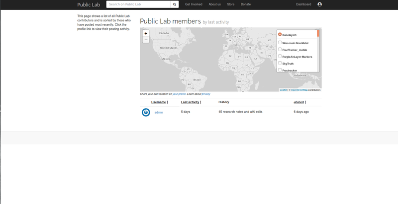
Currently the People's page looks like this
PROBLEMS
- The Page has too much black space and needs to be better arranged
- It is irrelevant to display so many layer options on the map here
- The table display can be changed to a card display to stand out
NEW PEOPLE'S PAGE
- It had a centered map to show user locations
- Displays users in the form of card
- Also arranges the user according to recent activity
- On hover displays the comments and questions and posts by the user
 __
__
3) Tags/Topics Page
Current Tags/Topics page
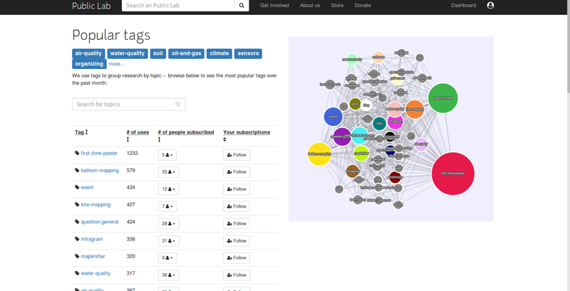
More info on issue https://github.com/publiclab/plots2/issues/5090
Changes to make
- making it 2-column
- adding https://publiclab.org/stats/graph in an iframe to the 2nd column
- adding the links below the graph
- Redesigning the search bar
NEW TAGS/TOPICS PAGE

4) Individual Tags Page
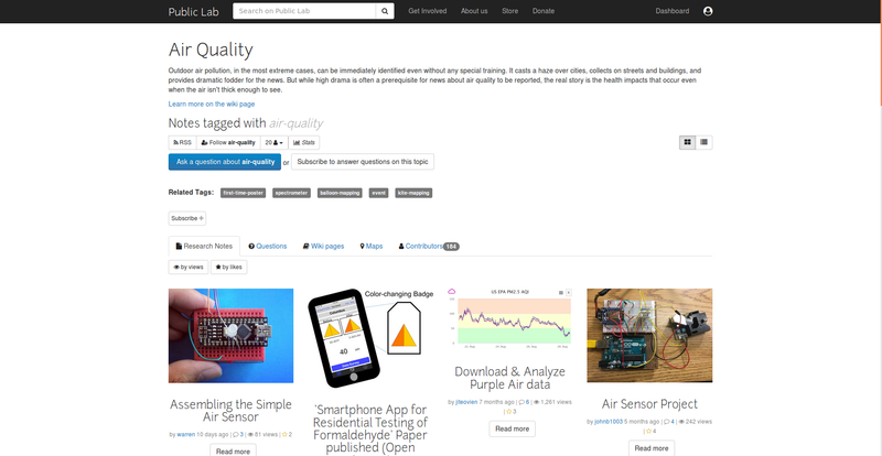
Current Look
PROBLEMS
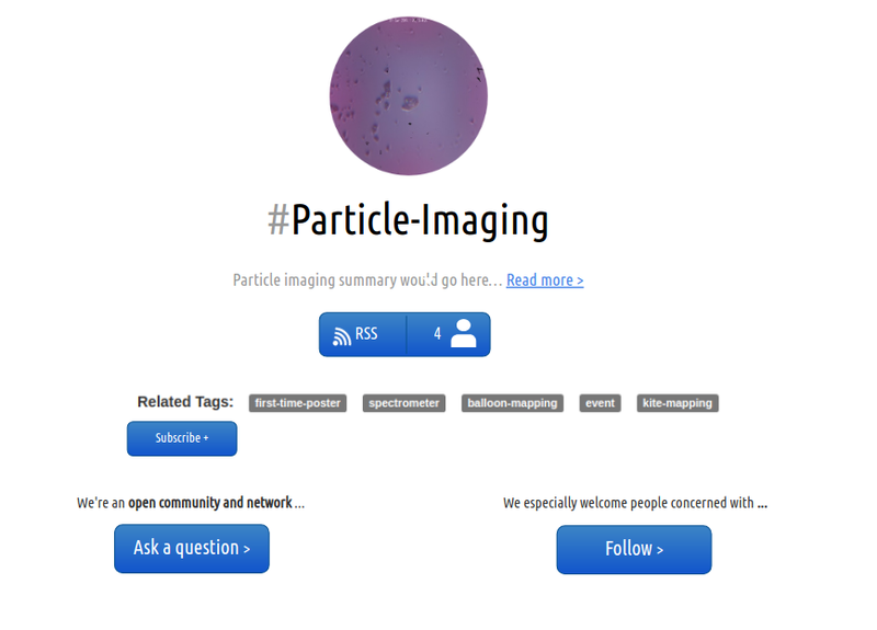
- The page looks cluttered and is not understandable to a new user
- No consistency in coloring of buttons.
- Subscribe button is not standing out on the page
- Nav bar looks crowed
- Card design can be used here for a clutter free neat arrangement
NEW TAG PAGE
- Display is using card design
- A read more button that explains more about the tag rather than crowding info on one screen like before
- Shows related tags for interested users
- All buttons are consistent in terms of color and stand out
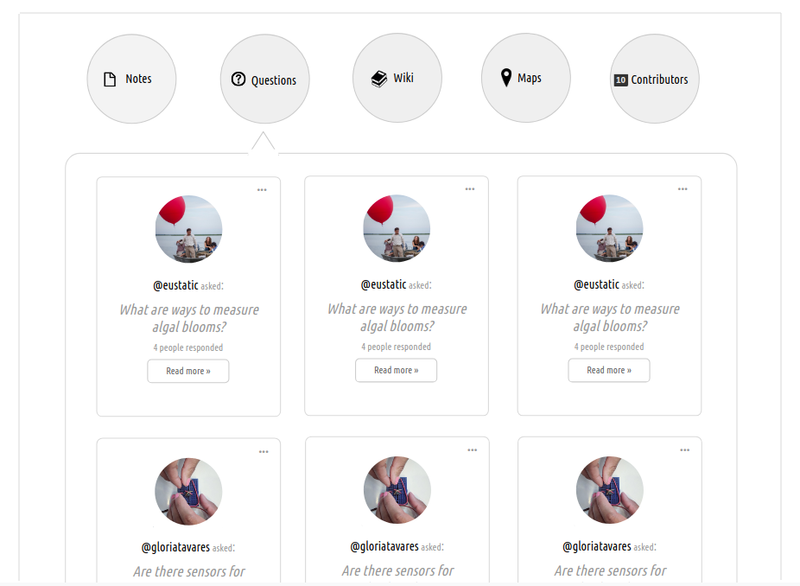
5) Questions Page
Current Questions Page
PROBLEMS
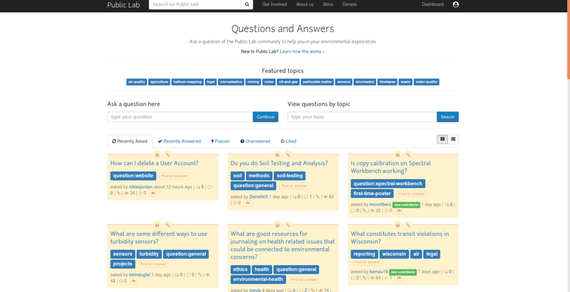
- The current UI is too cluttered and has too much information in one page
- Both asking questions and viewing other questions etc happen all on the same page which doesn't have much clarity
- 2 search bars on the same line doesn't look good and is too crowded
- Editor too can be centered and tooltips can be added to give instruction regarding all formatting options
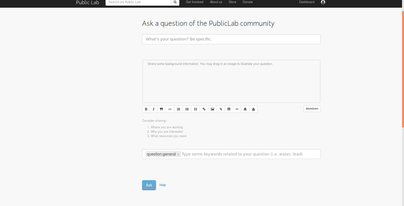
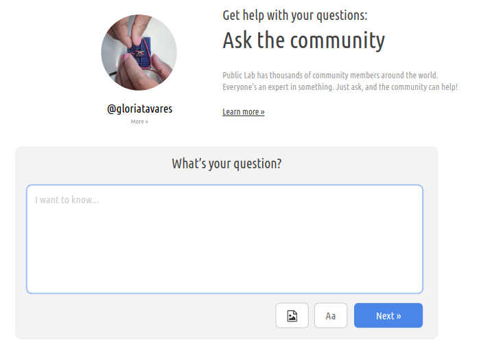
NEW QUESTIONS PAGE
- Adds more info regarding how to ask a question on clicking learn more
- Less cluttered and easily understandable UI
- Complexity in posting a question reduced with just a textarea to type out the question
- Also add featured questions and recent questions section to show a user the latest updates
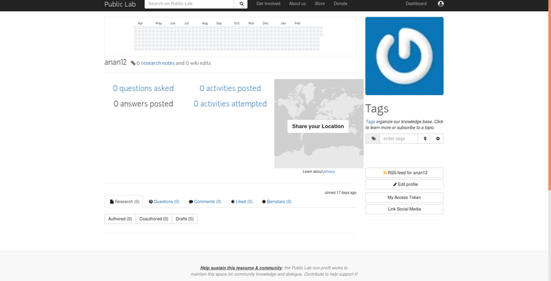
6) Profile Page
Current profile page
PROBLEMS
- Profile page is the most important page for a user and needs to be appealing
- Its too cluttered and not spaced out evenly
- The present design offers too much content in one page
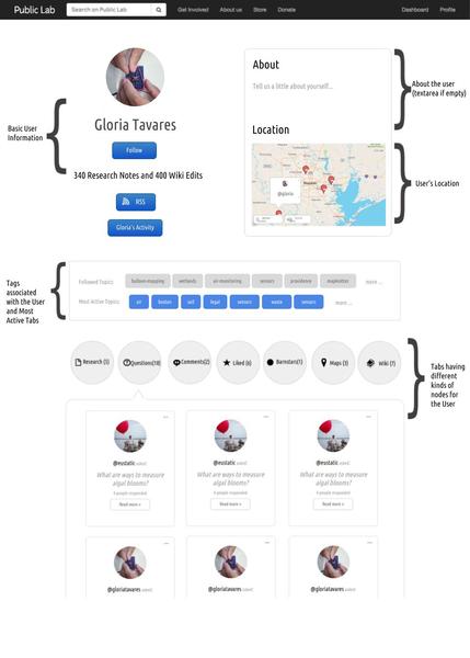
NEW PROFILE PAGE
- Shows all the relevant content in a neat manner
- Highlights the user profile picture and about and map sections on top
- Below follow tags according to user activity and most active topics
- Then the user can filter based on research, questions, comments etc and output is in a card format
Timeline/milestones
_____________________________________________________
TIME PERIOD TASKS
_____________________________________________________
PHASE 1
_____________________________________________________
May 20 - May 26 : Basic Dashboard
May 27 - June 2 : Personalize the Dashboard
June 3 - June 9 : Questions page
June 10 - June 16 : Editor part of questions page
Testing and feedback of phase 1 due
_____________________________________________________
PHASE 2
_____________________________________________________
June 17 - June 23 : FTO's, Documentation, Reviewing PR's
and other small UI changes in other pages
June 24 - June 30 : Start Profile Page (basic) and testing of developed features so far
July 1 - July 7 : Finish Profile Page (tabs,tags,topics)
July 8 - July 14 : Tags Page and testing of developed features so far
July 15 - July 21 : FTO's, Documentation, Reviewing PR's
and other small UI changes in other pages
Testing and feedback of phase 2 due
____________________________________________________
PHASE 3
_____________________________________________________
July 22 - July 28 : Individual Tags Page
July 29 - Aug 4 : People's Page
Aug 5 - Aug 11 : Other Leftover pages and testing
Aug 12 - Aug 20 : Other small pages and testing
Final Testing and feedback of phase 3 due
Needs
I would need the guidance and help of my mentors and community members in reviewing my work and finishing the project.
Contributions
- I have contributed to public lab repositories both frontend (in HTML CSS and JaveScript) and backed in ruby.
- As a contributor i have worked on solving bugs and fixing functionalities and reporting bugs and improvements as issues.
- I also helped create FTO issues to welcome newcomers into the community.
- I broke down big issues in 2-3 FTO's to encourage community growth and participation.
- I guided and reviewed the work of new comers to help them start contributing to public labs.
Issues created by me in plots2:
https://github.com/publiclab/plots2/issues/created_by/ananyaarun
PR's raised by me in plots2:
https://github.com/publiclab/plots2/pulls/ananyaarun
PR's raised by me in Leaflet-Environmental-Layers:
https://github.com/publiclab/leaflet-environmental-layers/pull/148
Experience
- I have been actively contribution to open source in the past one year.
I am a member of the opensource development group in my college (OSDG)
and a member of the Lean In circles to encourage
growth and participation in the women in tech community. - I'm a member of the coala organization.
I have fixed issues and reviewed issues in this org.
I have also helped new comers and am an active contributor.
Here are some of my work.
https://github.com/coala/coala/pull/5853
https://github.com/coala/projects/pull/661
https://github.com/coala/coala/pull/5540 - I'm a core member of the Virtual Labs organization known as VLED
which is an MHRD project to make Virtual online labs for all subjects.
I have reviewed over 70PR's in this community across the Labs and was
a mentor of the VLEAD bugathon held for collage students to help find
and fix bugs on github.
https://github.com/vlead - I have also contributed to systers community and sugarlabs in the past.
https://github.com/systers/mentorship-android/pull/137
https://github.com/systers/portal/pull/445
https://github.com/systers/malaria-app-android/pull/324
https://github.com/sugarlabs/musicblocks/pull/1217 I was mentor for the one million women to tech program this 2018 summer.
I helped and guided and worked with women all over the world to introduce
them and guide them to make small contributions to open source. Some of My projects:I have worked on a project for Open Street Maps organization.
A complete documentation of what i did can be found here.
https://github.com/ananyaarun/Open-Street-MapsI have worked extensively in web dev projects and game development in python Javascript and c++.
I have a strong hold of frontend development in HTML CSS and Java script
and have a strong knowledge of C, C++, Python, Reactjs, Nodejs Go , React native, OpenGL, WebGLNews App in Flask
https://github.com/ananyaarun/News-App-in-Flask- Quiz app in react and go
https://github.com/ananyaarun/React-and-Go-quiz-app - 3D adventure game in OpenGL
https://github.com/ananyaarun/3D-Adventure-Game - WebGL clone of subway surfers
https://github.com/ananyaarun/Subway-Surf - Jet pack Joyride in OpenGL
https://github.com/ananyaarun/Jetpack-Joyride - Mario game in Python
https://github.com/ananyaarun/Mario
Teamwork
I have also worked on the following internships and projects in teams before
- VIRTUAL LABS
Built a virtual Data Structures Lab for MHRD.I worked with a team of 20 interns.
Used pedagogy techniques and literate programming with several Javascript
libraries to deliver a working app in 2 months. Hosted links http://exp-vlabs.iiit.ac.in/demo.html - BUTTERFLY EDUFIELDS
Worked in a team of four to design a mobile application tool which parses information
such as data or an image through a template e.g. Excel or Jpg and outputs a clickable Html-5 format concept map.
Due to copyright agreement with the company, Source code is not available. - SCHROCKEN INTELLIGENT MACHINES
Working with a team of 3 and my mentor to Implement a Proof of Concept for demonstrating
"anonymous communication" from one-to-many parties on Hyperledger Fabric Blockchain using
Zero Knowledge Proof (ZKP) technology.
Passion
I am inspired by the motive of Public Labs to provide a better and cleaner world to live in. From childhood i have strongly felt the need for environmental conservation. I also love science and the very idea of DIY experiments to learn stuff excites me.
Improving the website for public labs would encourage better participation and promote a wonderful community to unite and discuss problems and make a change to this world. If i can be a small part of this change it would definitely mean something :)
Audience
The target audience ie mainly of the age group 13-60 are perhaps the end users of publiclab.org. Improving UI has a direct impact on user experience and the end result of this project would achieve a easily understandable and usable version of the website along with changes to make the UI more appealing after considering various design aspects and choices. This forum is a perfect example of technology meets nature and science and I would love to see people benefit from it.
Commitment
I have no other academic commitment in the months of may june and july and am ready to be fully dedicated and committed to this project and do my best in finishing it.

5 Comments
Hey everyone, This is my initial draft of my outreachy application. @warren @gauravano @cess @bansal_sidharth2996 kindly review my draft and let me know if there is more to add. I'll continue to keep updating it too with minor changes and improvements :) Thanks!!
Reply to this comment...
Log in to comment
Great proposal Ananya! Although, your timeline looks good, but I think you should reserve some time for testing and feedback. You can also refer to the @warren's comment - https://publiclab.org/notes/lekhidugtal/03-23-2019/soc-proposal-enhancing-the-ui-of-publiclab-and-relevant-changes-to-server#c23398 which highlights how we can test the work.
Also, I liked that you've given time for FTOs in timeline 👍
Thanks!
Thanks @gauravano !! I'll have a look at previous comments and incorporate the changes to my proposal :)
Reply to this comment...
Log in to comment
Hi @anan12! I really like your approach on dividing the topics into bullet points for better readability. Just a few questions that I mentioned here.
Thank you for sharing your proposal with us! We are here to help! 🎉
Is this a question? Click here to post it to the Questions page.
Hi @rexagod , Thanks for the feedback :) I'll definitely work on improving my proposal and add more info/code/tests !!
Reply to this comment...
Log in to comment
Login to comment.