(This template is for students applying to summer code programs with Public Lab. Use this link to start writing a post: https://publiclab.org/post?n=899&tags=soc,soc-2019,soc-2019-proposals You can delete this line once you've started filling it out.)
About me
I am called Ajongafac Zinkeng Mbetem, a third year software engineering student at the university of Buea Cameroon. Having a huge desire to learn and help others with my knowledge, I am passionate about open source projects because it permits me to learn and contribute to the development of a software product which is free. As a student, we often do not have the finances to purchase software products, as such, we rely on free open source or community products. Since I use open source products without pay, I thought it wise to also be a contributor to open source projects so other students like me can use for free. To this regard, I applied for the outreachy summer code program which link up students with open source project so they can contribute to it.
Affiliation: University of Buea
Location: Cameroon
Github: https://github.com/Zinkeng
Project description
Infragram is an online tool for analyzing plant-health with near infra-red imagery. It brings together a range of different efforts to make Do-It-Yourself plant health comparisons possible with infrared photography. It also allows for live streaming from a modified webcam. This project aims at improving the UI for the infragram full screen, making it more user friendly and increasing the user experience by beautifying the image-container, adding a filter option on the Q&A section, adding a navigation bar, creating another page for the Q&A section and also modifying the footer section.
Abstract/summary (<20 words):
To modify the UI of the infragram website, to improve the user interface and make it more user friendly.
Problem
1. The image-container not properly aligned.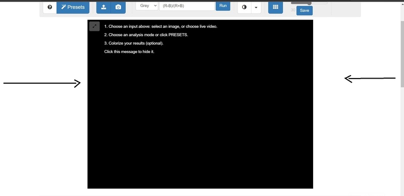
2. No page and no filter option for the Q&A section making it difficult to see already answered question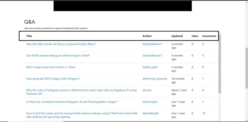
3. Footer section not properly styled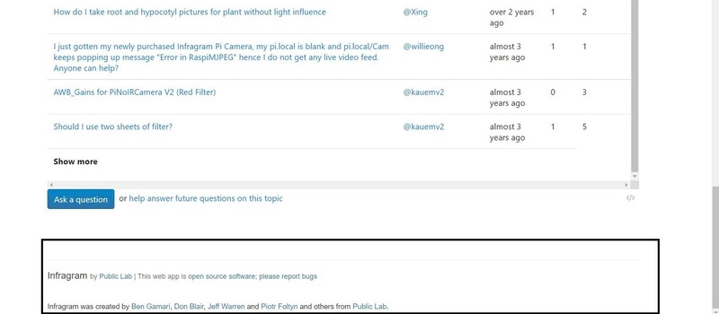
4. No navigation bar, without proper navigation, users can get confused on opening the page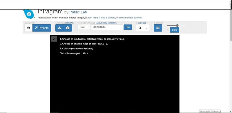
Proposed solution
1. The image-container could have a border around it to make it properly aligned, extending from the top bar to the bottom.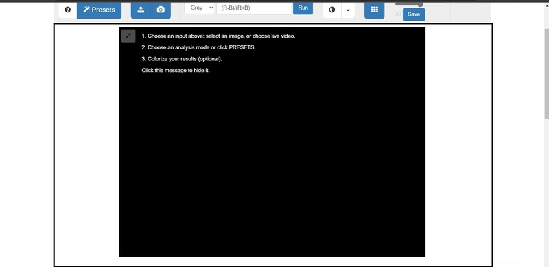
2.The Q&A section could be on a new page and have a filter option where users can filter questions according to some key words or phrases in order to help them easily locate already answered questions and give them a better user experience.
3.The footer section could give some space from the Q&A section before it being visible and could contain some links to the public lab infragram website.
4. Creating a navigation bar would help in the accessibility of the website, make it properly organized and will help improve the user experience. Users can easily find where to go like for example, to go to the Q&A page, to know about public lab and infragram by going to the About page and equally to learn more about the website.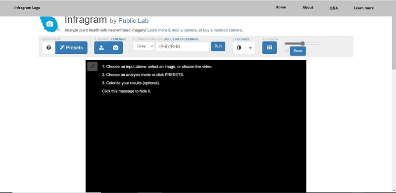
Timeline/milestones
Week 1(May 30 - June 5): Interact with the community, get to know the mentors, understand the design and UI and know how to tackle it, discuss the process with mentors.
Week 2(June 6 - June 12): Start off in implementing the new design for infragram, adding libraries into the design, creating files for the implementation of the design for modifying the image-container.
Week 3(June 13 - June 19): Working on the question and answer section, adding the filter option and making it active, Get feedback from mentors.
Week 4 (June 20 - June 26): Design a navigation bar, getting feedback from mentors, create an FTO issues.
Week 5 (June 27 - July 3): Start implementation of the navigation bar, adding hovering over links and making them active.
Week 6 (July 3 - July 10): Creating a designs for the Q&A section, the About page and the Learn more page, discuss and getting reviews from mentors.
Week 7( July 11 - July 17): Work on implementing the "Q&A" page, "About" page and the "Learn more" page, communicating with mentors and getting feedback from them.
Week 8 (July 18 - July 24): Test changes on the pages and linking these pages, getting reviews from mentors, creating FTO issues.
Week 9 (July 24 - July 31): Designing a new footer section, getting feedback from mentors.
Week 10( August 1 - August 8): Work on designing the footer section, getting feedback from mentors.
Week 11 (August 9 - August 17): Work on implementing the new design for the footer section, testing all links and getting feedback from mentors.
Week-12 (Aug 15 - Aug 21): Do general check up on the UI, checking codes for errors, making sure the spacings, font size and text, alignment are all good, start documentation.
Week-13 (Aug 22 - Aug 26): Test run the new UI, get review from mentors and finalize documentation.
Needs
I will love to get feedback and response from mentors, will need assistance, guidance and contributions from mentors and my fellow colleagues._
First-time contribution
- Open issues: https://github.com/publiclab/plots2/issues/10883
- Open issues: https://github.com/publiclab/plots2/issues/10153
- Closed PRs: https://github.com/publiclab/plots2/issues?q=mentions%3A%40me+is%3Aclosed
Experience
Entering the university and being an engineering student exposed me to the world of computer engineering. I got engaged in writing codes, doing other computer related projects and got familiar with frontend development. I am quite familiar with web development technologies like HTML, CSS, Javascript, sql and the bootstrap framework. I equally have some knowledge in python. Have worked on a bootcamp project to develop a plugin for a company named Zuri.
I equally have experience in UI/UX design and graphic design
Here is a github link to what I have done so far: https://github.com/Zinkeng
Teamwork
I have actively participated in group projects, be it in school and out of school. Have been an assisting team lead for the frontend development of a website. I have worked in a team to develop an application for a Zuri app and worked on a plugin for the application. This improved my team work spirit and made me to understand how working as a team feels like. The zeal to make my team stand out drove me and I had to work harder, helping my other team mates when they are stuck.
Passion
Contributing to open source has been my passion ever since I heard about open source and have had interest contributing to open source, working with great minds and learning from others. I am really grateful for coming across the Public Lab open community and their "infragram project" that collaboratively provide and develops accessible, open-source, do-it-yourself technology for investigating local environmental justice challenges. I equally believe that everyone has the right to contribute to an open source and everyone's opinion can be heard regardless of the color, size, background, sex and age.
Audience
Plant health is very important in our society as it serves as food and provides oxygen for animals to live on, amongst its many other uses. So plant health is a vital aspect we need to analyze in our society. Technology which is also growing rapidly and fast has a wide range of application. So technology can be applied on plants in order to check their health, making it more welcoming and user friendly.
Commitment
I do understand that this is a serious commitment I am applying for and I am equally willing to devote my time during this Outreachy internship from May - August 2022, working 40 hours per week.

3 Comments
@mathildaudufo, @warren here is my proposal, please could you kindly review ? Your feedbacks are highly welcome. Thank you
Is this a question? Click here to post it to the Questions page.
Reply to this comment...
Log in to comment
Hi @ajongafaczinkeng, I have some feedback:
I have seen the mock-ups on how we can improve the current UI, we would like to see how exactly the page will look like, represented in the mock-ups. e.g you show how the stretch screen will be on proposed solution 1, if you plan to have the box black as is currently, fill the box in black so that we can see how the new page will look like. Hope this makes sense.
There is also some contraction in the information under "proposed solution" and tasks under "milestones/timeline" e.g on the proposed solution 2 and 3 you talk of the improvements of the "Q&A" section and in milestones week 7, you have a task of "creating a Q&A page. Kindly iron these out for clarity. Thanks for posting
Okay thank you @cess, will do just that
Reply to this comment...
Log in to comment
Login to comment.