About me
Hello, I am Isha, a 2nd-year undergrad student at IIEST Shibpur.
Here are my details:
Full name- Isha Agarwal
College- Indian Institute of Engineering Science and Technology Shibpur (IIESTS)
Course Major- Mechanical Engineering
Year of Graduation- 2024
Github- https://github.com/Ishhha
LinkedIn- https://www.linkedin.com/in/isha-agarwal-774091222/
Discord handle- Isha Agarwal#6348
Primary email - agarwalisha121@gmail.com
Secondary email- 2020meb086.isha@students.iiests.ac.in
Location- Jaipur, Rajasthan, India
I am an enthusiastic developer and love to code. I started learning development after the 2nd semester with the basic knowledge of C, C++, and competitive coding. Later after exploring CP, Coding, Hackathons, and development, I found my interest in designing websites is much higher than in other fields. Hence, I decided to brush up on my front-end development skills.
I have experience with HTML, CSS, Bootstrap, Javascript, Jquery, and Figma to create responsive websites. I am willing to explore and learn more in the tech field. My motive is to add something meaningful to the tech community.
I am contributing for the first time to open source. I have tried my level best to submit the useful UI for the Infragram. I will be glad if you review it, it will be helpful for me to improve my mistakes.
I have done free boot camps and learned more about front-end development from the Udemy courses to perfect my designing and front-end developer skills.
I am currently a part of my college coding club and GDSC IIEST. Also, volunteered in mentoring kids and friends in my surrounding, who want to opt for STEM fields as their careers and share my knowledge and resources with them for the improvement of the community.
Project description
Designing a new full-screen user interface for Infragram.org
The Infragram project brings together a range of different efforts to make Do-It-Yourself plant health comparisons possible with infrared photography. Infragram.org enables people with Infragram-modified cameras to upload photos for analysis and conversion using techniques like NDVI (used in satellite imaging analysis). It also allows for live streaming from a modified webcam. This project will overhaul the UI of Infragram to be full-screen and create space for new features like multiple resolutions of video, dragging in a recorded video instead of a still image for conversion, and pop up panels with Q&A, tips, tutorials, and more, so that they can feature more helpful guidance text.
Abstract/summary (<20 words):
To create and implement a new and improved full-screen UI for Infragram.
Problem
Poor UI of Infragram Home page. It does not have a proper layout and there are so many hyperlinks added in between the paragraph.
As a user, it's difficult to understand the UI in one go. It's like messing up everything on a single page with no proper sections, it also does not contain proper information about how the website work, for what it is used.
There are many hyperlinks that land up on the same page and few of them are not found.
Poor CSS styling like font size, font style, color combination, and minimal use of Bootstrap. Lack of responsiveness in the website while switching from Laptop to mobile.
Double scroll bar in the QnA section.
The header section lacks quick links to the website.
The Footer section is not clearly defined.
Below is the current UI of the Infragram:
.
What problem(s) does your project solve?
To sort all these problems, I have designed a wireframe of the website that is easy to understand by the users.
Made Proper division of the sections with the appropriate layout.
Also, the links are added in the proper place and in a specific order. Repeated and not found page links are removed. So that users can understand easily and click accordingly.
1. This screenshot contains the navbar and the analyzing section:
Navbar:
-> Logo is something that depicts an image of what the website/product/company means.
As Infragram is related to plant photography, here is my logo proposal:
 and
and 
-> Clicking over the logo or the Infragram(label), we return to the home page.
-> Navbar will be static, as you hover over the nav links it will change its color.
-> Navlinks will direct to the respective sections on the website.
-> Question mark icon is for the help menu, which will direct to a new page.
-> Moon icon is to enable the dark mode. If you are in dark mode then it will show the sun icon, which is to enable the light mode.
-> Dark mode has a different background, icons, and text color.
Body section(Analyze your photos):
-> This section will have a background image. Its background image will have 2 parts, one is the actual/original photo and the other one is the photo after analyzing the first photo through Infragram.
I want to create the background change effect using the sliding option. So that user can see the difference between the actual photo and the one which is passed through the Infragram camera by sliding the circle in the horizontal direction.
Link: https://www.youtube.com/watch?v=Z7kmaWcMJBY&t=26s (similar to this)
-> Then there is a little description of what Infragram does.
-> There are two buttons, one is for directing users to the Infragram camera page (i.e. https://infragram.org/sandbox/index.html) and another one is to direct them to the DIY filter pack/Mooded camera (i.e. https://store.publiclab.org/products/infragram-diy-filter-pack).
-> First button will be highlighted, as to grab the user's attention to our Infragram camera.
-> Buttons will be styled with a hover effect, and appropriate boxing, and when the dark mode is enabled the color of the button will be changed.

2. This screenshot contains the Information part (About us):
-> Here I added the cover flow carousel effect with slide-changing icons. In these slides, I added answers to the questions like, What is Infragram? , How does it work? , Why do we need it? , adding information like it's open-source, you can report bugs with the respective button ( links ) at the bottom of the slide, similar to the "Learn more" button.
-> Also about the near-infrared camera, multispectral imaging, and balloon mapping with their respective Wikipedia link buttons at the bottom.
-> "Learn more" button will direct to the Wikipedia of the Infragram (i.e. https://publiclab.org/wiki/infragram).
-> Also we can add some pictures which will show the difference between the Grey, RGB, and HSV types in the Infragram camera.
-> Sliding changing icons are there on the leftmost and the rightmost side for changing the slides.

3. This screenshot contains the Gallery section:
-> The button at the top of the gallery section will direct users to the page which will contain all the images that are uploaded by contributors or the saved images. Hovering over the button will change the color of the button.
-> I have taken care of all the hyperlinks, present in both the image section on the current website, and added all the links where needed. Removed the repeated and not found page links.
-> Next comes to the photo layout, Hovering upon the image will give users a bit enlarged image than the previous, and clicking on the image will land users on that particular image page.
-> Similarly, clicking on the caption of the image will direct to the same page, i.e. that specific image page.
-> Clicking on the username will direct users to the username profile page.
-> Hovering over the eye icon will show the total number of views.
-> Hovering over the heart icon will show the total number of likes and clicking on it will add one like for that image from the user side.
-> Last is the comment icon, hovering over it will show the total number of comments. Clicking on the comment icon will direct users to that particular image page.
-> Only 8 images will be shown on the website and those 8 images will be according to the highest number of likes on that image.

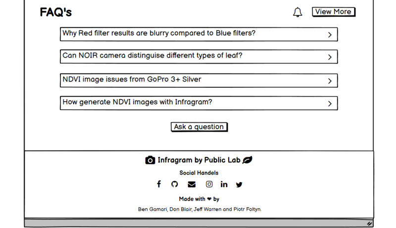
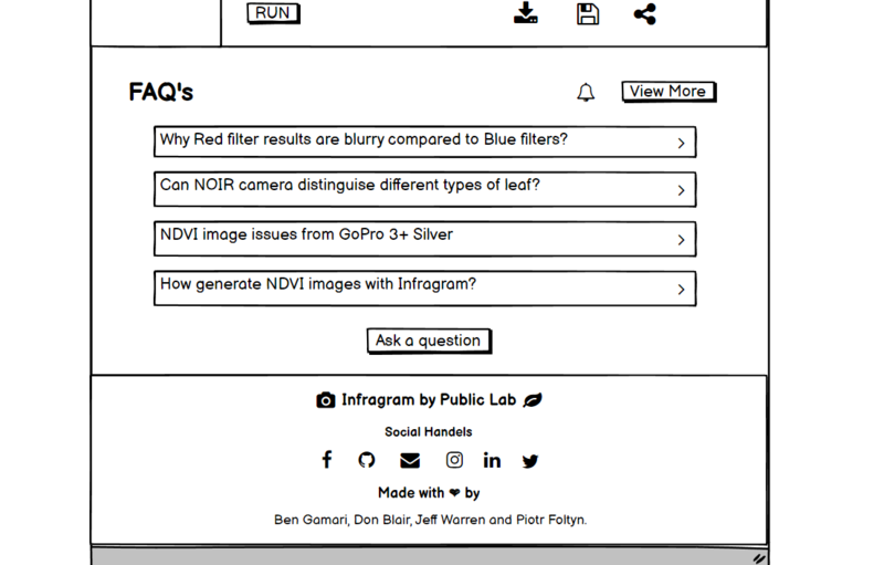
4. This screenshot contains the FAQ section:
-> The "view more" button at the top of the FAQ section will direct users to the page which will contain all the questions. Hovering over the button will change the color of the button.
-> Bell icon is for the subscription page (i.e. https://publiclab.org/subscriptions). Hovering over it will show the text "Subscribe".
-> Then the question bar is there, clicking on the bar will lead users to that particular question page. Also hovering over it will enlarge the bar a little bit.
-> In the last of the FAQ section, there is a "Ask a question" button which will direct users to the question posting page (i.e. https://publiclab.org/questions/new?tags=question:infragram,infragram&template=question&title=How do I...&redirect=question).
-> Only the 4 most liked questions will be there on the main page, the rest of the questions are on the page which will be directed through the "View More" button.

5. This screenshot contains the Footer section:
-> The heading "Infragram by Public Lab" in the footer section should depict the purpose of this website, for this reason, I added the camera icon and the leaf icon which depict that this website is related to plant photography. Clicking upon the "Infragram" will direct users to the top of the page and Clicking on the Public Lab will direct users to the public lab website (i.e. https://publiclab.org/dashboard). Hovering on the words will change the color of the text to indicate to the users that the word is a clickable text.
-> Then comes the social handles, these icons will direct users to the Infragram social media pages according to the icons. The hover effect is there in these icons, hovering on it will show the social media name above the icon and the icon will change its color.
Link: https://www.youtube.com/watch?v=ETvRZgrcFj8&list=LL&index=8&t=124s (similar to this)
-> At the last of this website, the names of the owner of the website are there. Clicking on it will lead users to the respective profile pages of the owner. Hovering on it will indicate to users that it is a clickable text. on hovering, the text will have a different color.
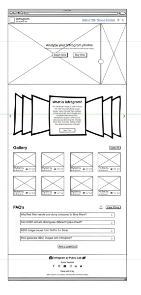
Complete UI of the website:
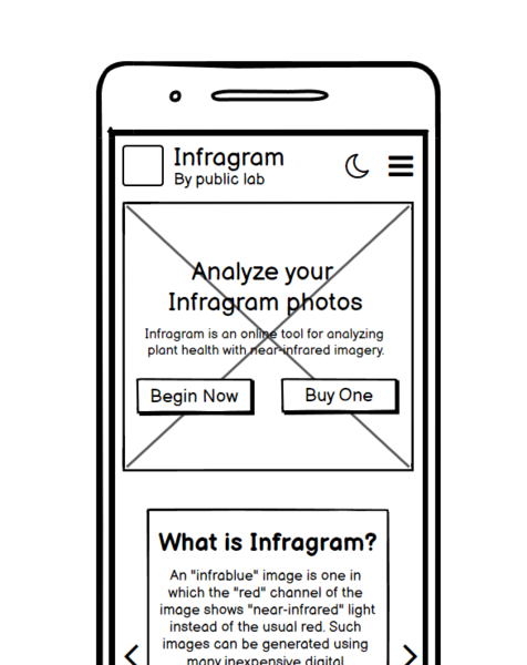
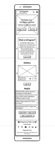
Mobile Layout of the Infragram page:
(i.e. https://infragram.org/)
-> Here is the responsive mobile layout of the Infragram webpage.
Navbar:
-> On top, the Infragram logo, Infragram By Public lab (label) is there. Clicking on Infragram will lead users to the Infragram home page (i.e. https://infragram.org/) and clicking on Public Lab will direct users to the Public Lab page (i.e. https://publiclab.org/dashboard).
-> The moon icon is for switching the theme to dark mode. In dark mode, there will be a sun icon to switch the theme to the light mode again.
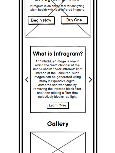
-> Toggle button is there for showing all the navbar links. The image shown below shows how it will look and work after clicking on the toggle button.
--> Gallery will direct users to the Gallery section. Similarly, these nav links will direct users to their respective sections on the web page.
--> Help option will lead users to a new help page.
--> On clicking again on the toggle button will close this navbar link menu.
Body Section (Analyze your Infragram photos):
-> It has an image in the background.
-> There is a little description of what Infragram does after the label.
-> There are two buttons, one is for directing users to the Infragram camera page (i.e. https://infragram.org/sandbox/index.html) and another one is to direct them to the DIY filter pack/Mooded camera (i.e. https://store.publiclab.org/products/infragram-diy-filter-pack).
-> First button will be highlighted, as to grab the user's attention to our Infragram camera.
About us ( What is Infragram? ):
-> Slide effect is there. In these slides, I added answers to the questions like, What is Infragram? , How does it work? , Why do we need it? , adding information like it's open-source, you can report bugs with the respective button ( links ) at the bottom of the slide, similar to the "Learn more" button.
-> Also about the near-infrared camera, multispectral imaging, and balloon mapping with their respective Wikipedia link buttons at the bottom.
-> "Learn more" button will direct to the Wikipedia of the Infragram (i.e. https://publiclab.org/wiki/infragram).
-> Also we can add some pictures which will show the difference between the Grey, RGB, and HSV types in the Infragram camera.
-> Sliding changing icons are there on the leftmost and the rightmost side for changing the slides.
Gallery:
-> It also has a slide effect with slide-changing icons. The slide consists of an image that has a caption, username of who uploaded it, number of views, likes, and comments.
-> Clicking on the image or the caption or the comment icon will lead users to land on the specific page of that image.
-> On clicking upon the username will direct users to the username profile.
-> Clicking upon the view and like icon will show the number of views and likes respectively.
-> "View All" button which will direct users to the https://publiclab.org/tag/infragram-upload page.
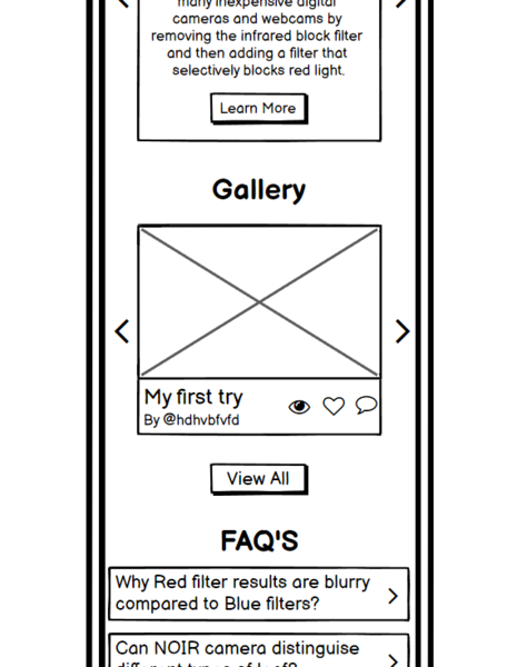
FAQ Section:
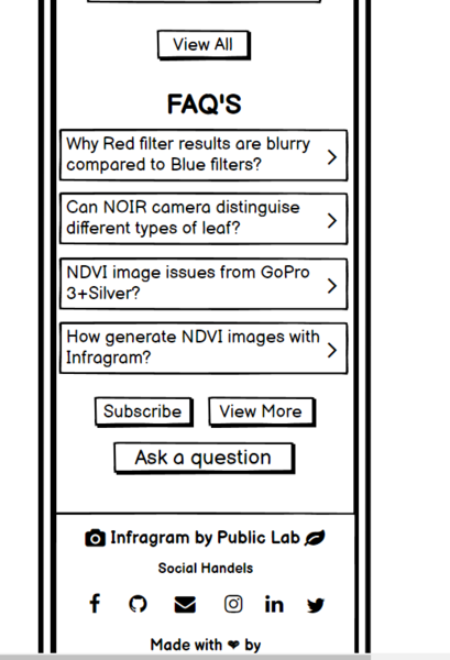
-> 4 most liked questions will be shown on the page and the rest will be on another page. To view, all the questions users have to press the "View More" button.
-> Clicking on any of those 4 question bars will lead users to that particular page of the question.
-> By clicking on the "Subscribe" button users will get a notification whenever a new question is posted or answered.
-> Through the "Ask a question" button users can post their questions on https://publiclab.org.
 **
**
Footer Section:
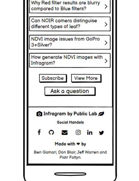
-> Clicking on the Infragram label will lead users to the https://infragram.org/ page and the public lab label will direct users to the https://publiclab.org/dashboard page.
-> Icons on both sides are for the users to relate those icons with the use of the Infragram i.e. analyzing plant health with near-infrared imagery.
-> Then there are social handle icons that have their respective meaning which will lead users to their respective social pages.
-> In the last, owners' names are there which is a clickable text and directs users to their respective profile pages.
 **
**
Complete UI on the mobile:
Problem
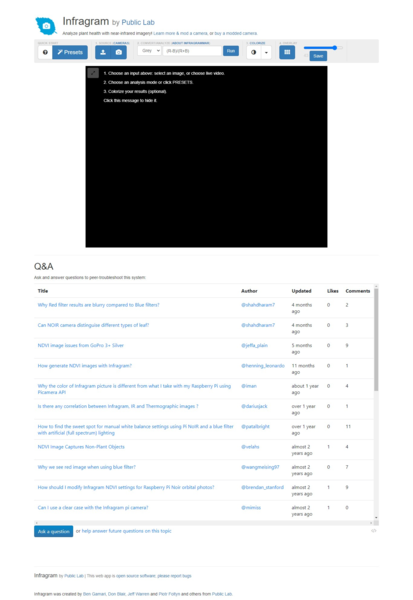
Here, the toolbar of the Infragram sandbox (i.e. https://infragram.org/sandbox/index.html) looks congested and has too many links in the text which are not easily identifiable.
- It does not have a clear hierarchy of components.
- Too much space is there on both sides which are left unused.
- It does not have a proper guiding bar that can guide new users on how to proceed with the Infragram sandbox tool.
- Does not have proper spacing and padding.
- Repeated links are there that land up on the same page and some linked pages are not found.
- Lack of responsiveness while going from full-size screen to mobile size.
- Pop up window could be better in terms of User Interface.
- Lacks drag and drop option.
- It does not have a navigation bar.
- All the questions are on the sandbox page.
- The Footer section is not precisely designed.
Below is the current UI of the Infragram Sandbox:
Below is the current pop-up window UI:

What problem(s) does your project solve?
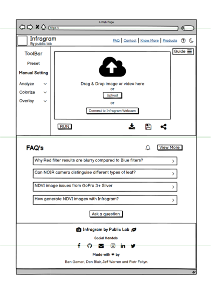
To sort all the problems like the arrangement of the toolbar, navbar, and drag and drop feature, I have designed a wireframe of the website (i.e. https://infragram.org/sandbox/index.html) that is easy to understand by the users. Also easy to proceed with the Infragram toolbox.
Made Proper division of the sections with the appropriate layout.
The links are added in the proper place and specific order. Repeated and not found page links are removed. So that users can understand easily and click accordingly. Also, a guide bar to navigate users on how to proceed with the Infragram toolbox.
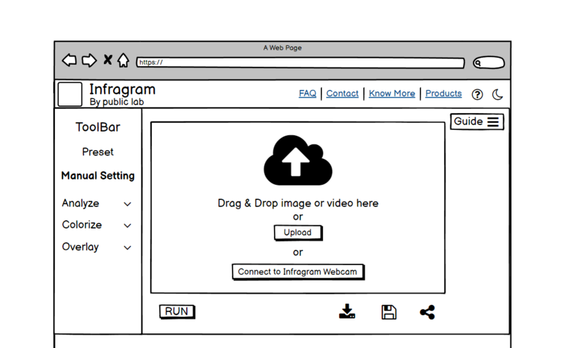
1. This screenshot contains the navbar, toolbar, drag-drop feature, and the guide bar:
Navbar:
-> It contains the Infragram logo and name, clicking upon the label will land users at https://infragram.org/ website page.
-> On clicking on the Public Lab label will users to the https://publiclab.org/dashboard page.
-> Then there are navigation links, clicking upon "FAQ" will direct users to the FAQ section on this page.
-> "Contact" nav link will direct users to the Footer section of the page.
-> On hovering or clicking over the "Know More" nav link will show a menu bar for learning more about the options given there.
Menu options:
Infragram: https://publiclab.org/wiki/infragram
Infragram Sandbox: https://publiclab.org/wiki/infragram-sandbox
Infrared Camera: https://publiclab.org/wiki/near-infrared-camera
Multispectral Imaging: https://publiclab.org/wiki//wiki/multispectral-imaging
Colormap: https://publiclab.org/tag/colormap
Contributors: https://publiclab.org/contributors/infragram
-> On hovering or clicking over the "Products" nav link will show a menu bar that contains links to the products which users can buy.
Menu options:
Infragram DIY filter pack: https://store.publiclab.org/products/infragram-diy-filter-pack
Balloon Mapping Kit: https://store.publiclab.org/products/balloon-mapping-kit
-> Question mark icon is for the help menu, which will direct to a new page.
-> Moon icon is to enable the dark mode. If you are in dark mode then it will show the sun icon, which is to enable the light mode.
-> Dark mode has a different background, icons, and text color.
ToolBar:
-> It contains all the tools present on the https://infragram.org/sandbox/index.html page.
-> Preset will open a pop-up window to select the predefined filter for the image or video the user will select.
* There is a cross icon on the top right side to close the pop-up window.
* Then there are 3 options for choosing the presets, each card contains the heading, a small description, and the buttons to choose the preset option.
* Clicking on the button will automatically change the settings according to the preset user chooses and close the pop-up window.
*
In last, the line contains clickable links to the
https://publiclab.org/dashboard page and a mail.
-> Then it has a manual setting option if the user wants to choose the options to analyze and colorize settings manually.
-> In the last of the toolbar, the Overlay setting option is there.
-> Only 1 setting option from the analyze, colorize and the overlay will open at once. If one option is open and the user clicks on the other option to open that then the previous will automatically get closed.
Drag-Drop Feature:
-> It is for uploading images or videos through multiple options like users can drag and drop or can browse through the upload button or can connect to the Infragram Webcam.
-> "Run" button is for applying all the changes to the image or the video user has uploaded.
-> "Download" icon is for downloading the image or the video on the user's local device.
-> Another is the Save icon which will post the filtered image or the video on the Public Lab.
-> Next is the Share icon which is to share the filtered image or the video.
Guide Bar:
-> It is a toggle sidebar when the user needs guidance regarding how to proceed with the Infragram Sandbox, then the user can click on the Guide toggle button.
-> It will open a sidebar (as shown in the image given below).

-> It is divided into steps for ease in the understanding by the user.
-> By clicking on the heading of the step, it will show a further description of the heading, so that the user can understand it properly and can go through these steps easily.
-> If one step is open (showing the description) and the user clicks on the next step then the previous step will automatically get closed and another will get open simultaneously.
-> If the user clicks on the Guide (label) then the toggle bar will close and only the toggle button will be shown.
2. This screenshot contains the FAQ section and the Footer section:
-> It is similar to the main page (i.e. https://infragram.org/) FAQ section and the Footer section.
The complete layout of the website:
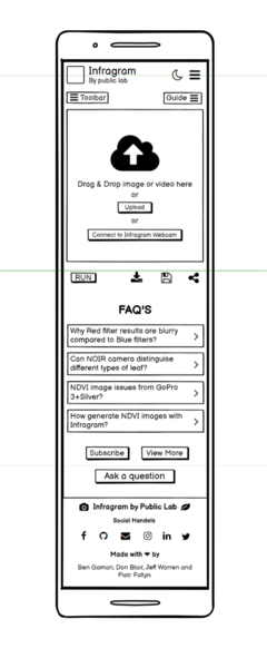
Mobile Layout of the Infragram Sandbox page:
(i.e. https://infragram.org/sandbox/index.html)
-> Here is the responsive mobile layout of the Infragram Sandbox webpage.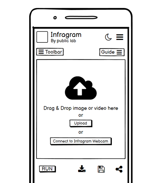
Navbar:
-> On top, the Infragram logo, Infragram By Public lab (label) is there. Clicking on Infragram will lead users to the Infragram home page (i.e. https://infragram.org/) and clicking on Public Lab will direct users to the Public Lab page (i.e. https://publiclab.org/dashboard).
-> The moon icon is for switching the theme to dark mode. In dark mode, there will be a sun icon to switch the theme to the light mode again.
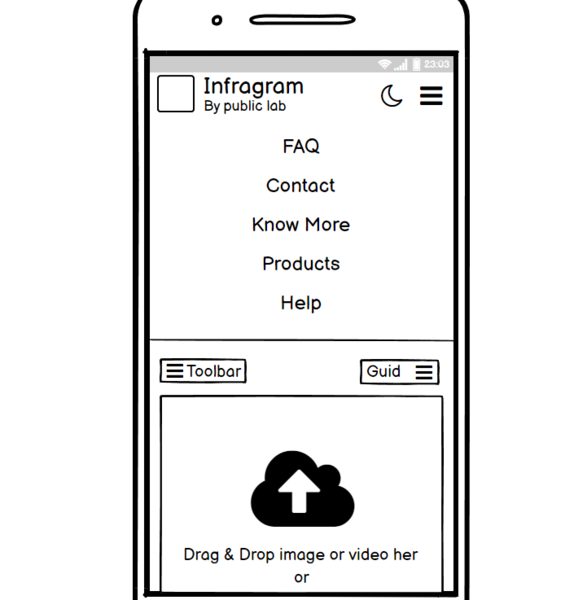
-> Toggle button is there for showing all the navbar links. The image shown below shows how it will look and work after clicking on the toggle button.
--> It has an FAQ that will direct users to the FAQ section on that webpage.
--> Contact will be direct to the contact section on the webpage.
--> Clicking on the know more will open a further list of things that are mentioned earlier in the website layout. Similarly for the products.
--> Help option will lead users to a new help page.
--> On clicking again on the toggle button will close this navbar link menu.
Toolbar:
-> It is also a toggle button. On clicking on it, will show a menu like shown below.
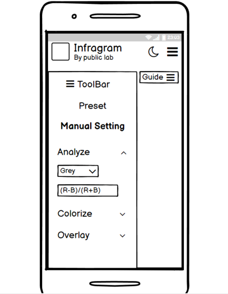
-> It has the same features as explained in the web page layout.
-> Clicking on the preset button will open a pop-up window (shown below in the image).
--> Cross icon will close the pop-up window.
--> It has a heading, a little description, and buttons for the specific settings.

-> If an option (from analyze, colorize and overlay) is open and the user clicks on another option then the previous option will automatically get closed (basically, only one option will be open at a time).
-> Clicking again on the ToolBar label will close this Toolbar menu.
Guide Bar:
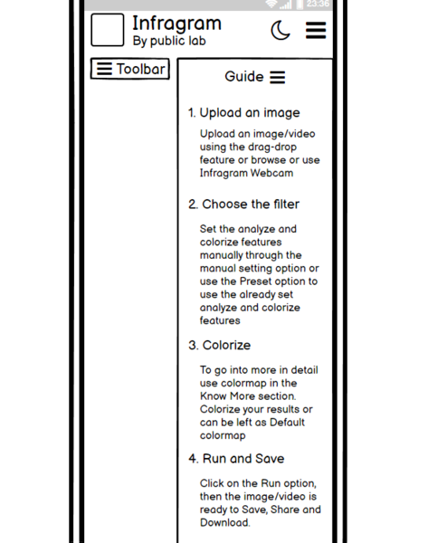
-> It is also a toggle button. On clicking on it, will show an information bar like shown below.
-> It is divided into steps that have a few lines of description for navigating new users on how to proceed with the Infragram toolbox.
-> Clicking again on the Guide label will close this sidebar.
Drag-Drop Feature:
-> Next is the drag-drop feature which has the same functionality as in web layout.
-> User can drag and drop or upload or connect to the Infragram Webcam.
-> Run button is to apply the changes and further icons are for downloading, saving, and sharing the image or the video.
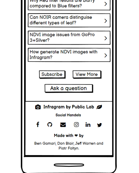
FAQ Section:
-> It is similar to that on the main page.
-> Top 4 most liked questions will be shown on the page, and the rest will be shown on the question-answer page. Users can view more questions by clicking on the "View More" button.
-> Clicking on the question will lead users to that particular question page.
-> Users can subscribe to the question page by clicking on the subscribe button.
-> Ask a question will lead to a page where user can post their questions.
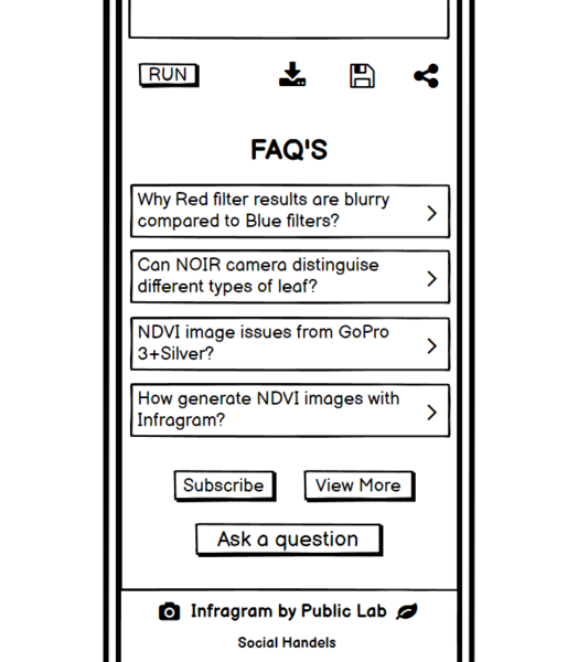
Footer Section:
-> Clicking on the Infragram label will lead users to the https://infragram.org/ page and the public lab label will direct users to the https://publiclab.org/dashboard page.
-> Then there are social handle icons that have their respective meaning which will lead users to their respective social pages.
-> In the last, owners' names are there which is a clickable text and directs users to their respective profile pages.
Complete UI on the mobile:
Timeline/milestones
Break your project up into small projects -- one per week!
See this page for guidance on breaking your plan up into small, self-contained parts: https://publiclab.org/notes/warren/01-18-2018/software-outreach-modularity-is-great-for-collaboration
Week 1:
-> Connect with the community and come to a conclusion on the design drafts/mockups and set up the working environment.
-> Interact with mentors and understand the UI and different use cases.
-> Make changes to the UI, timeframe, and implementation as advised by the mentors and collaborators.
Week 2:
-> Create FTOs wherever possible.
-> Create the other wireframes for other features, if needed.
-> Add user feedback.
Week 3:
-> Discuss the use case for the updated Wireframe. Get feedback from the mentors and make improvements as suggested.
-> Start implementing the navigation bar design using bootstrap-4 by creating a separate index2.html file.
Week 4:
-> Implementing the body ( including gallery and FAQ section ) design of the Infragram ( https://infragram.org/ ).
-> Discuss the strategy and implementations wherever needed and do changes according to the feedback provided by the mentors and community.
Week 5:
-> Implementing the Footer section and make sure that every button and each section of the Infragram main page is functional and gives the required outputs.
-> Also, start working on implementing the dark mode.
Week 6 and Week 7:
-> Show the main page of the Infragram to the mentors. Take feedback and make required changes.
-> Implement the dark mode feature and make sure that all other features and functions still work fine.
-> Also implement the responsiveness to the main page of the Infragram.
Week 8 and Week 9:
-> Create navbar, toolbar, guide bar, and drag and drop feature with the preset window on the sandbox page of the Infragram (i.e. https://infragram.org/sandbox/index.html).
-> Write documentation about all the changes.
Week 10:
-> Complete the sandbox page and make sure that all functions are working properly.
-> Start implementing the dark mode to the sandbox page of the Infragram.
Week 11 and Week 12:
-> Show the sandbox page to the mentors. Take feedback and make required changes.
-> Implement the dark mode feature and make sure that all other features and functions still work fine.
-> Also implement the responsiveness to the sandbox page of the Infragram.
-> Complete documentation and create FTOs wherever possible.
Week 13:
-> Ask mentors, community, and collaborators for their valuable feedback.
-> Complete pending tasks and changes according to the feedback.
-> Create FTOs and help new contributors to contribute more towards Public Lab.
Needs
What resources will you need: people, documentation, literature, sample data, hardware if applicable
I need guidance from mentors. Also the valuable feedback from the mentors, teammates, and the community at every section of the project. So that I can improve myself and build the best project I can.
First-time contribution
_Have you looked over our welcome page and are you familiar with how to make your first contribution? Have you already made it? We're eager to see that you've had a good experience making a small initial contribution to our site. Please check out our welcoming page: _
https://code.publiclab.org/#r=all
And paste in links to your initial contributions here so we can see them!
You can use links like these to show recent activity:
- Comments, to show overall community involvement (like helping others): https://github.com/search?utf8=✓&q=commenter%3Ajywarren+org%3Apubliclab&type=Issues
- Open issues: https://github.com/publiclab/plots2/issues/created_by/jywarren
- Closed PRs: https://github.com/publiclab/plots2/pulls?q=is%3Apr+author%3Ajywarren+is%3Aclosed
-> I have introduced myself to the community and on the welcome page.
-> Involvement with the community on Gitter and Github.
Links:
- First contribution: https://github.com/publiclab/plots2/pull/10990
- Issues Created: https://github.com/publiclab/plots2/issues/11036
- Closed PRs (Merged PRs): https://github.com/publiclab/plots2/pull/11037
- UI and logo proposal for the Infragram: https://github.com/publiclab/infragram/issues/390 and https://github.com/publiclab/infragram/issues/375.
Experience
Tell us how you've learned about writing software; what languages you've been learning, if you've worked on other projects, links to GitHub or other code repositories, or samples.
I started learning coding after my 2nd semester. Initially, I learned C than C++, STL, OOPs, and Data Structures and Algorithms. I started learning web development out of curiosity and interest, precisely front-end development. I am quite familiar with HTML, CSS, Bootstrap, JavaScript, and Jquery. Also GIT, Github, and version control that has given me an insight into open-source.
This is the first time I am contributing to a real-world open-source project. The experience so far has been awesome. I feel passionate about programming and web development because of the amount of power it gives me to turn an idea into a reality. I had put all my efforts into making myself a better developer. And with the increase in my knowledge and learning, my love for programming has also increased.
Since I am from a mechanical engineering background, I did not get an opportunity in college to get exposure to the computer science field and coding. Although I had an immense interest in learning coding, web development, and designing. So, I started acquiring knowledge from various online resources, and I am grateful for all guidance that is available online. I consider the combination of the internet and education an incredible opportunity for those who are ready to go the extra mile, in scaling themselves up.
Some soft skills about me:
-> I am an attentive learner. Need a lesser amount of time to understand a complex code or to implement something new that I have never done before.
-> I have brilliant Googling skills. Therefore, I can usually find my way out of problems.
-> I am good at managing time, so I can easily devote 50+ hours each week to complete the tasks that I mentioned in the timeline.
I have made various projects to improve my skills and participated in various hackathons to implement my skills practically to solve real-life problems.
I worked on a team of four to build a game named Dumcharades (https://github.com/Ishhha/Virtual-Game). I worked as a front-end developer and designed the UI components.
I made a Credit Card validator (https://github.com/Ishhha/credit-card-validator) using C++ which checks whether the card number entered by the user is a valid credit card number or not.
Teamwork
Describe teams you've worked with before, whether the open or closed source and in what capacity you participated. Cite examples of how you were self-motivated and self-sufficient.
Working together means success, so I firmly believe in teamwork. Open-source has provided me an opportunity to learn in a community and collaborate, which is a blessing for me to improve myself.
I love to participate in various hackathons and events and coordinate with people to exchange different ideas and opinions. I have also been a part of various workshops and events held at the college as a participant. I mentor and teach five unprivileged children, guide and motivate them to opt for STEM as their career options, and also provide my resources and study material to them so that they could not feel that they don't get ample opportunities due to their background or financial conditions. I worked in a team of four on a game, I mentioned in the experience section.
While working in a team or a group or a community, I realize and is important too that all members should be treated equally so that the conflicts can be resolved immediately. Also, I had an amazing experience working with the public lab community during my contribution period and I'll continue contributing to this wonderful community. I am glad to be a part of this collaborative community.
Passion
What about our projects, and Public Lab, interests you? What are you passionate about? Open science, environmental justice?
I choose this project as it aligns well with my interests and also matches my skill set and the work that I have done in past. This project provides a good opportunity to apply my learning on a practical scale.
Being a plant lover, this project is connected with my feelings. Protecting and analyzing plant health in their surrounding is everyone's responsibility towards nature and Public Lab made it easier, affordable, and accessible with the scientific tool (Infragram). The idea of the Infragram fascinates me a lot.
I appreciate the way the Public Labs community welcomes newcomers and first-time contributors in open-source. The community members are kind and helpful. What I liked the most during my contribution period is they praised newcomers and contributors for taking baby steps (small steps) that give a motivation to work more with positive energy.
I have been an enthusiastic developer, passionate about coding and web development, and always loved the concept of open source and wanted to contribute to it. Outreachy provides a good platform to dive right into the middle of open source development with the opportunity to work on big open-source projects with the core developers. This makes me excited and eager to participate in it.
Audience
Whom do you want your work to help? We especially appreciate proposals that make technologies and techniques more welcoming and friendly to those who've often been excluded.
This project will benefit a vast number of people from scientific experts, organic farmers, researchers researching vegetation, and wetland activists to common people growing plants in their houses. Users will be able to easily and effectively analyze plants' health and can learn about the growth of the plants using Infragram infrared photography.
Being an Indian citizen, where the slogan "Jai Kisan Jai jawan" rules the heart, agriculture is one of the important sources of livelihood. Infragram will help farmers as well as the agriculture industry to develop more in terms of healthy planting.
I have tried to keep its UI so simple and easy to understand that even a kid can use it. Infragram is for everyone and can be used anywhere to analyze plant health as it is easy to use, affordable, and has Do-It-Yourself kits for plant health comparison. This is what makes this project very interesting and unique!
Commitment:
Do you understand this is a serious commitment, equivalent to a full-time summer job? Tell us how you'll structure your schedule from day today!
Yes, I completely understand and I don't have any other commitments on my schedule, so I am ready to work full-time during the internship. I will be working about 50 hours per week for 13 weeks. There won't be any Academic conflict during the internship period.
I will be actively involved in the community, helping newcomers and other teammates. Discuss everything with the mentors and the collaborators, ask for guidance wherever required, and will be open to feedback and new suggestions throughout my internship period. Also, keep them updated about the progress of the project.

2 Comments
Hi @agarwalisha121, thank you for your proposal! I enjoyed the logo ideas, very cool! The navbar design looks good -- it could even be more compact, all in one line, to save pixel space.
The sliding effect is very cool, great idea!
How or where will you fit all the tools that would show up on the toolbar?
Thanks a lot!
Is this a question? Click here to post it to the Questions page.
Hello @warren Sir, I am grateful to you for the feedback. Thank you so much, Sir. I did the changes in the navbar section. Can u please check it now, is this seems alright?
By toolbar section, do you mean the toolbar that is on the sandbox page of the Infragram?
Sandbox page link: https://infragram.org/sandbox/index.html I'm working on the wireframe of the sandbox page, soon I'll publish it here.
I added the complete wireframing of the Infragram main page. Can you please review it and provide me the feedback Sir? Thank you Sir😊
Is this a question? Click here to post it to the Questions page.
Reply to this comment...
Log in to comment
Login to comment.