About Me
Name: Isha Gupta
Affiliation: Indraprastha Institute of Information Technology, Delhi
Location: Delhi, India
Project Description
Abstract/ Summary (<20 words)
Public Lab UI improvements
Problem
Public Lab has various features well divided into different pages. There are some pages that need improvement in their design so as to increase user interaction and make them use the website to the fullest.
Implementation
Initialisation: Making card partials for different types of cards
Card Design- People's Page
Card Design- Tag's Page


Card Design- Question and Answer
Card Design- Research notes and Wikis
Card Design- Comments


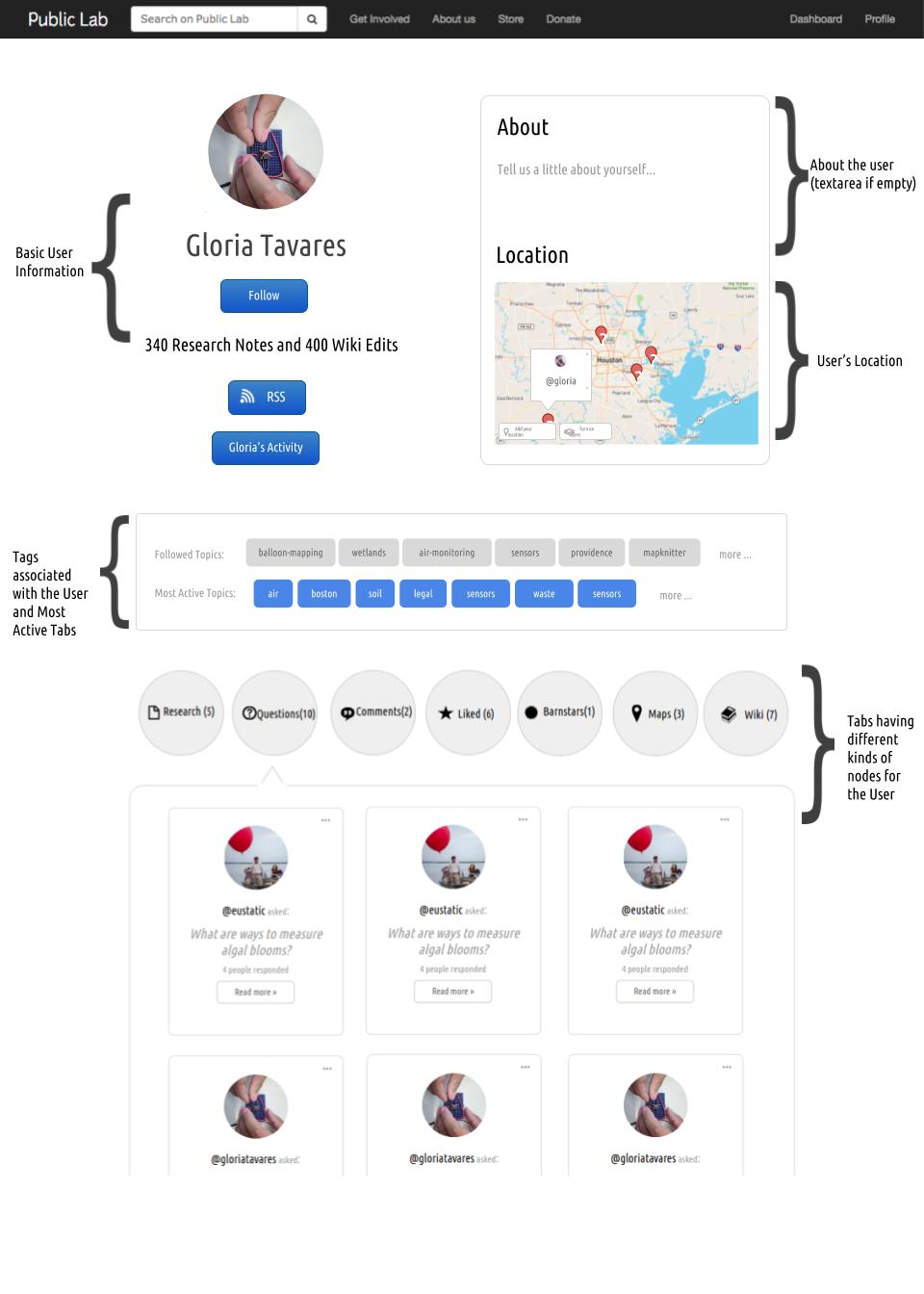
Part 1: Profile Page
Features which can be present on a profile page:
user's data should be encapsulated into a single page
the user should be able to access their activities easily.
The current design is too cluttered, although it includes all the information.
This information, if organized in a better and more appealing way, will interest the user more.
Utilize the available space to the maximum, but not overcrowd the page.
I think that the current amount of information is a lot to be present on just one page and we can represent it in a much more organized manner
Suggested Changes:
Firstly, we get rid of the activity graph, as there are very few users who have a proper activity graph, which looks good, but most of them have a sparsely populated and it basically looks like an empty grid and doesn't offer many conclusions.


V/S
Even a very active user has a less populated activity graph\

In the sidebar, we waste too much space to show a profile picture and associated tags in a vertical column. The profile picture's size can be reduced and the tags can be put in a box in one place. This way, we can increase the size of the rest of the page and get rid of the sidebar. We also show the user's basic information in a more concise manner now.\
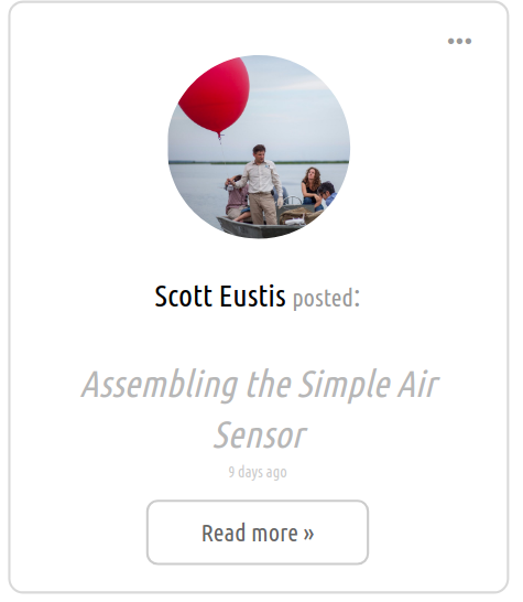
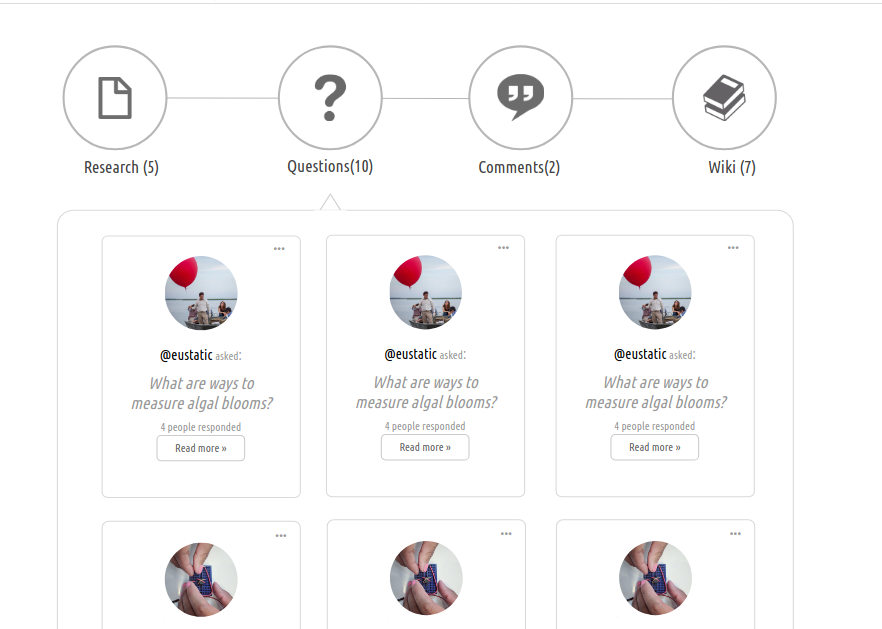
The cards in each of the tabs like research, wikis, questions etc are too cluttered


This should be changed to show 3 cards per row with a little more information about the node, also the less important nodes are given as links in the about me section, so as to not overwhelm the user with a lot of stuff on the page.
In the proposed design, a "Tell us about yourself" placeholder text has been inserted for those who haven't written their bio. For those who have, this will contain the text and a "Read More" button which will collapse that div and display all the information about the person. This will save space and also, won't be too empty for people have a little to write in their bio.
The size of the map has been reduced because not everyone sets their location and it shouldn't take up a quarter of the space in the page. The map is but below the bio to give the information about the user in one place.

A map interface to display recent individual content on a map
Deprecating the activity graph, we present a more interactive graph which would contain nodes of different activities by the user.
This graph would look something like the one that is implemented for tags. < https://publiclab.org/tags >
Instead of fixing this map on the profile page, a toggle button that would toggle the User's location and User's activity graph will be implemented.
Clicking on a node in the graph will open the corresponding research note/question/comment etc in a new tab.
There will be color differentiation for different types of post.

Complete View:

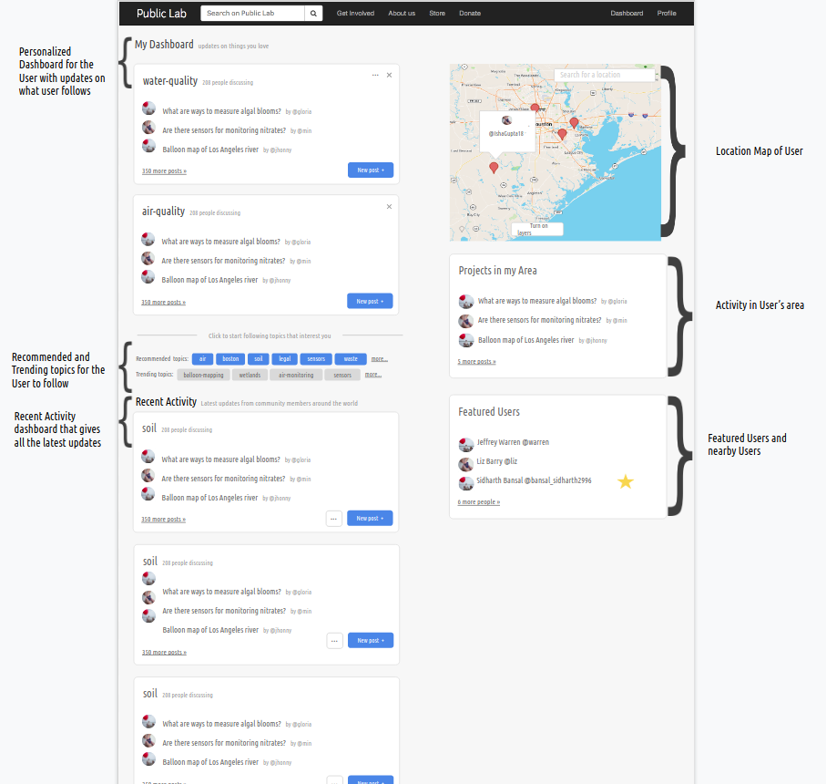
Part 2: Dashboard
Currently, the dashboard shows different kinds of notes like:
Comments
Questions
Questions which have been answered
Research notes
Events
They are shown in the order of how recently they were posted.
The problem with this is, not every user is interested in everything that is happening on the site. Dashboard is a feature for the signed up users.
The idea of a dashboard is to provide a personalized experience to the site's members and give them information about topics they are interested in and are relevant to them.
This is very important so that the user doesn't miss out on the updates on things they have subscribed to.
If the user wants to "unsubscribe" to a particular post or tags contained in that post, clicking on the cross button on the card will:
Unsubscribe the user with that post ie the function to unsubscribe will be called and the user will be unsubscribed to this, after which the post will be removed from the dashboard.
The card will slide out of the dashboard and next card will appear.
Another problem with the current design is the lack of consistency. There is a mixture of different kinds of posts and the color differentiation is
Not proper to tell which post is of what type
Doesn't look appealing to the user because of the structure in which the dashboard is made.
To solve this, card display should be used (which is being used at multiple places in the new design) and each card should be clearly marked with what kind of post it is.
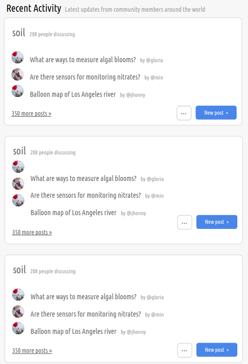
The sidebar should include a map containing the location of the user, below which, the activity related to that place is mentioned. This would encourage the user to be more involved in what goes on at PL.
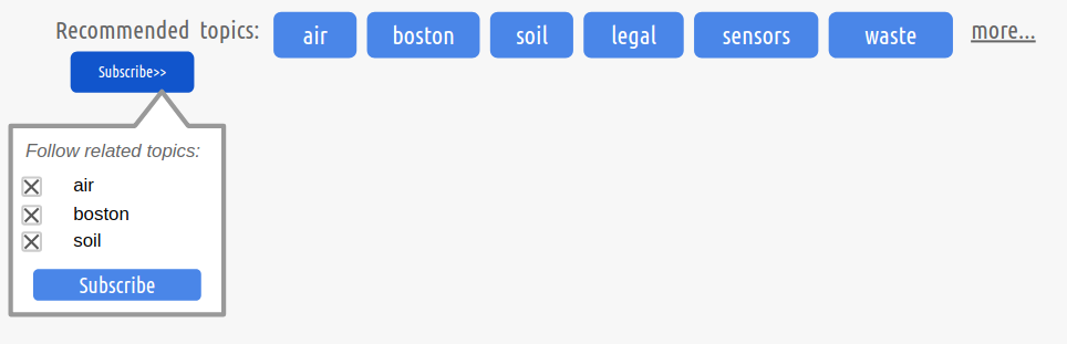
People get motivated to see active contributors. In the implementation of "Featured Users" , the most active users should be displayed. This should be displayed in the sidebar, and the users who share location with the current user should be marked with a star.
To generate the interest of users, we add a "Trending" activity section that would suggest some tags for subscription that can subscribed using the multiple tag subscribe button.


A "Recent Activity" section in which all the posts, in decreasing order of their dates are displayed.\
We can implement a "Recommended Tags" feature which would show some tags based on user's history and make them available for multiple subscription:
For this we can using caching at user's system.
Or we can keep a count of many times some tags were visited and suggest tags according to that.\
For NEW MEMBERS:
During Sign Up, we ask the user to subscribe to some tags.
When the user successfully signs up, they are subscribed to those tags.
The dashboard is then displayed to them according to their preferences.
This way, the user's interest is maintained in the site from the very beginning.\
Immediately after the sign up is completed (and we have the user in our database), we show the above modal and the user subscribes to the tags.
The selection will be done through hidden checkboxes.
A request is sent to a function written in subscription_controller.rb that subscribes the user to these tags and redirect them to the dashboard (instead of the subscriptions page, which is the normal flow).

Complete View:
]
Part 3: Questions page
Current Questions' page is very cluttered and in one go, the user doesn't get the idea of what can be done here or how to efficiently retrieve information.
There are 2 parts to redesigning this page:
Asking a question
Getting answers
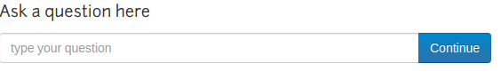
Asking a Question:
Right now, asking a question doesn't help the user in writing a good question, and doesn't offer proper space to do so:
To give the user a better experience:
Convert the field to an entire text area
Autocomplete inside the text area, when the user begins to type
Give a tooltip/accordion/collapse to give tips on how to write a good question.
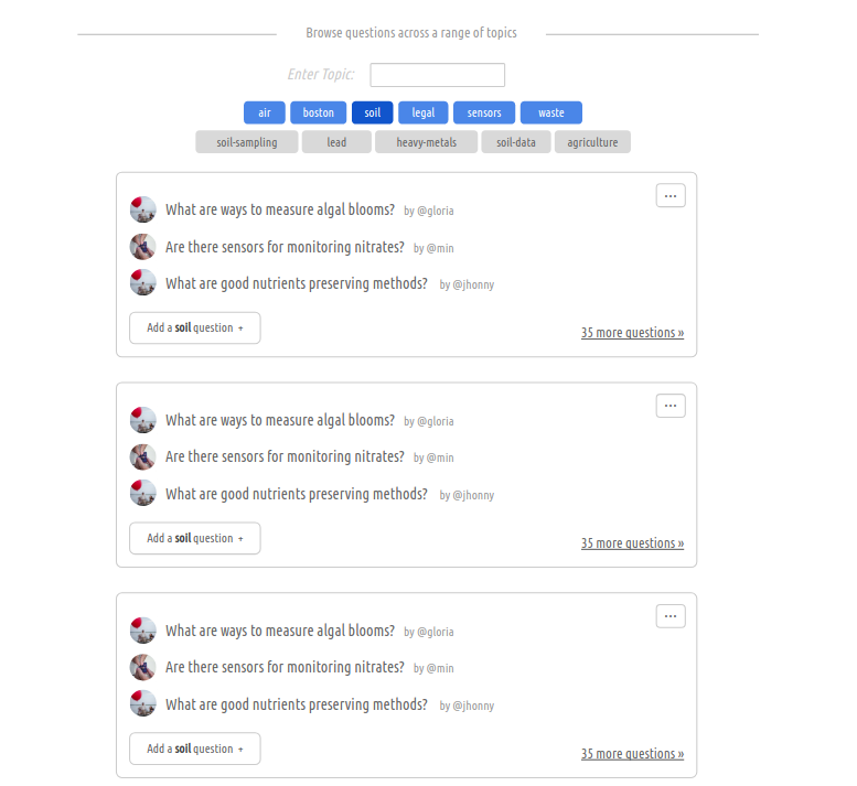
Getting answers:
"Trending Topics" tags can be displayed and on clicking on a tag from there, questions having that tag are displayed. There will be a small text box to enter the topic (with autocomplete), and corresponding questions could be displayed.
Each card will contain only the questions related to that tag.

Part 4: Subscription stats page
The current subscription stats page is a big JSON containing tags as keys and the number of users subscribed to them as values.
To organize it into more conclusive data, number of subscriptions can be grouped in intervals and displayed like this:
Corresponding to every interval, are a couple of tags having those many subscription.
On clicking a bubble, it expands and shows all the tags which have subscriptions lying in that range.
The size of the bubble (expanded or contracted) is proportional to the number of tags.
This makes a pure data page interactive and more informative.
Some work is in progress on this at < https://github.com/publiclab/plots2/issues/4603 >


For doing this we will have to write a function that iterates over the JSON hash puts each tag in it's correct interval along with
The JSON data will be preserved in another route.
Part 5: Per Tag Page
Currently the per tag page gives some information about the tag, some related tags to subscribe to and the activity involving that tag.
But we see that the page is too cluttered up, with all options at one place.
To improve this UI, we firstly need to give some space to different elements.
The "read more" will be a collapse and display the text about the tag.
Next, we need to put up the notes related to this tag. We can do it in the same way as proposed in the Profile Page design ie: Displaying each post in cards design.
We will be having a toggle button in Questions' tab that would toggle between "Recommended Questions" and "Featured Questions" which would give the suggested and best questions on that tag.\

Part 6: People's Page
People's page arranges the users according to how recent their activity is.
It also shows a map that has pins to the location of the users with most recent activity.
Currently, the data is displayed in rows in table, but the problem with that is:
It's not space efficient.
It looks too simple
It's static data
Users viewing this page should be able to follow users from here itself, so there should be a follow button next to each user (it should be marked if the user is already being followed by the current user)
Instead of table, card display should be used.

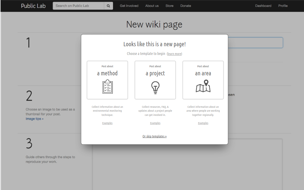
Part 7: Adding template selection when creating Wiki page
When a user creates their wiki page, they should be given a choice of a template to start with.
This makes it easy for the user to create a post.\
On selecting a template, the textarea in the editor will be filled with the template body and heading.
This can be achieved by simply sending a request on template selection and rendering the text to set as a default value in the textarea.
Part 8: Search interface
Current interface is too plain and simple.
We can modify it to promote more searching by our users

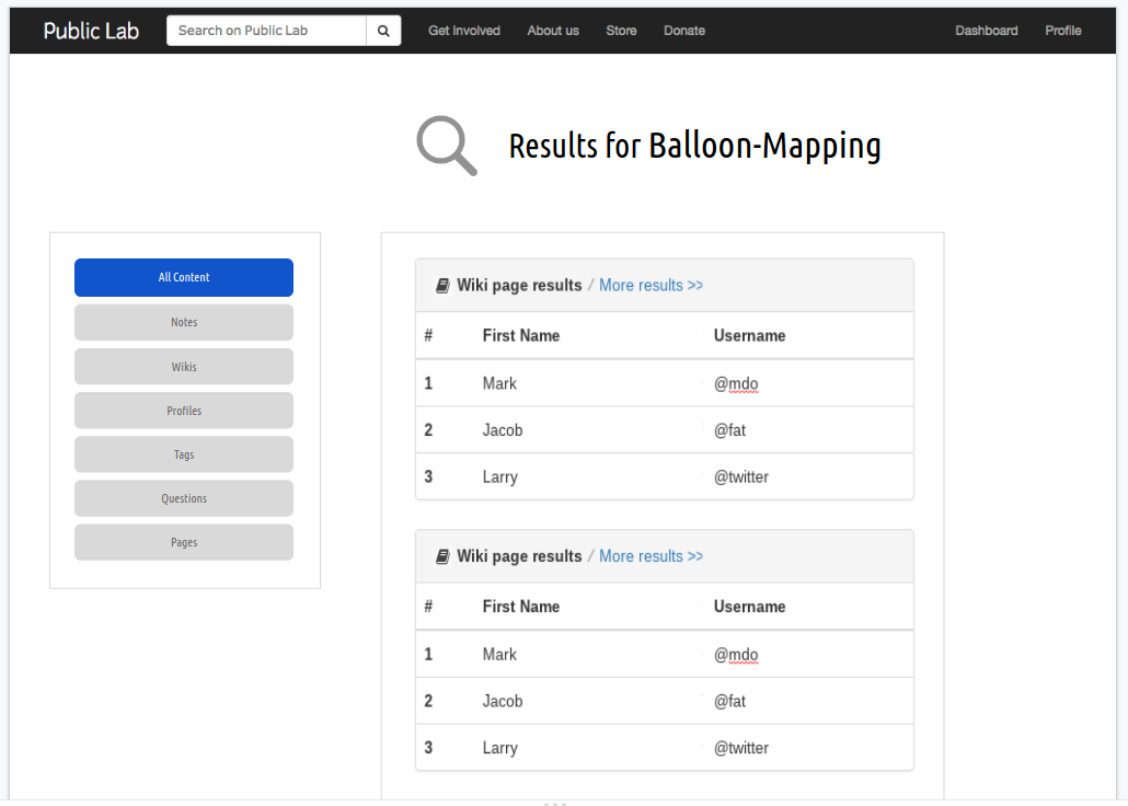
Part 9: Search results
The current search results' All Content tab looks very raw in terms of its tables.
The rest of the tabs have a card format.
To improve the All Content tab, we can organize it in table like panels, which are:
Better organized
Better looking
More informative\
"More results" will open the tab of the corresponding heading and show all the results there.
Timeline
PS: I would be opening atleast 2 FTOs every week. Also, smaller and more related tests with each design will be implemented along the way itself, so as to ensure a smooth flow. Card Design: Current design for displaying different types of nodes (research notes, questions, comments, tag information etc) is very cluttered and unbounded. To resolve this, each node will now be represented through a card format, with basic information on the card and different types of nodes having different options in a popover.
| Time Period | Work |
|---|---|
| May 20- May 21 | People's Page |
| May 22- May 23 | Tag's Page |
| May 24- May 25 | Question and Answer |
| May 26- May 27 | Research notes and Wikis |
| May 28- May 29 | Comments |
Profile page implementation
| Time Period | Work |
|---|---|
| May 30- June 1 | About Section: Will contain basic user information (profile picture, follow links, RSS feed), the user's bio and location |
| June 2- June 4 | Circular Tabs: Redesigning existing tabs to a more organized format, all nodes will have a card format now. Tags: Tags that the user follows and the most active tags for the user to follow |
| June 5- June 6 | Activity Graph: Deprecating the activity graph, we present a more interactive graph which would contain nodes of different activities by the user. |
Dashboard implementation
| Time Period | Work | |------|------| | June 7- June 9 | Right sidebar: User's location, using which, we display featured projects in that area. Also, some featured/most active users for the current user to follow, with the nearby users starred. | | June 10- June 15 | Personalized Dashboard: Not every user is interested in everything that is happening on the site.The idea of a dashboard is to provide a personalized experience to the site’s members and give them information about topics they are interested in and are relevant to them. This is very important so that the user doesn’t miss out on the updates on things they have subscribed to. Sign Up tags: During Sign Up, we ask the user to subscribe to some tags .When the user successfully signs up, they are subscribed to those tags. The dashboard is then displayed to them according to their preferences. | | June 16- June 21 | Recent Activity Dashboard in which all the posts are displayed in decreasing order of their dates. & Tags: Recommended tags specifically for the user to follow (history-based) and Trending tags on the site & Alignment of the entire dashboard | | June 22- June 24 | FTOs, Documentation, Blog, Reviewing PRs |
Questions' Page
| Time Period | Work |
|---|---|
| June 25- June 27 | Asking a question: Bigger Text area with autocomplete |
| June 29- July 1 | Recommended questions: Questions containing tags to which user is subscribed & Featured Questions: The best questions asked on the site |
| July 2- July 5 | Questions' Page- Tag Based searching (searchbox with autocomplete and some click-on suggested tags) |
Individual Tag Page
| Time Period | Work |
|---|---|
| July 6- July 8 | Tag information, Subscribing, Asking a question on that tag and Related tags |
| July 9- July 11 | Circular tabs with different kind of nodes and card display |
People's page
| Time Period | Work |
|---|---|
| July 12- July 16 | Arrange users according to their activity and display in card format to give more information about the user, as compared to current design. Also, display a map with pins to the location of most active users. |
Subscription Stats Page: Display Subscription stats in a more informative way
| Time Period | Work |
|---|---|
| July 17- July 19 | Subscription Stat's Page- Code to put tags in class intervals |
| July 20- July 24 | Subscription Stat's Page- Interactive Bubbles (each bubble containing all the tags which have subscriptions in that interval) and Static tags (some leading tags against each bubble) |
Wiki Templates
| Time Period | Work |
|---|---|
| July 25- July 29 | Wiki Templates for the user to choose to start a wiki page with |
Search Page and Search Results
| Time Period | Work |
|---|---|
| July 30- July 31 | Search Box with autocomplete |
| August 1- August 5 | Search Result page with card format for each category and table panels for all content and sidebar panel for different tabs |
Wrapping Up
| Time Period | Work |
|---|---|
| August 6- August 10 | Integrating Tests and minor debugging |
| August 11- August 15 | Finishing incomplete PRs and refinement |
| August 16- August 19 | FTOs, Final Documentation, Blog, Reviewing PRs |
| August 20 | Final report compilation |
Needs
I would be needing the guidance of mentors and I am open to any kind of help or input from other contributors.
Contributions to Public Lab
I have been actively contributing to Public Lab since December and I have worked on different types of issues, from minor to major and involving different aspects of the project (frontend and backend both). I am an active member of the community and have helped my fellow members with their issues and also opened some first-timers-only issues to welcome new contributors. I have made about 16 commits to the plots2 repository and I am well-versed with the codebase. I have also tried to expand MapKnitter to welcome new contributors and am in a discussion on some projects there as well.
I am working on some issues currently as well and hope to continue to do so!
Here are the issues reported by me:
https://github.com/publiclab/plots2/issues?utf8=%E2%9C%93&q=is%3Aissue+author%3AIshaGupta18
Here are my merged PRs:
https://github.com/publiclab/plots2/commits?author=IshaGupta18
Weekly-Checkin opened by me:
https://github.com/publiclab/plots2/issues/4844

Some activity on Mapknitter:
https://github.com/publiclab/mapknitter/issues/338
https://github.com/publiclab/mapknitter/issues/327
Experience
I am a first-year undergrad pursuing CSE at my college.
I am a part of the core team of Google Developer Student Club, which trains young developers on mobile and web development, and is an excellent platform to organize community workshops and showcases, apart from learning new technologies.
I have worked with Ruby on Rails for about 7 months now, which I learned at Coding Ninjas (https://codingninjas.in/courses/classroom-web-development-course) , which has taught me RoR from scratch so I am well-versed with the platform. I am also comfortable with Data structures and algorithms and am fluent in C++, Java, and Python.
Apart from this, at the front end, I have worked with and confident in HTML, CSS, JavaScript, and Bootstrap.
I am a member of the development club of my college, Byld where I get to organize and attend sessions about upcoming technologies.
In school, I was part of the cyber society, and have participated in numerous inter-school competitions.
Teamwork
I have worked in several group projects in my school and college, especially on IoT and on environmental projects in school called "Vasudha" (meaning Earth in English) every alternate year that dealt with a specific type of environmental problems like the issue of non-biodegradable poly bags, global warming, waste management etc. and required us to conduct surveys, analyze the results and propose solutions.
Apart from this, in open source, I have contributed to Public Lab only which has shown me how powerful a community is and how helpful people are. I felt so motivated when I my peers helped me in merging my PRs and I felt so good in helping them and welcoming newcomers to work out their solutions.
I get self-motivated whenever a bug is resolved and I move towards completion of some task I am doing. The best feeling is however, when one of my PRs gets merged. I feel confident about the fact that something I coded is being used somewhere.
Passion
Living in one of the most polluted cities in India, and pollution, which has always given me the sneezes through my childhood, Public Lab very much gets me interested in making the world a much cleaner place.
I am passionate about solving real-life problems, things that help people, even in the tiniest possible way.
I have always been interested in designing things, the reason why I pursued Photoshop was to see creativity come to life. Through this project as well, I want to use that creativty to make solid designs and make user experience better.
Audience
Since this project is all about UI, the target audience is the entire user base who uses Public Lab. For the community to expand and things to grow, a good user interface is required, to improve user experience, so that users are able to use the site to its best purpose.
Commitment
I completely understand that proceeding forward with this project and completing it is a very serious commitment and I will be fully dedicated to completing it because I am very excited in creating something new and useful and would be more than happy to work on it!
21 Comments
@warren @bansal_sidharth2996 @cess @namangupta @gauravano kindly review my draft for Outreachy's proposal. Any feedback is appreciated!
Reply to this comment...
Log in to comment
Wow!! awesome proposal @IshaGupta18 🎉 🎉 , Love the pointers to specific places where you plan to change plus your understanding of the website is amazing. Your planning looks neat and love your attention to detail. The images and mockups are great too. Good job
Reply to this comment...
Log in to comment
Hey thanks a ton @cess . I am so glad you like it!
Reply to this comment...
Log in to comment
Please have a look at the updated proposal @warren @cess and other mentors! Thanks a ton!
Reply to this comment...
Log in to comment
Hi @IshaGupta18 Great Work. You had specified each and every point.
I wanted to ask that In profile section - is that circular tab ?
I really liked the idea of decreasing the map. I've been empathising about this since week.
You inspired me XD
And In dashboard, You tried to resolve the lack of consistency with the card layout which are very much regular ?
The number of subscriptions stats, You''ll be showing it increasing order ? We can have the famous and more used tags in above I guess.
And what would be range for subscriptions. We can have diverse variety in amount of subscriptions for tags.
I liked map taking whole span XD
And Damnnnn.. We are IIITians .
Great going. 🎉 🎉
PS: I would love to have discussion with you again like we had today XD
Is this a question? Click here to post it to the Questions page.
Reply to this comment...
Log in to comment
Hey @lekhidugtal Thanks a lot for your review! Yes those are circular tabs. I will be showing in decreasing order of subscriptions, we sure can highlight the famous tags in every interval! I too enjoyed the talk we had today, would love to talk with you again.
Reply to this comment...
Log in to comment
Hi @IshaGupta18 I'm still a learner in designing but I'm still hesitating regarding the horizontal circular tabs. Usually we go vertical circular tabs OR horizontal circular timeline. This is new to me. 🤔 What are your ideas regarding this ?
Is this a question? Click here to post it to the Questions page.
Reply to this comment...
Log in to comment
Wow, there is a lot here to discuss, thank you @IshaGupta18! I'll comment on a few as I go through it:
I like how you're distinguishing between how things will look to a new user, who hasn't input much yet, and a more filled-out page. This is hard to capture on a static mockup.
Also, the idea of using the Tag visualization for a single user is pretty interesting! I wonder if it might be displayed instead of the map, if you press a toggle button. Maybe we could have a button switch the "Map" view to a "Topics" view... so we don't have 2 major visual displays competing? Just an idea though...
I'm thinking about the use of the blue buttons -- we typically want only one or at most two to appear on any given page, because they are designed to call attention (this isn't consistent across PL currently but it should be part of our upcoming style guide). The
follow,rssand other blue buttons - could we make them smaller white, minimal buttons so they create less visual clutter? They aren't primary functions of the page, so they could be tucked away a little, you know?Also, there are just so many circular tabs; is there any way to establish a hierarchy of importance, so that we don't simply bombard people with too many things?
In my latest attempt at the profile page mockup (in the shared design doc here: https://docs.google.com/presentation/d/1TCZoTfuhamRVrUak8aDgqJAwSgyhRtZg2Pgacl2_4zc/edit#slide=id.g4e2261b4b2_0_0) I tried making some of these into simply links, and not whole tabs, and relying on external pages to display them, rather than adding to the complexity of the profile page. This type of page is currently broken but we could debug it: https://publiclab.org/tag/coqui/author/zengirl2 (bug filed here).
For the design of the circular tabs, I do think there is a lot of benefit to using a familiar UI convention, as people will immediately recognize, for example, more traditional tabs, or other forms of organizing information. Perhaps there's an option in Froala Design Blocks that would help to structure the information in a more recognizable way for people? https://www.froala.com/design-blocks
Innovating in design is not a bad thing at all, but it's good to balance this with the benefits of a familiar interface that people would already know how to use. Open for discussion!
Like what's going on here and you're thinking through some of the details of how the new designs will work, esp things that aren't apparent in the static mockups. I like the question of "how do we determine the ordering" of topic areas -- this will be important when we actually code it up.
distinctcall in ActiveRecord?I'm thinking about how we might really achieve this best on the individual Tag/Topic pages, like https://publiclab.org/tag/coqui, for example. Could we do a better job there than simply having all mixed together on one page? And so perhaps the bottom of the Questions page would be better as a listing of topics, kind of like the dashboard, but showing questions lists instead of all posts within each card. Just speculating here...
I like where you're going with search and search results pages; the first very minimal like Google, the second more standardized. How could we show results for several different content types, and how do other websites do this?
For search results, perhaps tabs makes sense, or nav pills in a left-hand column? I think we should look carefully at Bootstrap styles (http://getbootstrap.com/) and examples from other sites.
Finally in terms of timeline, i think the People page may be pretty simple and could be done earlier, potentially, and then the card designs for the Topics (/tags) and people pages could be re-used in the dashboard pretty easily.
The Search pages are maybe the most in need of updating and they aren't super complex as designs, so we might push them earlier in the timeline too?
The profile and questions pages are the pages with the most left to do in design work, so we might consider those later in the project, and leave time to think through them.
Thanks again @IshaGupta18, and for others, these comments are surely helpful for everyone's proposals as well! I'm happy to hear everyone's thoughts on these, thanks so much!
Is this a question? Click here to post it to the Questions page.
Reply to this comment...
Log in to comment
Oh wow thanks a lot for such a deep analysis @warren. I really appreciate all the changes you have suggested and will definitely brainstorm on them and come out with the best possible solutions for smooth user experience! Also, I have anyways detailed out my timeline and made it to make the best use of my vacations. I will show you all the changes tomorrow before publishing my final application. Thanks a ton again!
Reply to this comment...
Log in to comment
Wow! Another proposal on UI Improvements. I like this proposal. There's a lot here. Focused on each and every part. And the design looks good. There is a couple of places where we can improve it but that has already been suggested by @warren --but it is already good. Thank You So Much!!! 👏 🎉
Thanks a lot @namangupta for your review!
Reply to this comment...
Log in to comment
@warren I have made the suggested changes, please take a look at them soon! Thanks a lot!
Reply to this comment...
Log in to comment
Hey Isha, great proposal! Although @warren covered all points, I will just add about the testing/feedback part, don't you think Aug 6 - Aug 10 is somewhat lesser time to test the project of such extent and that too in the end phase?
Also, I liked that you added about creating FTOs in the end phase of project. I will say, you should do that more frequently so that you can engage more new contributors in your project.
Nice designs and details overall!
Thanks!
Is this a question? Click here to post it to the Questions page.
Reply to this comment...
Log in to comment
Thanks a lot for your review, I will most definitely be making at least 2 FTOs pe week, Also, the tests written in the timeline are the final tests, smaller, related tests will be integrated side by side with the project.
Reply to this comment...
Log in to comment
I think you should mention about the tests by dropping a line in your proposal so no other mentor may get confused.
Done sir!
Reply to this comment...
Log in to comment
No need to use "Sir"
On Wed, Mar 27, 2019 at 12:06 AM \<notifications@publiclab.org> wrote:
Is this a question? Click here to post it to the Questions page.
Reply to this comment...
Log in to comment
Hi @IshaGupta18, you have written a very good proposal. I really like the idea, the way you are personalising the dashboard with the help of tags.
Just wanted to say you left out the wiki page and the note page. Aren't you redesigning them? Thank you!!
Is this a question? Click here to post it to the Questions page.
Reply to this comment...
Log in to comment
Thanks a lot for your review! I actually didn't iterate over the two. I'll have a look at them soon and see what can be done!
Reply to this comment...
Log in to comment
In some cases we might want to feature people not because they've been most active, but because the best embody the idea of Public Lab - collaborative work on environmental issues! So, in theory we might manually curate these (how might we do this? Profile tags?) and we might also brainstorm how else to feature people!
Ah, take a look at our simplified questions form here, which could be adapted for this use, and retain some rich text features but be even simpler! https://github.com/publiclab/plots2/blob/master/app/views/editor/questionRich.html.erb
How might we calculate a query to get "Recommended questions"? good idea!
People page - could the map be touching the top navbar and go full width, instead of having margins?
Search results page -- wow! Very cool!!!
Thanks Isha!
Is this a question? Click here to post it to the Questions page.
Reply to this comment...
Log in to comment
Oh, I am so sorry I don't know how I missed out on your comment @warren, I was not doing so well for the past couple of days. Yes, I think we could make some sorts of profile tags to implement that. I think "Recommended Questions" can once again be tag-based, according to what the user is following and check for distinct questions. I think we can stretch the map, no problem. Thanks a lot for your feedback and for spending so much time on my proposal, I will implement these changes soon and get back to you!
Reply to this comment...
Log in to comment
Login to comment.