I created some rough wirefarmes for profile section.
Regarding the profile, we had so much data that it took me a ton of hours to think than in actually applying. The information was huge and regarding architecture I had no clue. I needed to ensure that I don't miss out anything. And yet with so much data, the UI doesn't look messy. I walked-through various designs to ensure the consistency.
I used WYSIWYG concept to ensure that even mockup and prototype will be the same.
In the end, the information architecture I decided was following :
The section for research, questions, answers as it's already there in the pages. The positioning for it is almost the same.
I didn't add icons for now but they'll be there.
.png")
I aligned them a bit , so they look uniform which is not present in earlier one.
credits to jywarren's profile. because I needed a profile with a lot of data and mine didn't had that.
The main part of the profile page is map, along the bio or info and the your contribution map. I only had my one desktop screen and i had to assign them all along with the profile picture and other data... We can't shift them anywhere or give them small blocks covering the pages.
I took GIthub's UI as an example as they are the collection of repository of codes and publiclab org is the collection of research notes and etc, So I started brainstorming some ideas. But it was naught.
You must be wondering Why ?
* Github has small line bio but publiclab org don't.
* Publiclab org uses maps for the position but Github don't
But the desktop size was same. And I can't squeeze the contribution map to sqaure as they'll remain rectangle.
So I came across a solution of controlling my information architecture with input-controls ie : toggle buttons.
Why ?
Because
.png")
But all the data was the required important information.
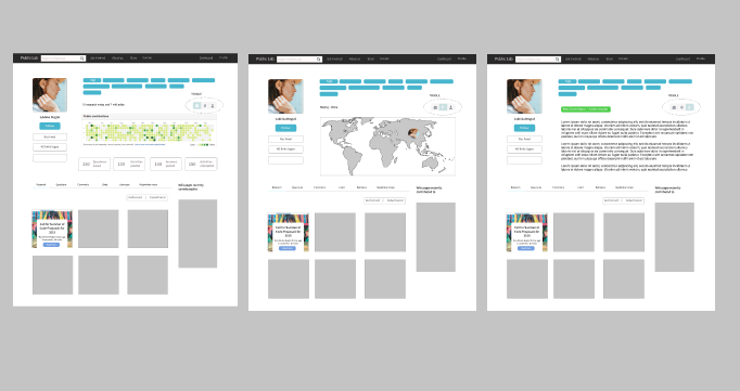
In the below picture, I used toggle buttons to toggle between the map, contribution graph map and the bio.
I tried to go for a way which is not "just a design" but is possible while implementing.
Fig1 : For bio
Fig 2 : Map
Fig3 : Contribution graph
Fig1 : The big paragraph text is the bio. it could be as detailed one want. And Even if the bio is empty. It doesn't matter as it won't affect other part.
.png")
Fig2 : The lady in the map is not necessary, I just wanted to show the position in map. I used a full map instead of a square to take advantage of space and use it.
The lady in the map is from here >>> https://designmodo.com/maps-websites/
_(1).png")
Fig3 : This contribution graph map and some questions aksed and etc.
The design here is not key part rather positioning is.
The contribution graph is of an image found online .
The questions asked part got little bit unaligned.
_(2).png")
Most importantly , For comparison :
.png")
As only one component in above is changed in all three of them, It doesn't affect the other part of UI. And even is the person hasn't uploaded the bio and other info. But the contribution graph will be always there . Though it will be empty. So when we'll open default profile page, the first thing coming into the view would be the graph.
These were some wireframes with some rough edges.
If anyone can tell me a better way to use the space ,with no cluttering, and show all the data in the screen,
Then do suggest your opinions XD.
This design is one of ideas for my 2019 outreachy proposal. I'll uploading them individually, So i can have some awesome suggestions for all XP.
I'll be drafting them in my final proposal altogether.
Thanks a ton for reading.
6 Comments
Hey Everyone, This is Lekhika Dugtal. I tried to create some designs which is possible to implement too. As being a designer and a developer, I usually came across easier designs than done on technical aspect. Its not that designing is easy , rather it needs a lot of work in thinking and analytical process. But A design which is possible to implement. Considering the timeline given to person for three months. I tried to keep it a simple as it is. And to make the UI user friendly.
I didn't go for some out of reach fancy UIs. Rather I tried to improve the design than redesigning it completely.
Considering the coding part, The code won't change much. Most of the work will be in css and html. The requests given are still the same.
Main part would be toggle, where if clicked on one icon, one group of items will be displayed and others will be hidden. And vica versa for others.
The Rest of the part will be almost same as only css will be worked on.
Thanks a ton to those who gave it a read.
The suggestions are welcome whether its technical or design XD
@gauravano @warren
https://publiclab.org/i/30050.png The UI of individual profile looks clean. But if you can change the button(Rss feed, All links logos, etc..) style in the left, then it will look more professional.
Reply to this comment...
Log in to comment
Hi! This is really cool. I will go through it in more depth soon, but just for context, did you see this design in the shared Google Doc for mockups? https://docs.google.com/presentation/d/1TCZoTfuhamRVrUak8aDgqJAwSgyhRtZg2Pgacl2_4zc/edit#slide=id.gfb2aa1b7ddf791c_5
Page 15:
I like a lot of the ideas in your mockups! Perhaps we could try to incorporate them and make a composite of the designs?
Is this a question? Click here to post it to the Questions page.
Reply to this comment...
Log in to comment
@warren I just visited this after you posted the link. Yeah it would be great to incorporate the best out of all the designs. The streams of idea would help us create a better prototype.
Reply to this comment...
Log in to comment
@IshaGupta18 take a look here! I'm also trying to link you into this discussion from https://github.com/publiclab/plots2/issues/4423
Reply to this comment...
Log in to comment
Yes @warren , I saw some of the designs here and some at the issue, I think we can discuss and try to combine both of them, to make it the best!
Reply to this comment...
Log in to comment
Login to comment.