
Google Summer of Code'19 Work Product: Isha Gupta
The GSoC period might be coming to an end, but the journey is not over yet. Here's the summary so far...
Project Details
- Student: Isha Gupta
- Github: IshaGupta18
- Project Title: Sensor Data Upload & Display Libary
- Project Proposal: Proposal
- Project Repository: Simple-Data-Grapher
- Organization: Public Lab
Abstract/Summary
Simple-Data-Grapher is designed in a standalone repository. It is an HTML, CSS and JavaScript-based library, made in NodeJS through which a user can import CSV data, select different columns and graph types, and plot charts.
The user can import data through: - Local File: A file on the user's system - Remote File: A globally accessible file on the web - String: A CSV String - Google Sheet: A published Google Sheet
The headers are automatically detected, and assigned if not present.
A sample of the data is displayed for the user to choose columns for X and Y axes.
The user can choose from a variety of graph types, and the graphs can be plotted using PlotlyJS or ChartJS.
Peripheral Features:
- Download data as a spreadsheet
- Add graphs
- View and Export Data through CODAP
- Export Data to Google Drive (via CODAP)
- Save data for later use (on integration with plots2)
- Publish plotted graphs as a Research Note (on integration with plots2)
- Upload data from previously uploaded file (on integration with plots2)
- Save file description and title (on integration with plots2)
- View all uploaded files, delete and download them (on integration with plots2)
Code Links
Links to Pull Requests in simple-data-grapher: Simple-Data-Grapher
Links to Pull Requests in plots2: Plots2
Links to Issues in simple-data-grapher: Issues in SDG
Links to Issues in plots2: Issues in plots2
Links to Commits in simple-data-grapher: Commits in SDG
Links to Commits in plots2: Commits in plots2
Github Pages demo: https://publiclab.github.io/simple-data-grapher/
Blogs: https://publiclab.org/profile/IshaGupta18
Project Description
Flow: Basic Flow of the Library
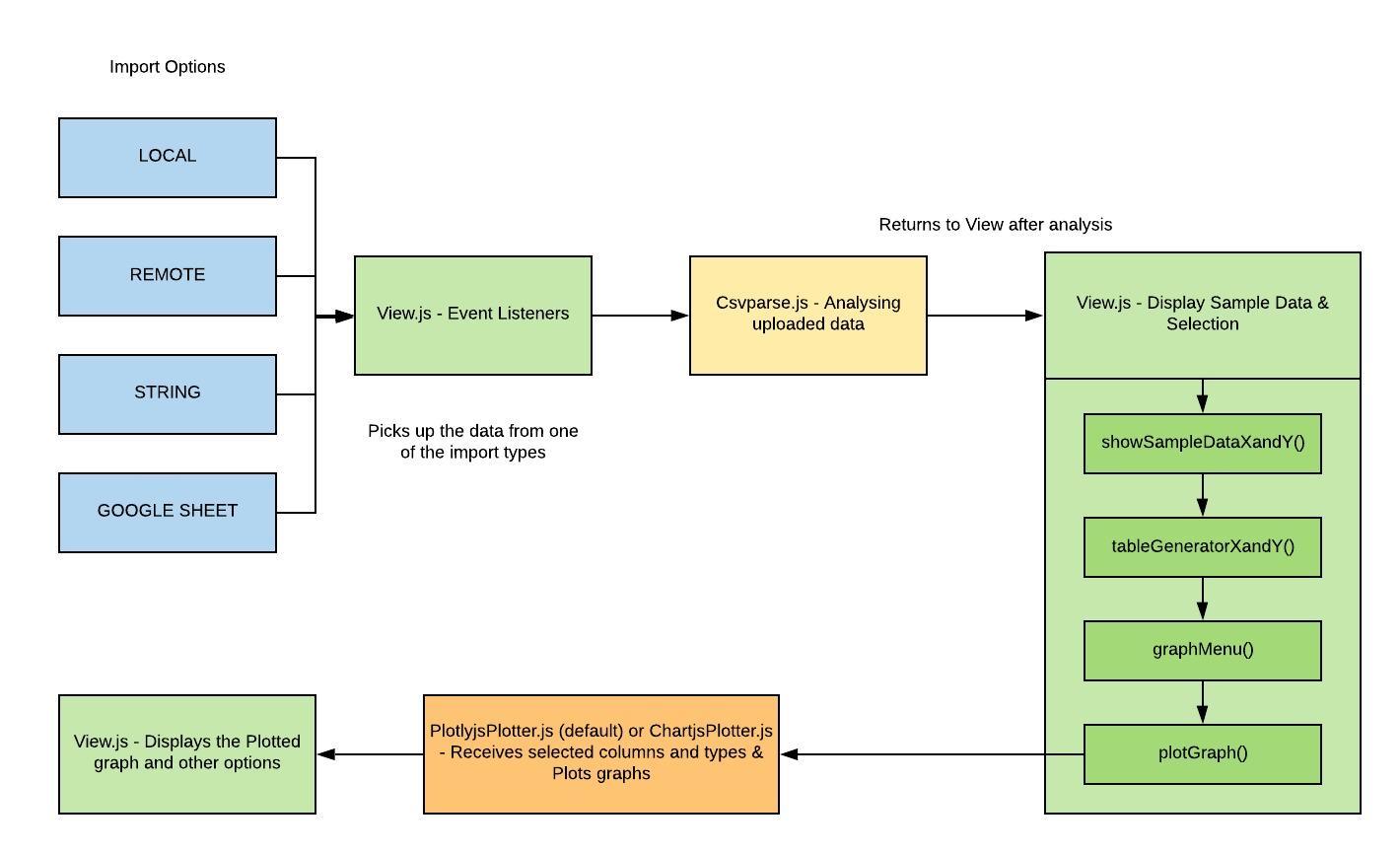

View.js: First reads the input files through the event listeners and sends the file to Csvparser.js, then once the required information is received, it displays a sample of the data. It then takes the selected data by the user, through the
afterSampleData()method, and goes to the plotting library, and displays the graph.Csvparser.js: Receives the file and it's format type and:
- Parses the CSV
- Determines headers
- Determines a matrix for the complete data
- Extracts sample data to be displayed to the user for selection
- Creates a transpose of the data
PlotlyjsPlotter.js (default) or ChartjsPlotter.js: Assembles the received data according to its format and plots the graph on the canvas element.
Peripheral Features in Stand-alone
- Add Graph: It is checked at
showSampleDataXandY(), where the number of currently plotted graphs is incremented and it is sent as a flag, where the newly plotted graph has to be appended in the chart area, and not clear the canvas.

Create Spreadsheet: Uses the transpose created by Csvparser.js and creates a (excel or xlsx) spreadsheet using
SheetJSand downloads it.Download as Image: PlotlyJS offers the ability to download the graphs as an image. A feature for ChartJS was created separately.

- CODAP Export: CODAP is used here to view the CSV data in a proper tabular form. From there, the user can view a summary of their data, view a more readable form of it and use other tools that CODAP's Plugin API offers. The user can also export their data as a CSV directly to their Google Drive.

Plotlyjs v/s Chartjs
I created an adapter function which can easily switch between the two charting libraries, as one can be advantageous over the other in different situations.
- Plotlyjs is more extensively used than Chartjs
- Plotlyjs provides options like:
- Zooming
- Panning
- Autoscaling
- Downloading the graph as an image
- Box and Lasso select
- Edit graph in Plotlyjs editor
- Chartjs:
- Better comparison
- Better color scheme and design
- More informative tooltips
Flow in plots2
The basic flow remains the same as in the standalone library.
Features introduced on integration
Save the data: The user can save their uploaded CSV and use it later for plotting.
Associate a file title and description with the uploaded data.

- Using previously uploaded data for plotting: Users can use their previously uploaded files for plotting in simple-data-grapher.

- Per-User Data Page: Lists down all the files a user has saved, their title & description. The user can delete as well as download the files.

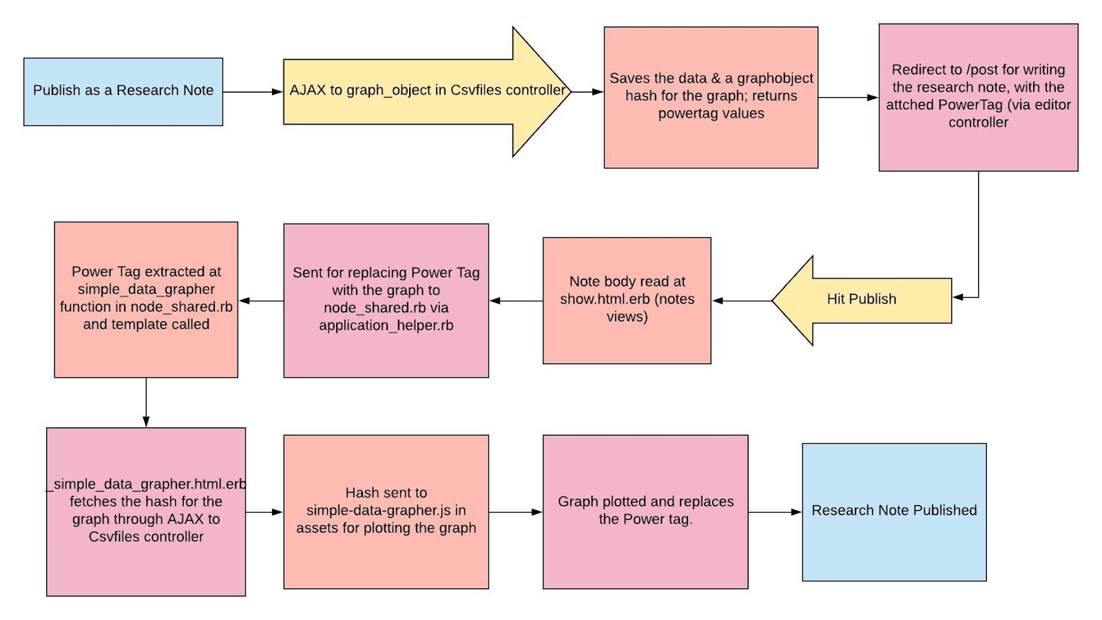
Publish as a Research Note
The user can publish their plotted charts as a Research Note on Public Lab and discuss their findings.

Flow
My Experience
Working with Public Lab for about 9 months now has been a humbling experience. The community has been extremely helpful and I have enjoyed working with amazingly talented people.
I have learned so much, before and during GSoC, both about development, and how to work in different projects, and I want to continue to do so in the days to come.
I will remain active as a contributor and would love to be a mentor for the upcoming Google Code-In.
First-Timers-Only
I have actively welcomed new-commers in plots2, and simple-data-grapher.
Links to relevant issues in plots2
Links to relevant issues in simple-data-grapher
What's left
It's been one packed summer for me and I have worked on this project from scratch, one by one executing the ideas I had suggested in my proposal. But as I went along, I stumbled upon a few more additions that can be well implemented.
Some of the planning issues I have in my mind are:
A more comprehensive UI Design, taking into account from users and making the process of uploading data handier. Views on this
Possible integration with MapKnitter, as mentioned by @ebarry on one of the Open Code Calls.
Implement an
Update Graphfeature for the plotted graphs.More analysis features, showing better conclusions, like basic statistics (mean, median, etc) or export features to sensor data analyzers.
Advancing the Graphs:
Adding axes details
Adding color variations
Manipulating data dynamically
Making the graphs more interactive and detailed
Optimize the code
Building a stronger open-source community around this new project, by creating more issues and welcoming contributors.
These were a few ideas I had during the project. I would like to take them forward, and would appreciate any more ideas from the members of the community, or potentially, for the next Summer of Code to come!
16 Comments
Isha I am glad to see the progress you made. I remember the initial pr stage in which we were discussing the designs and then my internship started so I was not able to help you much that time. The designs for plots are AWESOME. Alignment is awesome. I can guarantee that people will love using the plots which you introduced. Superb progress Isha. Well done.
The gifs are great and explain me most of the article in a decent way. Here are a few suggestions: Please crop the gifs so that it will not show the screen recorder dialog box and notifications of chat with Jeff. I am just concerned about this small thing as your blog will be read by 1000+ students aiming at SoC 20. Also, your flow chart are awesome. Just a small suggestion, read about UML diagrams like sequence diagrams specially and try to incorporate them in the design discussion from the next time. They are universally accepted and easily understandable as different shapes convey different meanings. thanks Isha for selecting PL for GSOC 2019 project. We are delighted to have you this year.
Thanks a ton! Yes, I will keep all this in mind and study about the UML diagrams. Thanks a lot for your support, especially during my initial stages at Public Lab!
Reply to this comment...
Log in to comment
@gauravano I think Isha wrote a really nice doc. Can you give her basic barnstar for her work in this research note? Thanks
Is this a question? Click here to post it to the Questions page.
Reply to this comment...
Log in to comment
Love the data flow diagrams and incorporation of the gifs 👍 Makes visualization of the project so real. Amazing project @IshaGupta18 and you have done so much in your project in a just the summer period congrats 🎉 🎉 This post is amazing and detailed. Maybe you could add a link to this post on your project documentation in case new contributors want to understand the project in depth?
Great job ❤️
Is this a question? Click here to post it to the Questions page.
Thanks a ton @cess. It sure has been an amazing summer, and I have really appreciated your help in my project! I would definitely add a link! Thanks again.
Reply to this comment...
Log in to comment
@warren awards a barnstar to IshaGupta18 for their awesome contribution!
Hey Jeff, I changed it to enthusiasm barnstar because Isha was REALLY enthusiastic during the whole summer.
Thanks Gaurav and Jeff for gifting her a barnstar. She did a fantastic job!!!
Love this idea :-)
Reply to this comment...
Log in to comment
@gauravano awards a barnstar to IshaGupta18 for their awesome contribution!
Reply to this comment...
Log in to comment
Great post Isha, and awesome work. You really did lot of work during GSoC and before that too. The milestones you've achieved are appreciable. And, we are very thankful for the contributions and time you spent for Public Lab 🎈.
We will surely love to have you as a mentor for the upcoming GCI. Thank you!!!
Thanks a lot @gauravano, it has been an awesome journey with Public Lab that I wish to continue. Thank you for all your help and guidance! I would be very honored to be a GCI mentor!
Isha please fill https://docs.google.com/forms/d/1OFjj_2d4BnntXEy6bddWoKNOeBqvnJCLeGwOFORajZI/edit and suggest any edits if required. Thanks
Yes, I filled it today, I think the form is good to go for now, however we might need a more detailed way of selecting the mentors!
Reply to this comment...
Log in to comment
Hi, Isha! I'm going into SDG with these files, uploaded by a community member with an air sensor:
https://gist.github.com/jywarren/0230c6e79794d3aa1cf2abe868971019 (4 distinct files)
It's a great example use case. This is the kind of thing people really want to use SDG for!
For example, there are too many columns. We really only want to look at a few, like time, temperature, pressure, humidity, and a few of the far-to-the-right ones;
pm1_0_atm,pm2_5_atm,pm10_0_atmUsing https://publiclab.github.io/simple-data-grapher/ - there are just too many columns to select! I think we need to make it be horizontally scrollable.
Also, I think i found the ordering of the
X-axisandY-axistoggle to be a bit odd - like, it seemed like i was using the toggle above thePlot graphbutton, but choosing the columns below?I wonder if it's possible for SDG to auto-detect a time-based column, and default to using that as the x-axis?
Then, i had some trouble with the screen not letting me scroll down to see the graph:
However, overall this was a really cool way to try exploring this data. I was also really impressed at the CODAP integration! This data file was a bit big for CODAP to handle, but it was very cool to see it uploaded so easily. Maybe a "full screen CODAP" view would be nice, or an "Open Codap in a new window" for once you're done exporting, would be nice?
Awesome work!
Is this a question? Click here to post it to the Questions page.
Reply to this comment...
Log in to comment
Login to comment.