Spectralworkbench Blog

The comparison of DVD and CD using halogen, incandescent, and fluorescent lamps
We were interested in determining what effect changing certain aspects of the spectrometer kit would have on the quality of our spectra and if other options were viable. We compared different diffraction gratings (CD versus DVD) as well as light sources (incandescent, halogen and fluorescent). We found that the prescribed combination of DVD grating with fluorescent light source did provide the best spectra, but that the CD/fluorescent combination also provided adequate results. The materials we tested included a red tinted blank CD, a blank DVD, a halogen lamp, an incandescent lamp and a compact fluorescent lamp. The instructions provided on the publiclaboratory website were followed for setup of the spectrometer and preparation of the DVD. Preparation of the CD involved removing the top red (in our case) reflective layer which the labels are imprinted. To accomplish this, a combination of removal by tape and scraping was used, and the touching of the disk was avoided to eliminate fingerprint interference. Areas that were scraped were not selected for the 1 inch square required for the spectrometer grating. The clearest area of the CD remaining was chosen to avoid interference issues. No special setup was required for the different light sources, although some adjustments were made for the varying intensities. The distance between the slit and source was adjusted for each lamp until the intensity was at an appropriate level and as equal as possible to each other. The relevant difference between the CD and DVD when used as diffraction gratings is the number of lines/mm. The DVD has about twice as many lines/mm as the CD. According to nnin.org a DVD has 1350 lines/mm while a CD has only 625 lines/mm. The greater number of lines on the DVD causes a greater amount of separation of light and thus better resolution. This also means that the DVD will provide a better spectrum than the CD, however we wondered if the CD would be a viable alternative to the DVD at all. As expected, all of the CD spectra were poorer in quality than the DVD spectra. However, the incandescent and halogen sources were merely smudges of red. The fluorescent spectra maintained distinct separation of light. Although not to the same quality as a DVD/fluorescent combination, the CD/fluorescent combination is an acceptable alternative if a DVD is not readily available. The second variable in our experiment was the source light. The difference between incandescent and halogen lamps from fluorescent lamps is the way light is produced. Incandescent and halogen lamps both produce light through heating of a filament. Halogen lamps also include one of the halogen elements to help prevent evaporation of the filament. This also allows the lamp to burn at a higher temperature which can improve the production of a spectrum in the visible region. Both of these lamps produce a continuum spectrum. Fluorescent lights work differently. Instead of using a heated filament to produce light a fluorescent light works by exciting mercury atoms via electricity. A phosphor is then used to produce a visible light spectrum. Because of this unique setup fluorescent lights produce both a line and continuum spectrum. There are sharp lines produced by the mercury and a continuum from the phosphor. The fluorescent spectrum for both the CD and DVD gratings was the sharpest and clearest of the three. This is probably due to the presence of the sharper mercury lines coming from the source. There was no noticeable difference in quality between the halogen and incandescent lamps. The following is a link to our spectra:
Follow related tags:
spectrometer spectralworkbench plots cd
Attempt at Quantitative Analysis for Desktop Spectrometer
Motivation Quantitative analysis is a major application of UV-Visible spectroscopy. Specifically, one can determine the concentration of dilute colored compounds in solution by measuring the amount of light a solution absorbs. The correlation between concentration and absorbance is known as Beer's law and follows the equation
A = ebc
where A is the measured absorbance, b is the path length of the absorbing solution (in cm), c is the concentration of the colored compound in solution (in mol/L), and e is an empirically determined constant. We thought it would be interesting to see whether the spectral workbench could be used to collect quantitative data. Method We set up the spectral workbench spectrometer following a procedure described elsewhere on this website (http://publiclaboratory.org/wiki/dsk). After doing that, we used aluminum tape to make a 1cm wide by 2cm/tall mask over the opening in the spectrometer where light is incident on the paper slit. We then made solutions of various concentration of an absorbing species. This involved mixing 1)a variable amount of methyl red indicator, 2) 6 drops of 0.1M HCl, and 3) diluting to 10mL total volume in volumetric flasks. We put these solutions in 1cm quartz sample cuvettes. We then took transmission measurements at the wavelength where the absorber absorbed most strongly using the online software (https://spectralworkbench.org/). The source was a CFL lamp pointed at the spectrometer. The results of these experiments are listed below in this note and compared with the results expected by Beer’s Law.
List of Materials Public Lab Store Spectrometry Kit Computer Aluminum tape Quartz Sample Cuvettes Methyl red indicator dye 0.1M HCl Dropper 10mL volumetric flasks Incandescent Lamp
Results and Commentary The results are listed in format {percent concentration of methyl red}, {absorbance} . 0.025, 1.12 0.01, 0.20 0.05, 0.82 0.1, 1.00 0.15, 1.20 0.2, 0.60
As can easily be seen, these data are not even remotely linear. Does this condemn the use of the spectral workbench for quantitative analysis? Perhaps not. I think the blame for this non-linearity resides in other parts of the experiment. It turns out that the absorbances of indicators such as methyl red are intimately related to pH. In the experiment, I just added enough acid to make the solution look a certain color. There is actually a wide range of absorbances when something looks a certain color. Since I did not control pH very carefully (added a few drops to each solution), control of the concentration of indicator that actually absorbed at the given wavelength was not very good. Therefore, this experiment would need to be repeated with more precise control of pH. Preferably, I would use a simpler dye without a pH dependence.
Another issue with this setup is the use of materials that are not readily available, such as quartz cuvettes, volumetric flasks, 0.1M HCl, and an indicator as the absorbing compound. Using a different dye (such as food coloring) in the experiment would eliminate the need for the acid and the indicator. Volumetric flasks could easily be replaced by measuring cups in the real world. Quartz cuvettes are probably the biggest issue, and I just used them because they were readily available in my college’s lab. There are a few possibilities for replacement. I think a water bottle with a square edge (such as Fiji bottles) would work well although the long path length would mean that only extremely dilute solutions could be used. Another possibility is plastic sandwich bags suspended such that the path length is controllable. Let me know if you have any questions or comments.
Follow related tags:
spectrometer analysis spectralworkbench centre_college

Light Amber
Maple syrup grades are determined by the color of the syrup. The lightest colors are less common because they generally require sap from the beginning of the sugaring season which often has a higher sugar content. The color is caused by heat, especially during the later stages of evaporation when sugars are concentrated and the boiling point of the syrup approaches 220° F. Sap with a higher sugar content can be made into syrup with less heating, and therefore can produce lighter syrup. Efficient processing can also reduce heating time and produce lighter syrup.
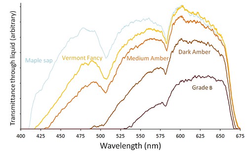 Intensity graphs for four grades of Vermont maple syrup. The darker grades transmit little or no blue light.
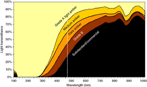
The chemical reactions that color syrup cause more absorption of the blue end of the spectrum. The more syrup is heated and colored, the more blue light it absorbs. So as syrup gets darker, a greater proportion of red light is transmitted causing dark syrup to have a reddish brown color. The darkest grades transmit little or no violet or blue light (400-500 nm).
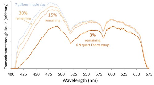 Intensity graphs for four stages in evaporating maple sap into maple syrup. 97% of the water in sap is lost before it becomes syrup.
As sap is boiled, the color change is slow until the later stages of the process. Boiling away 85% of the water has a minor effect on color, and almost no effect on transmittance of red light. Evaporating the next 12% of water causes most of the color change.
Technical notes: Averages. To produce a graph of the intensity of each wavelength, Spectral Workbench takes the average of the intensities of each of the three color channels (red, green, blue) recorded by the camera. These averages incorporate many zero values, and the way the color channels overlap produces some artifacts in the graphs. The graphs displayed here are not averages, but are the value of the color channel which was highest at each wavelength value. This also produces artifacts, but they seem a little easier to interpret for this type of transmission spectra.
Smoothing. Spectral Workbench presents a graph with an intensity value for each pixel in a transect across an image of a diffraction pattern. The images I have been uploading have a width of about 1400 pixels in the visible light region of 400 to 700 nm. That allows more than four values for each nm of wavelength, far greater than the resolution of the spectrometer. The graphs presented here are smoothed with a running average that combines 10 values into one. This better reflects the resolution of the spectrometer which might approach 2-3 nm.
White balance. By mistake, I captured the spectra for the two graphs presented here with different camera settings for white balance. The spectra in the graph of different syrup grades were taken with a fluorescent white balance which suppresses the blue end of the spectrum. The spectra in the graph of stages of boiling sap were taken with a tungsten white balance which suppresses the red end of the spectrum. So the lopsided shape of those graphs should not be given any meaning related to maple syrup. The relative relationships within each graph still have validity. This was a good lesson that I need to pay more attention to the camera which is creating the spectral data, something it was not intended to do. It also makes me wonder about spectra captured by cameras using automatic white balance adjustment.
Two sets at Spectral Workbench include all of the spectra presented here: https://spectralworkbench.org/sets/show/205 and https://spectralworkbench.org/sets/show/207
Below is a figure from an article in a food journal of the actual shape of transmission spectra of different grades of maple syrup.
Follow related tags:
spectrometer vermont spectralworkbench ebert

Macro system for Spectral Workbench API
The Spectral Workbench API is getting a boost with a new system for sharing macros, released late this week. Since it's an early-stage release, there are few links to it on the SpectralWorkbench.org website, but you can published macros and share your own it by visiting this page.
Some notes on the system:
- currently it's only for Analyze page macros; the Capture page is being rewritten before we release the macro system there
- we'll be improving both the display of saved macros (with syntax highlighting) and the editor; if you have suggestions, leave a comment here!
- there will be a way to "install" or "favorite" macros for easy access, and a way to search for them
- macros may have comments
- the API continues to evolve but we'll hopefully be releasing some educational macros which will be both useful and educational
The macro system is where we plan to develop a lot of new features for the website; if you have JavaScript coding experience, this is a great way to get involved in shaping and improving Spectral Workbench!
Follow related tags:
spectrometer spectralworkbench api

Polynomial
Image above: Spectrum of a CFL calibrated by anchoring two well-known peaks at 405 and 650 nm (arrows). Other peaks do not align well with their known wavelengths.
Calibrating a Public Lab spectrometer is a crucial step. The raw image from the spectrometer's camera has no information about which wavelengths are represented until it is associated with a wavelength scale. Typically, this is done in Spectral Workbench by identifying two well-known peaks in a spectral image of a compact fluorescent lamp (CFL). Spectral Workbench then knows how to stretch a wavelength scale along the image. If the image is a faithful representation of a good diffraction pattern, a dozen other well-known peaks in the spectrum will line up with their proper wavelengths.
This week I was pleased to see that a half dozen different calibrated spectra taken by Ebert of CFLs all lined up nicely with each other. But I was puzzled that they did not line up so well with a diagram of the 14 major emission peaks in a CFL. I made a set in Spectral Workbench of this result. The image above is one of the spectra in that set (SnowSky) with the 14 CFL peaks overlain. That spectrum was calibrated by telling Spectral Workbench the wavelength of the blue peak at 405 nm and the red peak at 650 nm (using the macro feature). The failure of many of the other peaks to line up properly suggests that the spectral images taken by Ebert are distorted. To align them properly, the image has to be rubber sheeted -- a non-linear adjustment must be made.
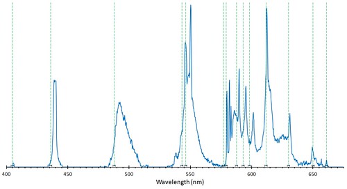 An intensity graph of the CFL spectrum above which was calibrated just by anchoring two peaks, one near either end. Many peaks do not line up with the well-known peaks from CFLs (green dashed lines).
There has been some good discussion about calibration at the plots-spectrometry Google Group, where I learned about the technique that I describe below for fitting a second order polynomial to adjust the calibration spectrum above so it matches the proper peaks more closely. I used the cursor readout in Spectral Workbench to find the wavelength of each of the 14 peaks in my poorly calibrated spectrum above. I knew the correct wavelength of these peaks from sources like this. Excel has a function (=LINEST() ) which will do this multiple regression properly and compute such things as the F statistic, but if you just make a scatterplot graph of the 14 wavelengths of the poorly calibrated peaks (x) against the 14 known correct wavelengths of those peaks (y) and fit a second order polynomial "trendline" to the points, Excel will print the equation for you. In this case the equation was:
y=0.0002x2 +0.8394x+37.788
where x is the old lousy wavelength and y is the new adjusted wavelength
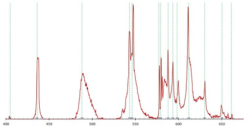 An intensity graph of the same CFL spectrum above which has been adjusted by fitting a second order polynomial to the wavelengths. The peaks are closer to the known wavelengths of those peaks (dashed lines).
Applying this function to each old wavelength shifted the spectral graph in the right direction, but was not as satisfying as I had hoped. So I got rad and clicked "Format Trendline" again and went for a third order polynomial. That improved the fit some more and probably as much as it needs. I will have to live with the remaining errors (at least until I figure out what causes them).
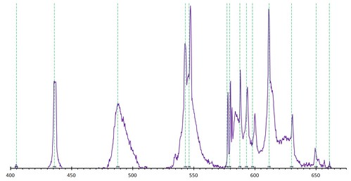 An intensity graph of the same CFL spectrum which has been adjusted by fitting a third order polynomial to the wavelengths. The peaks are as close to the known wavelengths (dashed lines) as they are going to get.
Now that I have this function (y=-0.00000141x3 +0.0024x2 -0.376x+250.15) I could apply it to all the spectra taken with Ebert. So when I capture a spectral image of an unknown light source, the peaks will be more accurately aligned on the wavelength scale and be more reliable clues about the atoms or molecules producing or modifying the light. It would be great to have this functionality in Spectral Workbench, so if you would like to help with the programming, get in touch.
Follow related tags:
spectrometer vermont calibration spectralworkbench

SpectraOnline.com spectrum searching
I was just contacted by a guy from spectraonline.com, which has been absorbed into ThermoFisher -- he came across our work and was duly impressed -- and tried downloading some of our data to run in their old technology demo site, http://spectraonline.com.
With a small modification, our CSV exports will upload to their site and run in a search against a collection of 8000 spectra, of combined publicly available sources. I modified our CSV export to "just work" on their site (preserving the more compete CSV export as "CSV (raw)") and now you can upload your spectra directly to try searching. Woohoo! Above is Chris F's neon spectrum in their uploader.
A few things:
- first click on "By Spectrum Matching" at the bottom of the first section of links
- choose "UV-VIS" -- that range worked best for me
- the site hiccups from time to time -- it was written a while ago
- I imagine it is matching absorption, so we'll need to begin developing a consistent way to measure absorption and generate CSVs before we can expect to get a good match
Post if you get anywhere with this!
Follow related tags:
spectrometer spectralworkbench matching search
